
Learn data visualization in Python using Matplotlib and Seaborn in this data visualization guide.

Exploratory data analysis (EDA) is often overlooked in data science projects. It is tempting to train models right away and see the results to make decisions. However, conducting a thorough EDA is important to get a better sense of what your data looks like and ensure there are no outliers or missing values that might skew your analysis. Python is a great language for data science because it has two libraries called Matplotlib and Seaborn that will help you visualize data.
Matplotlib & Seaborn
Matplotlib is a data visualization library that can create static, animated, and interactive plots in Jupyter Notebook. Seaborn is another commonly used library for data visualization and it is based on Matplotlib. Both are usually used in conjunction during the EDA process because Seaborn’s default color themes are better than Matplotlib but Matplotlib is easier to customize. In this article, we will use both libraries to conduct an example EDA on Jupyter Notebook using the Boston Housing dataset from Kaggle. Please note that this example is purely an example and I did not form any hypotheses surrounding this data which could influence my focus and choices in what to investigate.
Importing Libraries
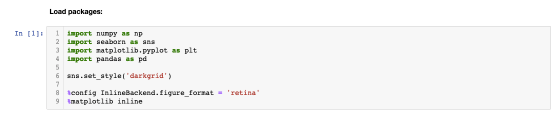
Let’s start by importing libraries we will need to conduct some basic EDA. As you can see, I have renamed the libraries using the ‘as’ statement. These abbreviations are accepted as industry-standard but you can name it to whatever you wish.

The ‘sns.set_style’ sets the aesthetics of the plot and ‘%config InlineBackend.figure_format = ‘retina’’ makes the plot higher resolution. Life’s too short for pixelated graphs, right? Finally, ‘%Matplotlib inline’ is a magic function that tells Matplotlib to generate our plots within the front-end of the Jupyter Notebook under our code. This allows us to store the plot within the notebook.
Loading the Data
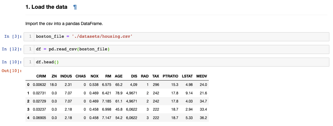 Let’s load the data and name the variable ‘df’. We can see the first five rows by inputting ‘df.head()’. You can specify the number of rows you wish to see by typing a number in the parentheses.
Checking Null Values
Determining how many values are missing for each feature column is an important step in validating our data. When we start building models with our data, null values in observations are almost never allowed. Fortunately, there’s a handy way that we can use to check for nulls:
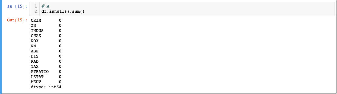
The.isnull() built-in function converts the column values into boolean True and False values and returns them in a new dataframe. The null values will return True. The.sum() function tacked behind will sum up the True values in each column and return the total number of null values. Fortunately, the Boston dataset has 0 null values. There are different methods to fill in null values but that’s another deep topic in itself.
Renaming Column Names
You probably realized what the abbreviated column names mean. Datasets usually come with a codebook that you can reference to check the meaning of a variable. However, I personally like to rename them to make it more descriptive.
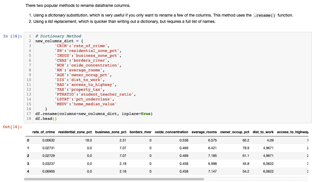
Make sure you type df.head() to check if the column names changed successfully!
Checking Summary Statistics
Now that we’ve checked our data and renamed our columns, it’s time to see its summary statistics. The.describe() function returns a summary statistic for every column. Let’s see what we find.
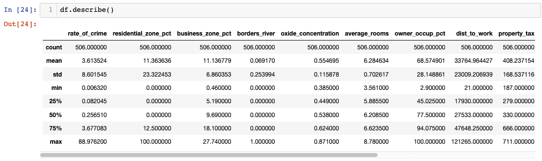 Did you find anything noteworthy in the summary? If you’re like me, I found it difficult to find anything meaningful when data was presented in a table format. Let’s try using boxplots next.
Boxplots
Boxplots are useful for seeing distribution, central value, and variability. The ends of the box show upper and lower quartiles. The line going through the box shows the median value and the whiskers go from each upper and lower quartile to the maximum and the minimum. The maximum is calculated by the following formula (Q3 + 1.5*IQR). The minimum is gotten by (Q1-1.5*IQR). Whatever falls outside the whiskers are considered outliers. Fortunately, we don’t have to do any of the calculations- whew! Seaborn to the rescue!
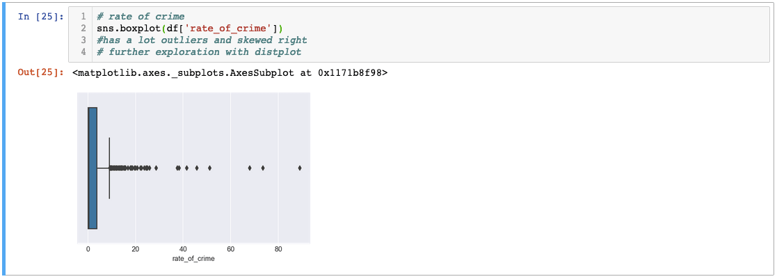
I’ve used seaborn’s boxplot function to graph ‘rate_of_crime’. As you can see, there are a lot of outliers that are skewing the data to the right. Let’s try another variable.
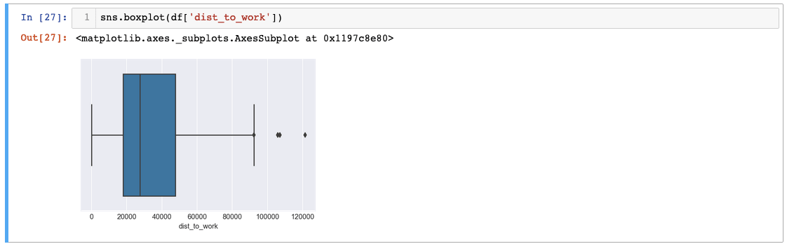
In ‘dist_to_work’, we can see that there are three big outliers! Imagine traveling over 120,000 miles for work. It could be a typo that might have to be revisited later but for now, let’s operate under the assumption that everything is valid.
Instead of checking each variable one by one, there’s another method you can use to check for distribution. In this case, we are using Matplotlib to customize the shape of our plot and Seaborn to graph our boxplot:
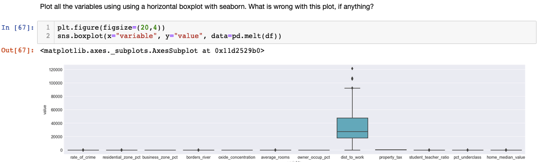
Although this method is convenient, we might want to exclude ‘dist_to_work’ because the values are too big. Other columns’ boxplots became quite meaningless.
Correlation Matrices
Besides from boxplots, another important visualization tool we should consider is correlation matrices to check for linear relationships between our variables. The formula we are using is called Pearson correlation and we can use Seaborn to visualize it.

We can see each variable’s correlation coefficient. Note how the coefficient is 1 when it is related to itself. This heatmap easily shows which features could be worth exploring further and include it in our models. If you are interested in one particular variable, we can code it for a closer look:
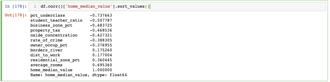
According to our correlation, it looks like average_rooms will be a good indicator of a home’s median value.
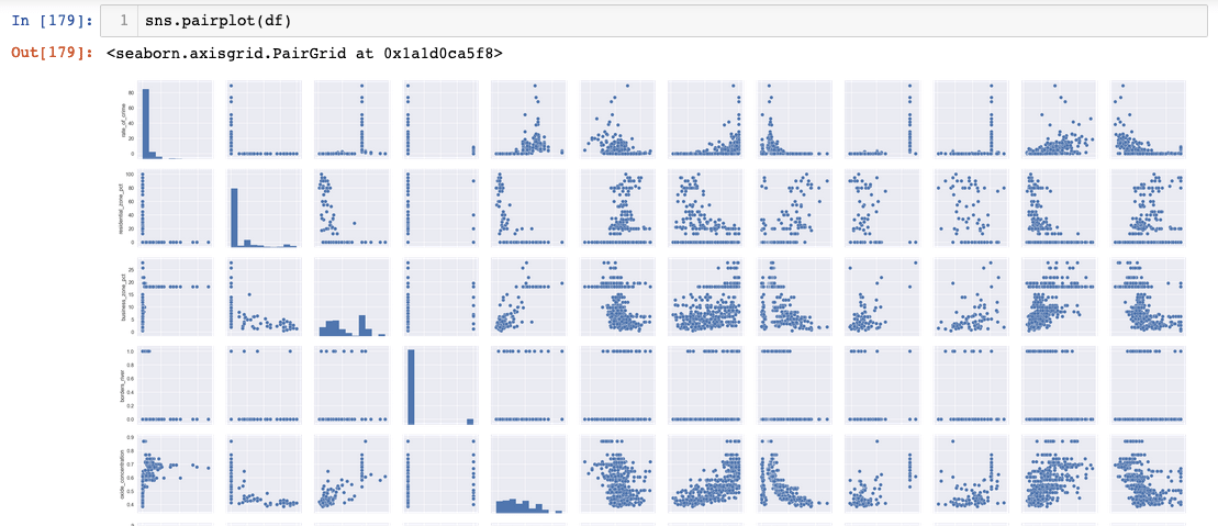
If you wish to visually check the linear relationship between variables, Seaborn’s pairplot function can help you check. However, it is harder to draw any meaningful insights from it.
Recap
I hope this EDA tutorial gave you a taste of Seaborn’s and Matplotlib’s powerful data visualization capabilities! Different datasets might call for different visualization techniques such as a histogram. In this scenario, however, we used boxplots to check for variance and outliers and the correlation matrix to check for linear relationships.


