
Explore the process of creating dual-axis charts in Tableau, understand their significance, and learn how to use them to effectively analyze and compare two sets of data.
Creating Dual-axis Charts in Tableau

What is a Dual-axis Chart?
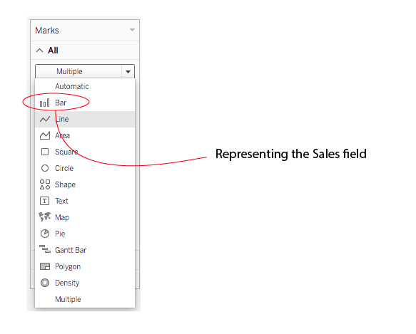
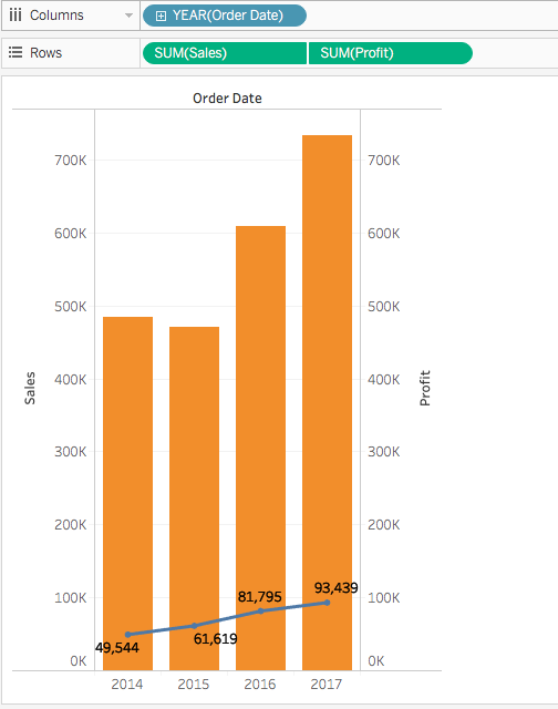
A dual-axis chart is a chart representing two sets of data overlaid on top of one another, in which the resulting charts will have a shared axis. For example, you might have an X-axis for date (months) values, and two separate Y-axis representing separate measures, sales, and profit, on each side of your chart. This allows you to compare profit and sales figures over a period. In dual-axis, you can format your chart with separate marks card for each axis. In our example, we are representing sales figures using a bar chart while using a line chart for profit.

Blend Measures Vs. Dual-axis
Dual-axis charts are particularly useful for analyzing two measures that have different scales. In the case of measures with the same scale, they can share the same axis using the blend method. Blending measures in Tableau will consist of dragging one measure or axis and dropping it onto an existing axis. Instead of adding rows and columns, Tableau will show your second measure on that same continuous axis.

How to Create Your Dual-axis Chart in Tableau
The first step in creating dual-axis charts is to make a graph for one of your measures.
You then drag your second measure onto your row shelf. Tableau will generate a second graph which is technically a dual-axis chart at this point. But not a dual-axis combination chart.

Note: You can add up to four layered axes: two on the Columns shelf and two on the Rows shelf.
Synchronizing Axis
You will need to decide whether or not the two axes should be synchronized. If the unit of measure is the same for both measures, right-click on the right axis and select Synchronize Axis. This aligns the scale of the secondary axis to the scale of the first axis.
In our example, the Profit axis is the secondary axis and the Sales axis is the primary axis.

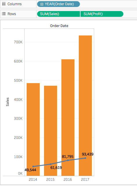
You can also hide one of the axes and display the values on the graph area, or change the order of your fields in the row shelf to alternate which field to represent the primary and secondary axis.
Right-click the right-side axis and select Show Header to toggle off the labels on the right side. Switch one measure from one side to the other in the Rows shelf to move one measure forward.
Note: You can synchronize dual axes for numeric data types that don't match. For example, you can synchronize an axis that uses an integer data type and an axis that uses decimal data type.
Extending the Possibilities of Dual-axis
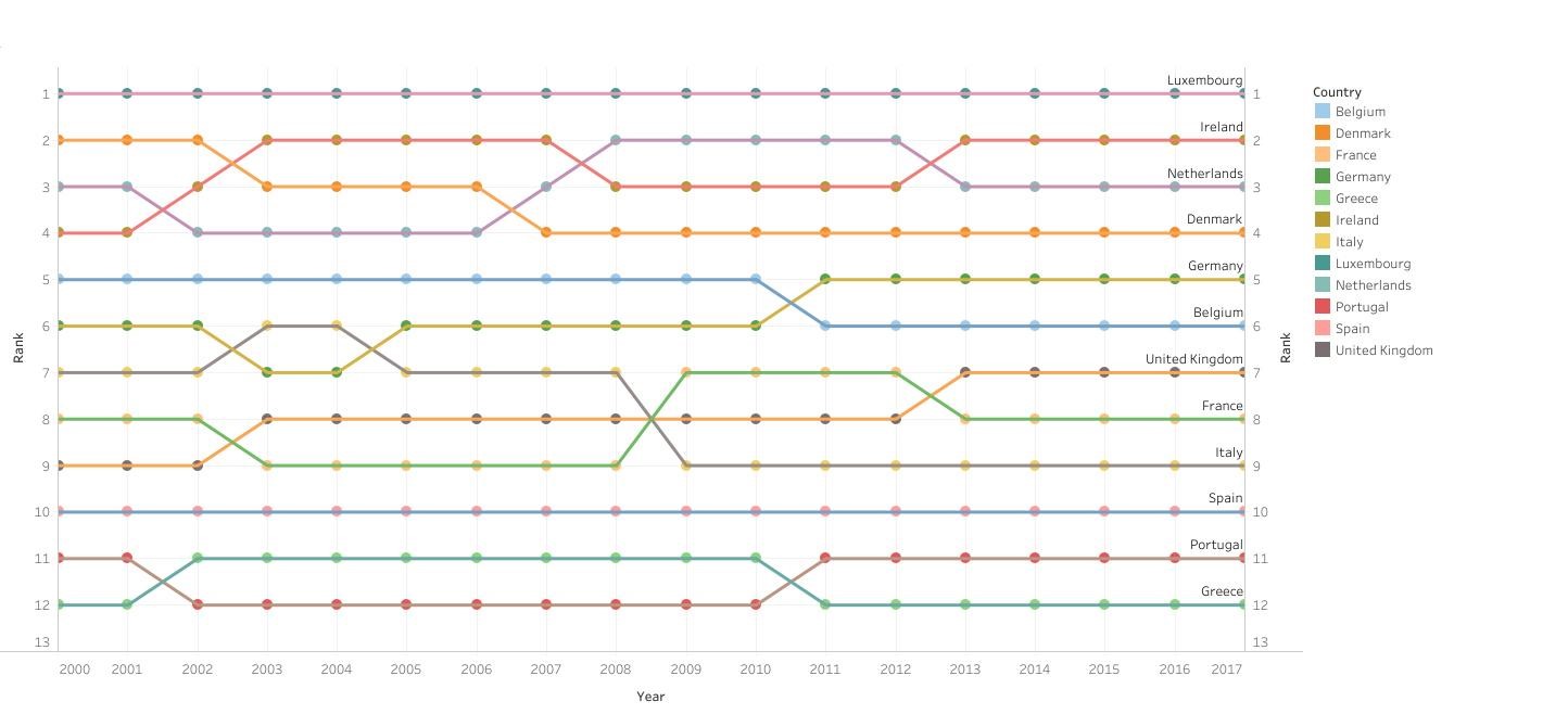
Understanding the logic behind dual-axis charts can be useful if you are looking to create more custom chart such as a ranking chart.
Dual-Axis (Layered) Maps
You can extend the possibilities of these charts in the context of maps: when two sets of geographic data are overlaid on top of each other, we obtain a dual-axis (layered) map.
For example, you might create a map with polygon areas filled with one measure and geographic data points for cities on which you mapped another measure. In the example below, we mapped CO2 emissions per borough of the city of London, and mapped the population of each borough on the second “layer” of our map using circle sizes.
-Maps.png)
There are different ways to create these maps in Tableau, which we will explain in a separate post. Using one or the other methods will depend on the type of geographic data you collected (latitude and longitude generated, polygon data, or a combination).
Conclusion
While using Tableau, you will need to use dual-axis charts, either because blending axes for multiple measures into a single axis isn’t sufficient to analyze your data, or for the creation of custom charts such as ranking charts.
The ability to add a second axis to your chart unlocks many more possibilities in Tableau, making dual-axis charts some of the most useful charts. In particular, the fact that they retain the same level of customization as a single chart allows you to customize the level of detail, size, shape, and color encoding for each measure. They are also a great addition to maps as well.