
Discover the versatility and integration of Tableau's mapping capabilities to better interpret and present your data geographically, offering a powerful tool for data analysis.
Getting Started with Maps in Tableau
Answering the “where” has become more and more important in the interpretation of your data. For that purpose, Tableau presents many possibilities when it comes to displaying your data on a map, and no other tool offers as much flexibility and integration with your data. This three-part article highlights the many tools and ways to create maps in Tableau.
Why Maps Are Relevant?
Maps let you unravel information about your data even the most complex graph can’t. They allow you to compare your location data, discover patterns of repartition, and find out how the geographic data evolve over time. When you combine the map information with other graphs, this leads to better answers to your data questions.

Did You Know You Can Create a Multitude of Maps in Tableau?
The followings are some examples: Choropleth maps, proportional symbol maps, heat maps, dot density or point distribution maps, flow maps, spider maps, and many more.
Additionally, Tableau comes built in with a series of map layers: Census-based population, income, and other standard demographic datasets which can be overlayed on your data.
You can find these options in Tableau under the menu Map > Map Layers
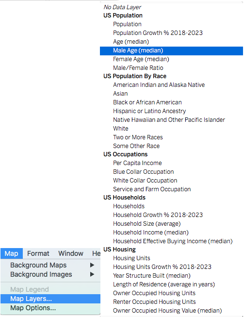
Tableau also allows you to add details to the map using parameters like County borders, zip code area, and streets as well.
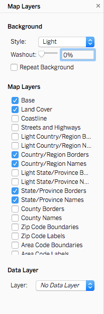
Tableau Goes Further…
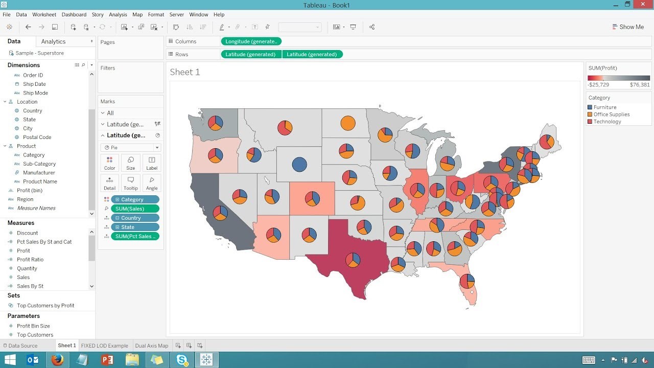
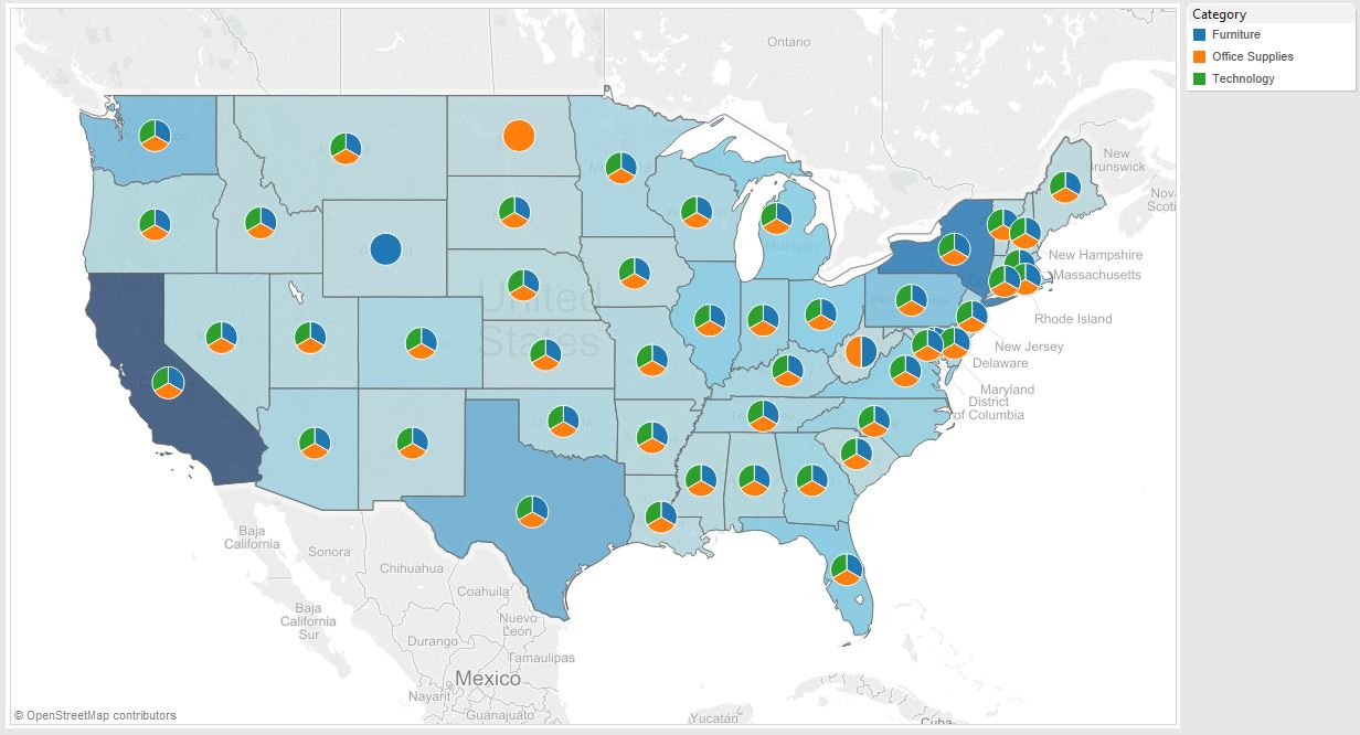
Using Dual-Axis layer you can create multi-layered maps.
For example, you can combine a Choropleth (or filled map) with pie charts, to reflect percentage analysis across regions. Reflect relative repartition of your data with larger and smaller circles. Use color spectrums to reflect small or large numbers.
-> Read our previous article to familiarize yourself with using Dual-axis charts.
How Do You Create Maps in Tableau?
Tableau is designed to make the most of geographical data. If your data has geographic coordinates, or locations Tableau recognizes such as country or zip codes, for example, Tableau will use them to generate a map. All you have to do is double-click on the geographic field associated with your data. This is the field that displays an ![]() icon next to it. Once you have plotted the data on the map, you can share your map with a click.
icon next to it. Once you have plotted the data on the map, you can share your map with a click.
Creating Custom Maps Using Images:
In Tableau, you can also work with an image as a map and plot data points on it.
Tableau will treat this image as a background image with coordinates based on the dimension of the image.
Access this feature in the menuMaps > Background Images.
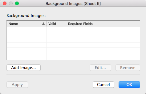
Note: Although this method offers the advantage of using your own image which could be anything, a building floor you have created and saved as an image file (jpg, png) for example. It can also be more time-consuming than using geographic data as you will have to add your point coordinates one by one in your data table.
Once you have created an image map and added your point coordinates, by removing the axis you will have the map left with your annotated points.
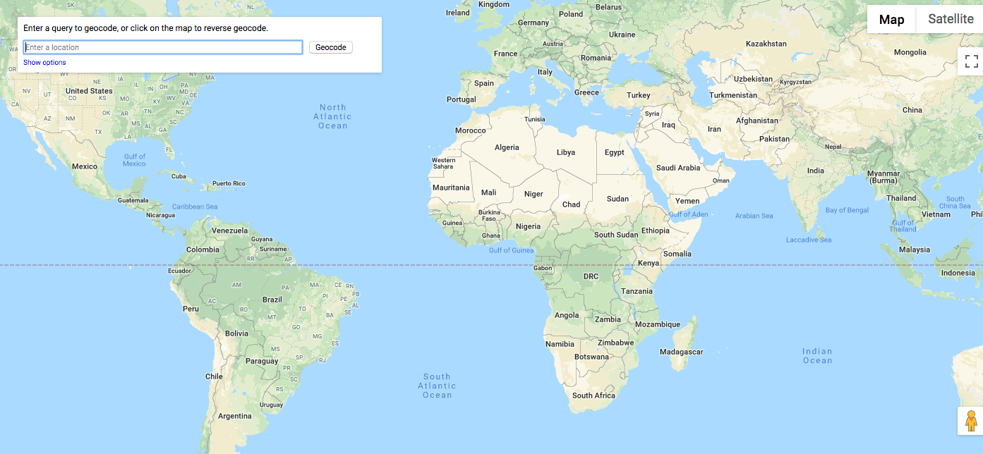
Geocoding Your Custom Locations
Using addresses instead of zip codes requires to geocode your data. Geocoding is the process of determining geographic coordinates (latitude and longitude) for your addresses. There are many free tools offering geocoding. Is one of them. Note that some are limited in the number of places or addresses you can geocode.
Using Spatial Files for Your Maps
Expanding the scope of possibilities, you can also import geographic data from R or GIS (or other spatial files or custom geocode data you have available such as the following examples which are customizable.
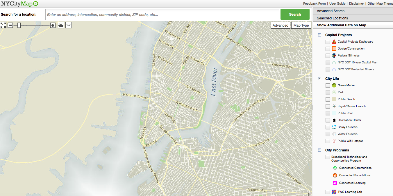 (Image Source)
We will review how to use GIS (Geographic Information System) files in Tableau in part two of this article.
Conclusion
Adding maps to your analysis offers powerful ways to dissect your data and answer questions that would otherwise be impossible without the map. Tableau simplifies that process by treating maps like any other graph. As a result, with tools like the dual-axis, you can create rich data maps. The combination of map layers and customization with several map types opens new possibilities not available in traditional tools like Excel.
Fully integrated in Tableau, maps can also be used in a dashboard to filter data from other charts.