In this article, we are going to look at how to use the Analyze Data Tool in Microsoft Excel.
Using Excel’s Analyze Data Tool
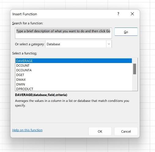
Technically, there are many functions built into Excel that help you analyze your data. From the “-IF” versions of functions like SUM, AVERAGE, and COUNT to VLOOKUP and XLOOKUP to the many Database category functions (as shown here), anything that allows you to filter for, sort, or otherwise organize and view your data in a way that makes it easier to draw conclusions from that data is helping you to perform data analysis.
But Excel’s designers weren’t happy to leave you with just the data analysis tools in the Insert Function dialog box. No, they had to take things to another level, and thus was born the Analyze Data tool, found on the Home tab.

TIP! Get to know the IF and XLOOKUP functions via these links:
- IF Functions—https://www.youtube.com/watch?v=hjTQ519d9rA&list=PL_eVGUXO7Anha4lv9dp_Nk96KP1WuBpKi&index=38
- XLOOKUP—https://www.youtube.com/watch?v=zUGR39BZeBQ&list=PL_eVGUXO7Anha4lv9dp_Nk96KP1WuBpKi&index=25
The Interface
The Analyze Data tool gives you an interactive interface through which to obtain an automatic analysis of key portions of your data and/or to pose questions – asking Excel to look intuitively at your data and make observations for you.
When you first click the Home tab’s Analyze Data button, the interface opens in a panel on the right side of your screen, and you can resize it by mousing over the seam between that and the worksheet to its left. When your mouse turns to a 2-headed arrow, drag left to make the panel wider or right to make it narrower. The analysis boxes resize to fit as you resize the panel.
The first analysis that appears is based on the automatic selection of your entire database, which Excel determines by looking for column headings and rows of data. This is why your data’s structure in the worksheet is important. Never leave any completely blank rows within your data – you don’t want any blank rows below the column headings or between records – as this can limit Excel’s ability to determine where your data begins and ends. Any cells left out of the perceived data won’t be included in the analysis, and that can drastically reduce the value of the Data Analysis tool and any data-related function.
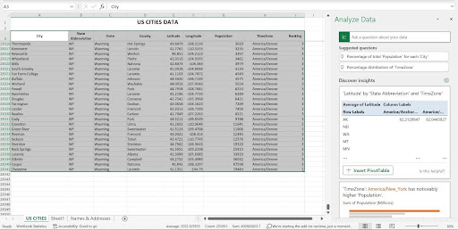
As shown here, after I activated one cell within the data and then clicked the Analyze Data button, Excel has selected every cell that it deems to be part of the data, and it has done so correctly. It assumes the top row is my column headings, or field names. Each row below that is a record, and the selection ends with the last column on the right and the last row containing data. Note that in the captured view, the last row of data is in row 28,341 – I have the column headings row (row 3) frozen, so I can scroll through the records and the headings remain onscreen.
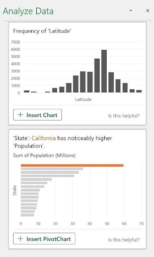
Once Excel determines the scope of my data, it does some quick analysis, including the highest values in important fields and averages across all of the data. You can scroll up and down in the Analyze Data panel to see all of the available analysis. If you’re trying this with your database as you read along here, don’t worry if you see different types of analysis appearing – the analysis Excel offers is entirely dependent on the data at hand.
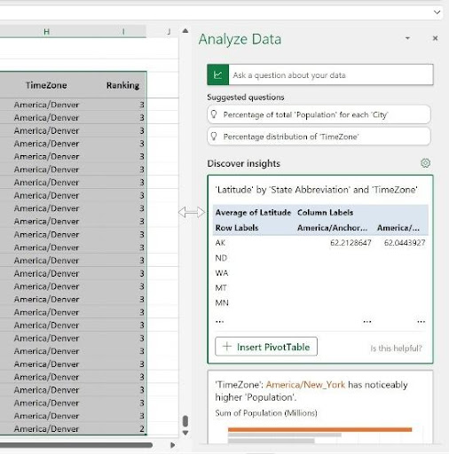
Now, the phrase “in important fields” may have made you wonder how Excel can know which fields are important – and that’s a reasonable question. It’s done through built-in algorithms, based on common types of data, common field names, and the presence of words in field names that also appear in the file name and in the worksheet title. In my database, the Population data is quite straightforward, in terms of formatting, and Population would be a common field name in a variety of databases. It has no decimal places and no negative values, so the analysis is simple to perform. The adjacent column, TimeZone, is paired with the Population field, and the zone with the highest population (America, New York) is highlighted in the Analyze Data panel as the first analysis Excel thinks will be useful for me.

The panel also offers a box with the instruction, “Ask a question about your data” – which allows you to do just that. This triggers Excel’s data filtering tools, so you can look for a particular piece of data or ask Excel to SUM or AVERAGE a given field’s values. We’ll discuss the parameters for successful questioning later in this article, but the Suggested Questions listed below that box give you an idea of the kind of questions you can easily ask – specific to your data.
Customizing Your Analysis
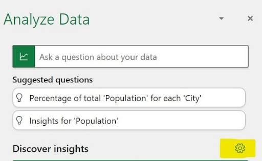
One more aspect of the interface you need to make note of is the little cog (highlighted in the image here) above the first Discover Insights box. This cog, when clicked, displays a two-column list of your database fields and the nature of their content, entitled “Which fields interest you the most?” The left-hand list, Include Fields, gives you the chance to check and uncheck the fields, indicating which ones are of primary interest. It defaults to them all being checked, based on the assumption that if you’re storing the information, it’s important to you.
TIP! What might be anunimportant field? If I had a field called Websites, listing a link for each city in my database, that would be a field that would have no quantitative or qualitative value, so I could uncheck it, thus freeing the Analyze Data tool from trying to use that data in any answers to questions. Any field that can’t be used in a calculation or that doesn’t identify or categorize the other data in your database has limited analytical value, even if it’s important to the database overall. Note that unchecking a field in this feature does not impact its functionality in the database itself, so don’t worry about designating something as unimportant for the purposes of the Analyze Data tool.
The right-hand column, Summarize Value By, is your chance to correct any misperceptions Excel has in place as to the quantitative or qualitative value of a given field. In my list, shown here, Excel is correct that the City, State Abbreviation, State, and County fields are Not a Value fields, meaning they have no numeric value and cannot therefore be used in calculations.
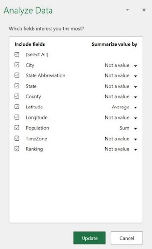
Excel got it wrong about my Longitude field; however, seeing that as Not a Value, when in fact, like Latitude, it is a value. I can click the drop arrow, and reset this to Sum or Average (shown here).
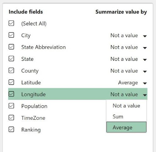
TIP! I see another change I need to make. Excel wants to SUM the Ranking field, but that’s not really useful. I’ll change that toAverage , which for data of that type, is much more valuable. Always be on the lookout for similar errors in your analysis.
Once you’ve made your selections and corrections, if any, click the Update button to put them into effect. If you don’t need to make any changes, click Cancel to return to the default Analyze Data panel view.
Asking a Question
So that “Ask a question about your data” box – how does that work? Well, it’s pretty intuitive, much the same way Google’s search bar knows what you mean when you type “how old is Julia Roberts?” It knows “how old” means you want to know her age, and it knows you’re referring to the actress by that name, not some random person named Julia Roberts.
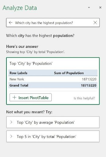
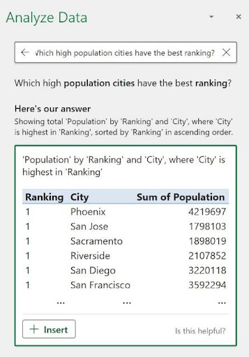
Asking, therefore, “Which high population cities have the best ranking?” will work, because Excel knows you want cities with a high ranking (and it assumes 1, in this case, is the highest rank), and from those, only the cities with the biggest populations make the cut. The result of my asking that question appears here.
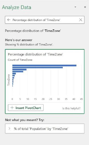
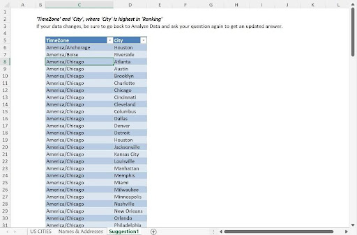
When the results appear, you also have the opportunity to review how Excel came up with the answer it did. As shown, the question “Which time zone has the highest ranked cities?” shows us a series of TimeZone values and the cities in them that are highly-ranked. The description appears above that, under “Here’s our answer” – and the logic behind the answer is explained as “Showing TimeZone and City where the City is highest in Ranking.”
![[Insert screenshot, “Excel Explains Its Answers.jpg” here.]](https://www.nobledesktop.com/rails/active_storage/blobs/redirect/eyJfcmFpbHMiOnsibWVzc2FnZSI6IkJBaHBBcDFLIiwiZXhwIjpudWxsLCJwdXIiOiJibG9iX2lkIn19--ee064a30383694df37c69db1860ac6d0533ff0e8/answers.jpg)
Note the Insert button that accompanied the results. This button, if clicked, adds a new worksheet, called Suggestion 1 (the number is “1” because it’s the first time I’ve clicked Insert in this Analyze Data session), and a Table is built from the answer to my question. We see a list of all the TimeZones and City data for records with a 1 for the Ranking field – though the Ranking field is not included in the resulting table.
Displaying the answer as a new table does two things. It allows you to see all of the data that’s part of the answer to the question posed, and it gives you a clean, simplified place to see just the data you asked about.
TIP! Note the “Is this helpful? ” question in the lower right corner of the answer to your question. Click that question and chooseYes orNo from the resulting pop-up to help hone Excel’s skills in analyzing this particular database and the effectiveness of the Analyze Data tool in general.
Now, this level of intuition on Excel’s part doesn’t mean you can ask anything and expect an accurate answer. Asking something like “Which is the best city to live in?” will not give you a single city as the answer, because Excel can’t isolate one city as the best, given that many cities are ranked with the highest possible value (1), and “best” is a relative term. In fact, if I ask that exact question, I get the same answer I did when I asked, “Which high population cities have the best ranking?” – because Excel can’t pick just one with the available information. I might as well have asked “Which city has the most restaurants?” As there is no “Total Restaurants” field, such a question would not elicit a useful answer.
So, it’s important that you pose your questions based on what Excel can “know” from the available data. Thinking of a different collection of data such as an auto parts database, asking “Which muffler costs the least but has the best consumer rating?” will work if the data includes a Price and a Consumer Rating field for each product in the list. “Which muffler will last the longest?” probably won’t work unless there’s also a field for “Average Product Lifespan” for each item in the database. Now, Excel might assume that Consumer Rating reflects product longevity, but that would be an unreliable conclusion.
Overall, the more fields your database includes, and the more unique the values are, the more pointed questions you can ask, and the more useful the results will be. Keep this in mind as you design future databases, as that approach will serve your analysis needs well, with or without the Analyze Data tool.
Suggested Questions
Excel also offers suggestions for questions it believes might be useful to ask. You can click any one of them under the heading Suggested Questions, and you’ll find that the suggestions vary depending on the question you’ve just asked. They may also vary based on whether or not the Analyze Data panel was just opened and Excel is taking a fresh look at your data, as previous questions can impact the next batch Excel offers up.
![[Insert screenshot, “Ask a Suggested Question.jpg” here.]](https://www.nobledesktop.com/rails/active_storage/blobs/redirect/eyJfcmFpbHMiOnsibWVzc2FnZSI6IkJBaHBBcDlLIiwiZXhwIjpudWxsLCJwdXIiOiJibG9iX2lkIn19--7cc4f3625ab8f7b1c15967355a6adb0d7ccbf574/suggested.jpg)
TIP! If you find you’ve gone down a data-analysis “rabbit hole” with your questions and what’s appearing in the blocks is no longer useful, just close the panel and then click in any cell within your data. Re-click the Analyze Data button, and Excel takes the aforementioned fresh look at your data, all over again.
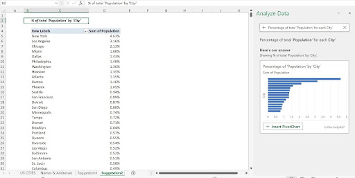
When I clicked the suggested question, “Percentage of Total Population for each City, ” a PivotChart is displayed, with an InsertPivotChart button, allowing me to instantly create that PivotChart. Only if I click that button is the PivotChart created, but Excel has told me that’s how it wants to answer my question. If I like what I see in the Analyze Data box for that question, the complete answer is just a click away.
Inserting PivotTables, PivotCharts, and Standard Charts
Speaking of PivotCharts, when Excel sees the potential to further analyze your data in a separate Pivot Table or PivotChart, or to better show the values in your data with a standard chart, the option Excel deems most appropriate appears at the bottom of the related analysis box. PivotTables and PivotCharts, if you choose to add them, appear on a new, automatically-added worksheet. Standard charts appear on top of the data itself, so cutting and pasting them to a different sheet is advisable.

So, upon clicking the displayed Insert button at the bottom of the box, Excel responds by building the suggested object automatically. The resulting Pivot Table or PivotChart appears on a new worksheet, as I said, and it’s set up the way Excel thinks is best for the data in question. The new worksheet’s default name, which you can also edit later, is “Suggestion” and a number, indicating the order of the addition.
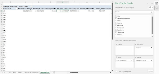
This no-questions-asked approach might sound rash – you’re most likely thinking you’d want to make some choices, as you would when building a Pivot Table, PivotChart, or standard chart from scratch. But fear not, once made, you have the same customization tools you’d have for an object you built yourself. Shown here, a Pivot Table appears on a new sheet, and I can either delete the entire worksheet if I feel the Pivot Table isn’t useful, or I can customize the Pivot Table by clicking within it and then using the Pivot Table Fields panel, which temporarily replaces the Analyze Data panel.
TIP!Want to refresh your Pivot Table customization skills? Check out these videos:
- Editing a Pivot Table—https://www.youtube.com/watch?v=OPsX5wFhdkk&list=PL_eVGUXO7Anha4lv9dp_Nk96KP1WuBpKi&index=20
- Formatting a Pivot Table—https://www.youtube.com/watch?v=MPtCmE8uL-I&list=PL_eVGUXO7Anha4lv9dp_Nk96KP1WuBpKi&index=19
When it comes to charting the data, you’ll find that you may not need to do much customization for standard (non-Pivot) charts, other than perhaps editing the colors in the resulting chart, or the addition of axis titles or changing the chart title. Excel’s charting tools are fantastic, and its ability to intuit which chart type shows a particular selection of data most effectively is very reliable.
The chart Excel proposes appears in a thumbnail within the Analyze Data block, so you can see right away how Excel intends to show the information graphically. Excel knows when a comparison makes more sense (a pie chart or column chart) or when a frequency chart or a line chart, representing data over time, is best. It all depends on the data.
Setting – and Then Un-Setting – the Table
And speaking of the data, Excel’s documentation of the Analyze Data tool will tell you that the tool works best when your data is in a Table, not just a range, or list of columns and rows. My personal preference is not to use Excel’s Table feature, because I find it makes it harder to edit data, especially if I want to add a column within the series of existing columns or paste rows of data coming from another source. Further, the Analyze Data tool will work just fine on a range, provided that you don’t have any blank rows or columns within the data – the good structure I referred to earlier in this article.
Don’t let my bias affect you, though. If you want to try the Analyze Data tool after having converted your columns and rows to a Table, just press CTRL + T while any cell in the data is selected, and voila! You’ve got a table. You can also use the Table button on the Insert tab to convert your range to a table.

If you want to return your data to just that – data, in what Excel considers a range – and remove the table effect after you’ve tried it, click anywhere in the data and go to the Table Design tab. There, you’ll find the Convert to Range button, and a quick click restores your table to a range of columns and rows.

