In this article, we're going to look at how to build complex and thorough reports in Microsoft Excel
Designing Impressive Reports with Excel
Ah, the tidy, simple grid of an Excel worksheet. You can’t beat it for organizing your information, whether it’s information about a new product, complex marketing statistics, or detailed scientific data. Whatever text and numbers you need to store and correlate, Excel’s your vessel.
Of course, when you’re expected to share that information – to report on it – for others to use or evaluate the data, the simple, tidy grid may not be “impressive” enough. If you’re building a report for distribution to shareholders, clients, or for use as a sales tool, you’ll want a more polished, professional look, and you may not want to see the grid at all. You’ll also want to include charts and diagrams, if necessary, to drive home the major takeaways from your data, and you’ll want to position them alongside the data they pertain to. You might even want to include graphics – logos and photos – the create a truly professional-looking, compelling report.
The good news? It’s easy to achieve a polished, impressive appearance for your Excel worksheet. All of the tools you need to do so are right there within Excel. And it’s just as easy to save and share your report in a format that makes the report’s origins in Excel invisible to the viewer.
What Does “Impressive” Mean, Anyway?
First, let’s define the goal. What would make an Excel worksheet-based report look “impressive”? Here’s a list of common features one would expect in a report:

- No visible grid, unless it’s helpful for reading across several columns of data
- Colored backgrounds, including white, to hide the grid and delineate areas of the data
- Charts and diagrams appearing next to related data
- Clear, legible titles that make sections of the data stand out from each other
- Appropriate number formatting for accounting, currency, and statistical data
- Subtle use of shapes and lines to define areas, highlight information, or explain/instruct the viewer
- Photos, logos, and other graphics to associate brand elements and other images with the data
Combined, these attributes will enable you to export your worksheet – or an established print area within it – as a PDF for sharing with anyone who needs to see, understand, and be persuaded by your data.
First Things First
Of course, you don’t want to do any of this formatting – other than, possibly, the number formatting – before you’re finished building the worksheet itself. I know I like to have my columns of currency values formatted as such before I even start entering numbers into the cells in question, so number formatting is likely to be in place in my worksheets, long before I start any formatting for a report. But with or without that sort of formatting in place from the start, you’ll want to apply the “impressive” report formatting in this order, starting with the completed worksheet, i.e., all of your data, in place:
- Titles created – including merging and centering major titles
- Formatting titles and section names
- Sizing and formatting text within your data
- Applying number formatting
- Applying alignment – both vertical and horizontal – within your columns and rows
- Wrapping long titles and cell values where necessary
- Background colors, applied to ranges
- Borders applied to cells within colored backgrounds, if needed, for to help viewers read across rows of numbers when data spans across more than, say, five columns, or when you want viewers to see the numbers behind a sum, average, or other calculated result
But That’s Not All
Once the formatting is in place, it’s time to start adding the elements that help people understand the data, that draw people’s eyes to key points within the report, and that instruct people in the use of the information included in the report. With your text and numbers in place (the worksheet built) and all of the aforementioned formatting done, now it’s time to:
- Create, size, and position your charts and diagrams
- Insert shapes – with and without text in them – and draw lines and arrows
- Define the print area, so that nothing beyond the data you wish to include in the report turns up in the exported PDF
- Preview the “printed” report
- Make modifications to content, formatting, and placement of floating charts, diagrams, and graphics, as needed
- Export as a PDF
Formatting Titles and Section Headings
For your own sake, it’s a good idea to start with your titles and section headings in terms of formatting. Why? Because that way you can begin to envision the report’s sections for yourself, and that makes all the subsequent formatting easier to map out and apply. For example, if you plan to make all the cells under a given section heading a different color than the cells in an adjacent section, that section heading (and that of its neighboring section) will help you define the range of cells to fill with a different background color.
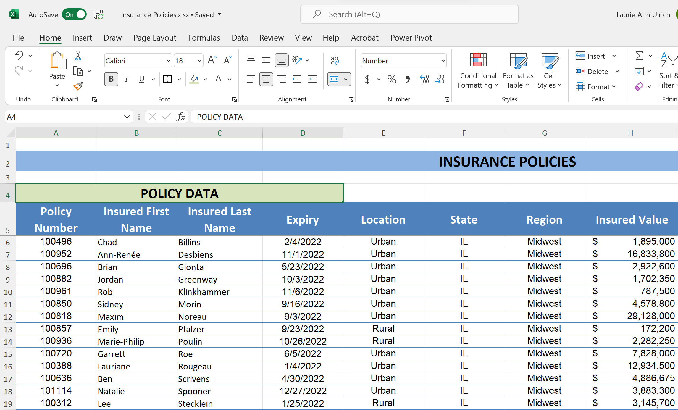
I like to merge my titles – the main title across the top of the report and the titles above various sections – so that they’re living in a single cell that spans the width of the report and/or section. As shown in this image, a section that spans four columns is headed by a title that’s in a cell merged from four cells across that span.
The process of applying merge and center – and formatting titles – is simple, and you can learn more about it in this video.
Https://www.youtube.com/watch?v=Zg0w_fy76uA&list=PL_eVGUXO7Anha4lv9dp_Nk96KP1WuBpKi&index=53
Formatting Text and Numeric Data
The formatting you apply to your text and numbers in the report is dependent upon the nature of that content. Applying bold and italic formatting is simple enough, using the Bold and Italic buttons in the Font group on the Home tab in your worksheet – but specialized formatting, which includes changing the size, font, and color is covered in this video, at the following link:
Https://www.youtube.com/watch?v=tWBjWamK9OE&list=PL_eVGUXO7Anha4lv9dp_Nk96KP1WuBpKi&index=56
Formatting your numbers – as currency, accounting values, percentages, etc.… is also easy, via the Number group of tools on the Home tab, and you can also learn more in this video.
Https://www.youtube.com/watch?v=XnOc07hag2Y&list=PL_eVGUXO7Anha4lv9dp_Nk96KP1WuBpKi&index=55
You may also be referring to various dates and times in your report, and there are simple formats to choose from in the Number drop list on the Home tab (also in the Number group of tools), but there are many options you may need that go beyond those basic formats. You can learn more about how to apply Date and Time formatting from this video.
Https://www.youtube.com/watch?v=MeIaZui-5nc&list=PL_eVGUXO7Anha4lv9dp_Nk96KP1WuBpKi&index=52
Setting Alignments
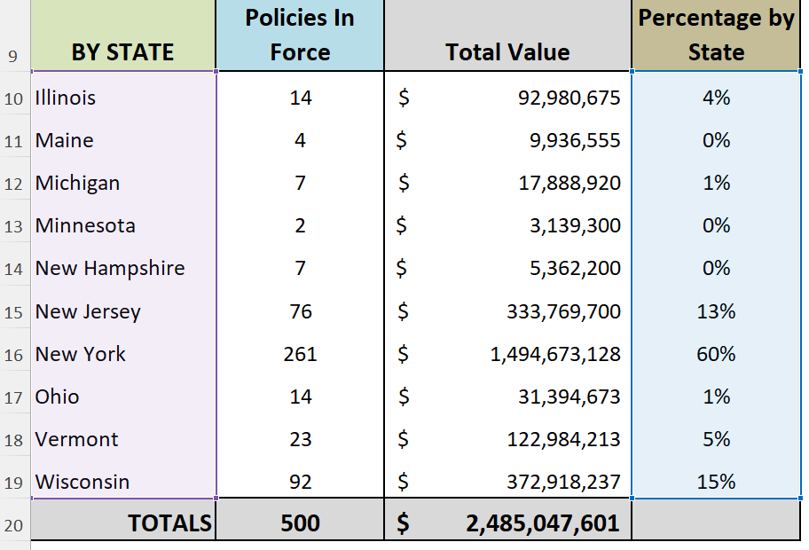
Where your content appears within cells in the worksheet can significantly impact how well that content translates to a professional-looking report. As shown in the images here, see how much better a series of titles, especially those wrapped within the cell, look when vertically centered.
To control both vertical and horizontal alignment – and to indent content within cells – you can use the tools on the Home tab, in the Alignment group. Or, check out this video for all the help you’ll need.
Https://www.youtube.com/watch?v=sugRLJZbkyQ&list=PL_eVGUXO7Anha4lv9dp_Nk96KP1WuBpKi&index=50
Applying Colored Fills to Ranges
Putting a solid color behind your ranges of related content is an effective way to create sections in your report – both visually and conceptually – for the audience. And it’s unbelievably easy to do.
To begin, select the range by dragging through the cells that should have the same background color. If it’s a long or wide range (or both!), you can click in the first cell in the upper left of the desired range, and then scroll until you can see the last cell you want to fill with color. Press and hold the Shift key, and then click in that last cell in the desired range, and voila, the entire range is selected.
Next, with your selection made, go to the Home tab’s Font group – oddly enough – and click the Fill Color drop list, as shown in the image here.
.png)
From the resulting menu, you can choose from Theme, Standard, and/or Recent Colors, or click More Colors for a dialog box (shown here) that gives you two different ways to choose a color by clicking the one you want with your mouse, or you can enter a hexadecimal color if you prefer.
Whichever color you choose, however you choose it, that’s now the colored fill within the cells in your selected range. Bear in mind this covers up the gridlines – so if this particular range is one that really would benefit from seeing the lines that help a person read from left to right in a row or from top to bottom in a longer color, you can restore them by using the Borders button, and choosing All Borders. Be sure the selection is in place before making this choice.
.png)
Using Borders for Legibility and Delineation
Speaking of borders, you’ll also find them helpful in underlining column headings, boxing key cells or ranges, and as stated previously, to restore the visible table grid when you’ve applied a colored fill.
My favorites are the thick borders – Thick Outside Border and Thick Bottom Border, because they really stand out. To apply them, just select a range and then click the Borders button on the Home tab and make your choice.
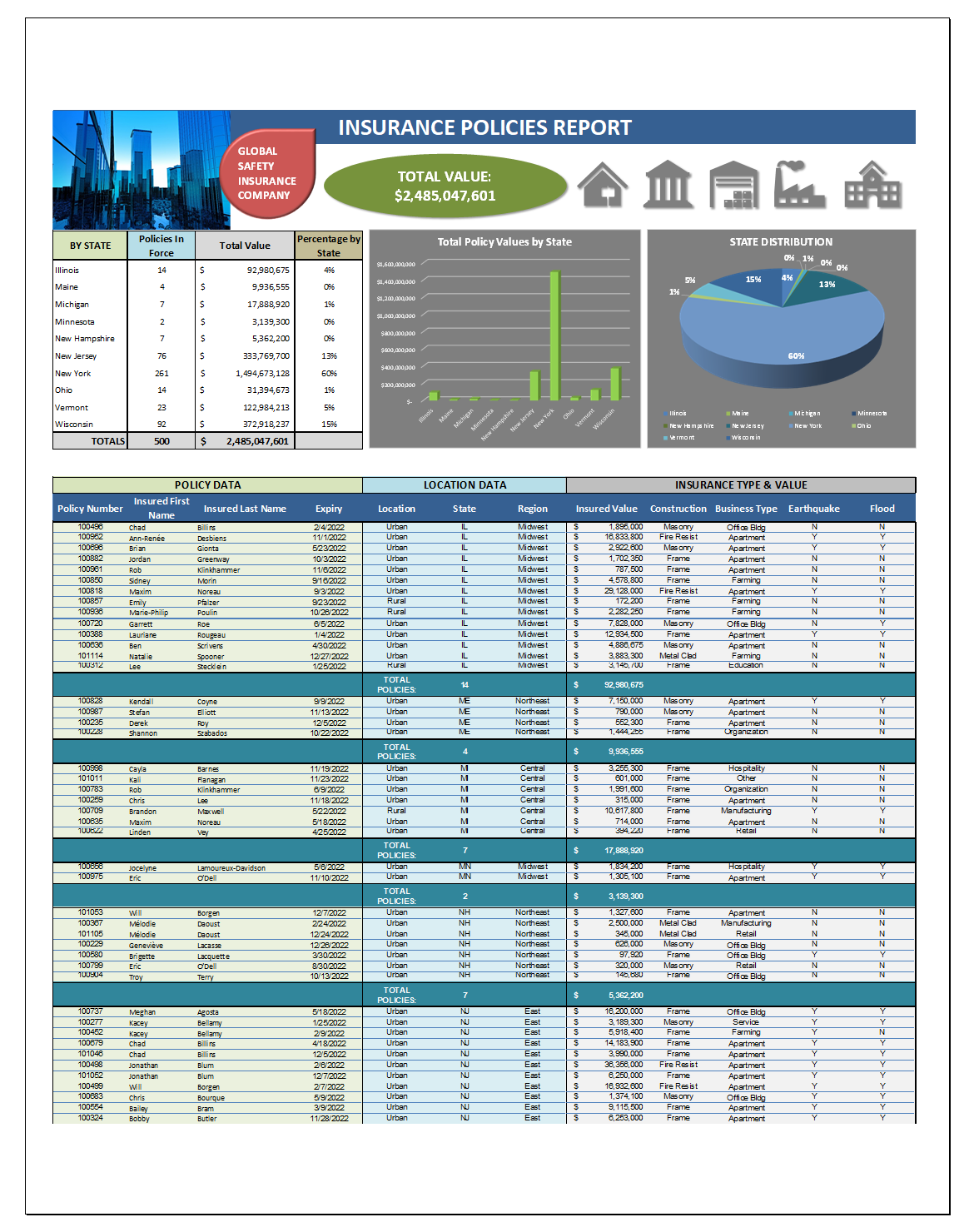
Telling Your Story with Charts & Diagrams
Complex data is always easier to absorb and understand if it’s shared in a way that makes it easy to get the major takeaways “at a glance” – and nothing achieves that more efficiently than a chart or diagram.
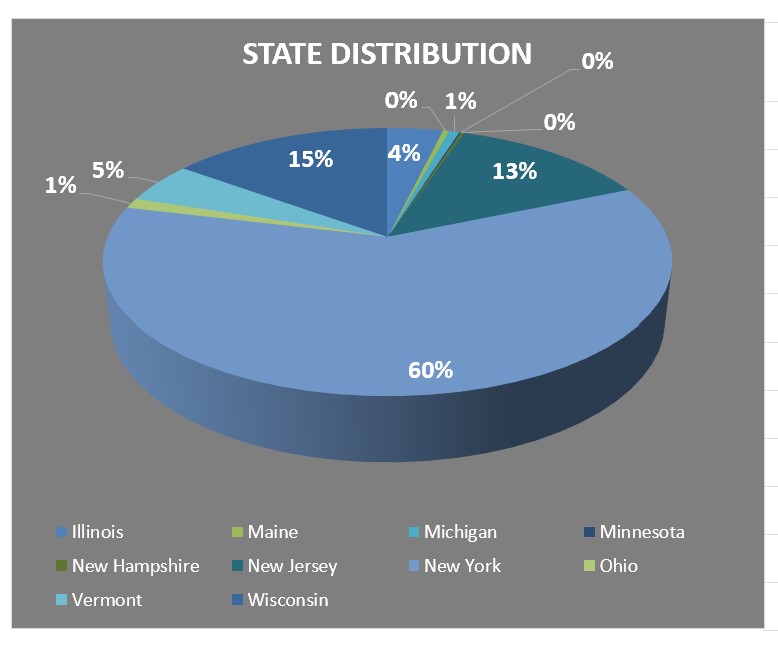
Charts shouldn’t be overly-complex – it’s better to have several separate charts that each visually explain or reveal a single set of related statistics than to have one or two inscrutable charts with lines, columns, bars, etc.… in a misguided attempt to consolidate the message. And charts should also have clear main titles and axis titles, so it’s obvious, right off the bat, what’s being shown.
To learn more about creating any kind of chart from your data, check out this video:
Https://www.youtube.com/watch?v=NFAa8lPY50c&list=PL_eVGUXO7Anha4lv9dp_Nk96KP1WuBpKi&index=8
And to make sure your chart is an attractive, cohesive part of your report – in terms of colors used, fonts, and so forth, you’ll want to watch this video on good editing and formatting techniques:
Https://www.youtube.com/watch?v=xx4QtLnUW4U&list=PL_eVGUXO7Anha4lv9dp_Nk96KP1WuBpKi&index=6
Now, if your report also requires explaining relationships between people, departments, products, or any other concept that would benefit from a picture rather than an assumed understanding, diagrams help, too. Here’s a video on using Excel’s SmartArt to show processes, connections, hierarchies, and other concepts, through illuminating, colorful, and eye-catching diagrams:

Https://www.youtube.com/watch?v=NqpvF6dPaNE&list=PL_eVGUXO7Anha4lv9dp_Nk96KP1WuBpKi&index=7
Using Shapes, Lines, and Arrows to Control Viewer Focus
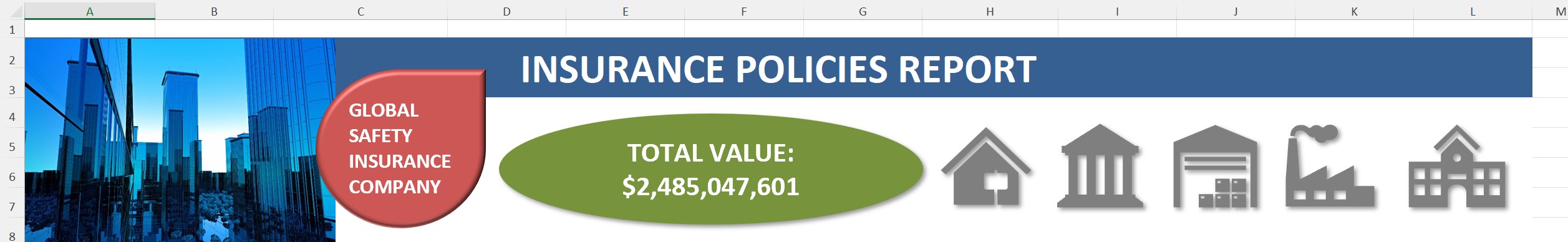
While most worksheets that are set up to serve as reports are already laid out so that people can easily spot key information, the addition of shapes, lines, and arrows (which are just another kind of shape) are helpful additions. In the image shown here, an oval is used as a text box, with a key total showing inside it, and icons have been added, too – showing a series of building types that the insurance company in question covers.
Adding shapes – be they polygons, lines, or arrows – is easy, utilizing the Illustrations button on the Insert tab. From there, choose Shapes and then choose the one you want to draw from the drop list as shown here. Learn the full process of inserting, resizing, and formatting your shapes – including adding text to them, so they serve as a way to highlight important data, give instructions, or background info to the viewer – with these videos:
Https://www.youtube.com/watch?v=72XhCmKqZ_4&list=PL_eVGUXO7Anha4lv9dp_Nk96KP1WuBpKi&index=5
With these added features in place, your report takes another major step away from simplistic grid packed with text and numbers toward professional-looking report!
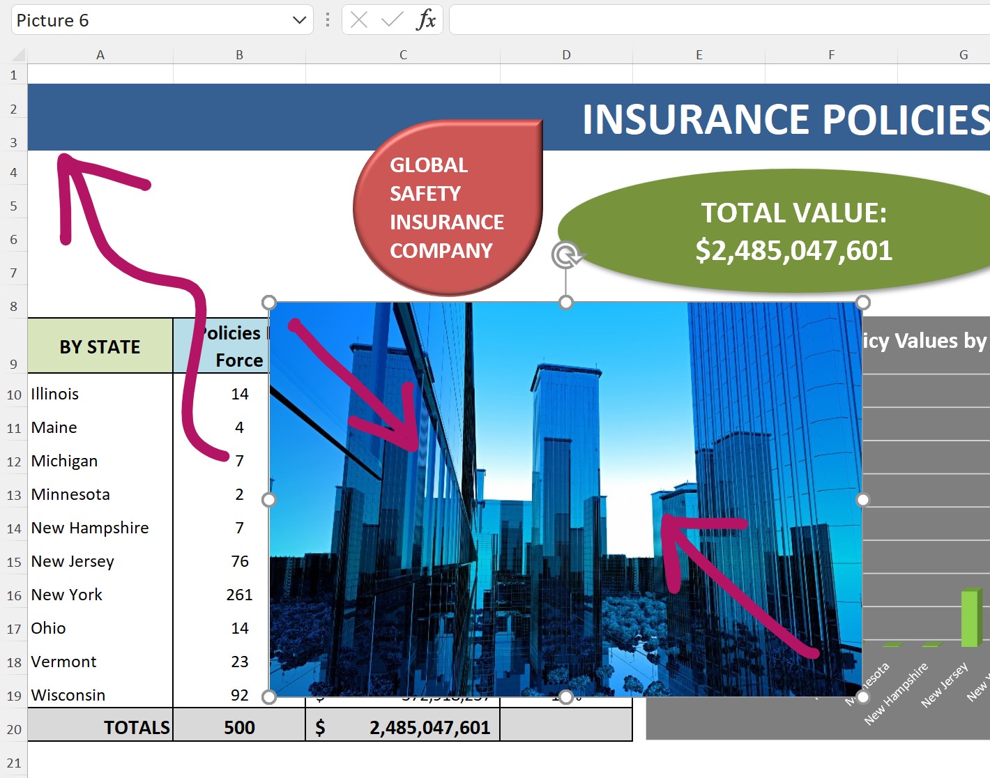
A Picture’s Worth…a Lot
Photos aren’t used quite as often as charts, diagrams, and shapes in a worksheet, but for reports, they can play a useful role. Maybe your report, on the status of new product that’s going into production, would benefit from a photo of the product, or an aspect of its assembly. Maybe a photo of a building’s blueprint, the team responsible for a major accomplishment, or from an event, the registration data you’re reporting on, would help the report seem more “real” to its viewers.
To add a photo or other image to your report:
- Click the Illustrations button again on the Insert tab.
- Choose Pictures, and then select where those pictures are – on your device or online. If you have an account with a stock images service (Shutterstock, for example), you can choose that, instead.
- Note that the This Device will include any network or cloud-based drives to which you have access, not just your hard drive.
- Select the image you want – the exact process will vary depending on where your image is – and it appears in the worksheet, at which point you can reposition and resize it as desired.
.jpg)
Sharing Your Masterpiece
There’s no point in creating a report and going to all the trouble of making it pretty if you’re not going to share it, right?
Print This
Sharing all starts with the File tab, where you can choose the form in which you’ll disseminate your report. You can, if you’re going to go “old school, ” opt to print the report to paper. The process is pretty simple, but there are many options – so you’ll want to watch this video that explains everything you can control about what’s included in your printout, how many pages it prints out on, and more:
Https://www.youtube.com/watch?v=BU05l2YMhek&list=PL_eVGUXO7Anha4lv9dp_Nk96KP1WuBpKi&index=70
Saving or Exporting As a PDF
If you want to send your report as a PDF – your best bet, as everyone has the ability to view PDF files, even if they don’t have a copy of Adobe Acrobat – just choose Export from the File tab, and then click the Create PDF/XPS document button.
If you have Adobe Acrobat, you’ll also see the option to Create Adobe PDF.
After making the choice that’s right for you, you’ll be able to name and choose a location to save your PDF, as you would any other file in any Save operation.
Attach it to an email or share it via a link to its location via Teams – it’s up to you!
.jpg)
