Dive into this detailed web development tutorial that guides you through understanding Flex-Wrap, Sizing Flex Items (Flex-Grow & Flex-Basis), and how to implement them into your code effectively.
This exercise is excerpted from Noble Desktop’s HTML & CSS training materials and is compatible with Flexbox, Grid, and Bootstrap updates through 2023. To learn current skills in HTML & CSS with hands-on training, check out our Front-End Web Development Certificate, Full-Stack Web Development Certificate, and coding classes in-person and live online.
Topics Covered in This Web Development Tutorial:
Flex-Wrap, Sizing Flex Items (Flex-Grow & Flex-Basis)
Exercise Preview

Exercise Overview
In this exercise you’ll learn how to make flex items can wrap onto multiple lines.

Getting Started
- In your code editor, close any files you may have open.
- For this exercise we’ll be working with the Flexbox Wrapping folder located in Desktop > Class Files > yourname-Flexbox Grid Class. You may want to open that folder in your code editor if it allows you to (like Visual Studio Code does).
- Open index.html from the Flexbox Wrapping folder.
-
Preview index.html in Firefox (we’ll be using its DevTools).
- This is page very similar to previous exercises, but this time we’re going to style the navigation a bit differently.
Leave index.html open in Firefox as you work, so you can reload the page to see the code changes you’ll make.
Setting Display Flex & Wrapping
- Switch back to your code editor.
- Open main.css from the css folder (in the Flexbox Wrapping folder).
-
In the .navbar rule add the following bold code:
.navbar {
   display: flex;
   border: 8px solid gray;
Code Omitted To Save Space
} -
Save the file, and reload the page in Firefox.
- Notice the items in the nav now display as a row (they were stacking).
- CTRL–click (Mac) or Right–click (Windows) anywhere on the apge and choose Inspect Element.
-
If the DevTools are not on the right side of the window, at the top right of the DevTools panel, click the
 button and choose Dock to Right.
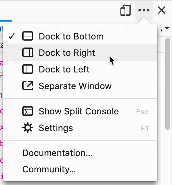
Now you’ll be able to resize the webpage area smaller than you could if the DevTools were not open.
- Resize the webpage area narrower until you can see the nav items remain on one line, even when it forces the content wider than the width of the window (which requires horizontal scrolling).
- Keep the DevTools open.
- Return to your code editor.
-
In the .navbar rule add the following bold code:
.navbar {
   display: flex;
   flex-wrap: wrap;
   border: 8px solid gray;
Code Omitted To Save Space
} -
Save the file, and reload the page in Firefox.
- Resize the webpage area and notice the items now wrap when they do not fit on a line.
Sizing the Flex Items
- Return to your code editor.
-
Above the min-width: 571px media query, add the following new media for smaller screens:
@media (max-width: 570px) {.navbar.logo { flex-basis: 100%; } } -
Save the file, and reload the page in Firefox.
- The logo should fill the width, with the other items wrapping to the line(s) below.
- Because the remaining items don’t scale up to fill the available space, there’s empty white space on the right. Let’s make them grow.
- Return to your code editor.
-
In the max-width: 570px media query, below the .navbar.logo rule, add the following new rule:
@media (max-width: 570px) {.navbar.logo { flex-basis: 100%; } .navbar li { flex-grow: 1; } } -
Save the file, and reload the page in Firefox.
- Now that the items are bigger, let’s center the text inside them.
- Return to your code editor.
-
In .navbar li rule add the following bold code:
@media (max-width: 570px) {.navbar.logo { flex-basis: 100%; }.navbar li { flex-grow: 1; text-align: center; } } -
Save the file, and reload the page in Firefox.
- That looks better with the text centered for the nav items.
- Resize the webpage area so the 4 nav “links” become a grid of 2 × 2.
- It would look nicer if they were 50% wide so the widths would match across both rows.
- Return to your code editor.
-
In the max-width: 570px media query’s .navbar li rule, add the following bold code:
.navbar li { flex-grow: 1; flex-basis: 50%; text-align: center; } -
Save the file, and reload the page in Firefox.
- That’s looking better on small screens!
- Close the DevTools.
- Make the browser window wide enough so you see the navbar on one line again.
- Notice that all the extra space is on the right of the nav. We’d like the nav links to move over to the right (while the logo remains on the left).
- Return to your code editor.
-
Before we adjust the spacing, let’s make our code more efficient by changing it to the flex shorthand.
In the max-width: 570px media query’s .navbar li rule, replace the two flex properties into one as shown below in bold:
.navbar li {
   flex: 1 0 50%;
   text-align: center;
}
NOTE: Remember that the syntax is flex: flex-grow flex-shrink flex-basis;
Adjusting the Layout on Larger Screens
-
In the min-width: 571px media query, above the footer rule add the following new rule:
.navbar.logo { margin-right: auto; } -
Save the file, and reload the page in Firefox.
- The nav should now look better on larger screens, with the logo on the left and the nav links on the right.
Optional Bonus: Refining the Layout at Another Screen Size
The 2 × 2 grid looks good on small screens, but we you get a little bigger, all 4 nav “links” could all fit on a single line below the logo. Let’s add a new media query for these size screens.
-
Above the min-width: 571px media query, add the following media and new rule:
@media (min-width: 415px) and (max-width: 570px) {.navbar li { flex-basis: 25%; } } -
Save the file, and reload the page in Firefox.
- Resize the window from narrow to wide, so you can see the nav links should be a 2 × 2 grid on small screens, then changing to a single row (below the logo), and finally changing to logo on the left with the nav links on the right.
