Discover how to accelerate your web development projects using Bootstrap. This tutorial covers everything from grid systems and components to containers, rows, and columns, equipping you with the skills you need to speed up your front-end design process.
This exercise is excerpted from Noble Desktop’s HTML & CSS training materials and is compatible with Flexbox, Grid, and Bootstrap updates through 2023. To learn current skills in HTML & CSS with hands-on training, check out our Front-End Web Development Certificate, Full-Stack Web Development Certificate, and coding classes in-person and live online.
Topics Covered in This Web Development Tutorial:
Using Bootstrap’s Grid System (Containers, Rows, & Columns), Creating Columns & Adding Content, Adjusting Column Sizes Across Screen Sizes, Using Some of Bootstrap’s Components & Pre-Made Styles
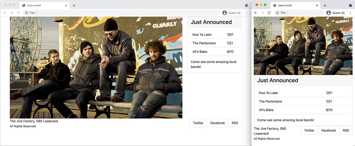
Exercise Preview
Exercise Overview
In this exercise, you’ll start learning about Bootstrap… a popular front-end component library that can make web development faster and easier. Its core features are a grid system for creating rows/columns, and components (such as navbars, buttons, carousels, and more). We’ll be using Bootstrap version 5.0.2.

Getting Started
- Switch to the Desktop (don’t be in your code editor).
-
Navigate into Class Files > yourname-Flexbox Grid Class > Bootstrap Starter.
-
We went to getbootstrap.com and downloaded the files for you. The download included css and js folders.
In those folders we deleted all but the 2 required files (1CSS and one JS file). The full download includes many files you typically don’t need. For example .map files aren’t needed unless you’re using the Sass version of Bootstrap. In the CSS and JS files we also deleted a sourceMappingURL comment on the last line. It’s not needed and can be confusing in some DevTools when you’re not using Sass.
We added a standard index.html file, img and snippets folders.
-
- For this exercise we’ll be working with this Bootstrap Starter folder. Open the Bootstrap Starter folder in your code editor if it allows you to.
- In your code editor, open index.html.
-
We need to link to Bootstrap’s CSS file, which will provide us with the grid and components. Below the title tag, add the following link:
<title></title>
<link rel="stylesheet" href="css/bootstrap.min.css">
<link rel="stylesheet" href="css/main.css">
NOTE: We link to Bootstrap’s CSS before our own, so we can override theirs as needed. We use the minified version because it’s a smaller file. If you would only be using Bootstrap’s grid (none of its components) link to bootstrap-grid.min.css (which in the full download) because it’s much smaller.
Bootstrap’s Grid: Containers, Rows, & Columns
Let’s start with Bootstrap’s grid using their pre-made classes, which are explained at getbootstrap.com/docs/5.0/layout/grid
Bootstrap’s grid requires a specific nested structure: container > row > column.
-
Let’s start by adding a .container div. Inside the body tag, add a container (as shown below in bold):
<body> <div class="container"></div> </body> -
Add a row inside the container div:
<div class="container"> <div class="row"></div> </div> -
Add 2 col divs inside the row:
<div class="container"> <div class="row"> <div class="col"></div> <div class="col"></div> </div> </div> -
So that we can see our 2-column layout, add the same image into both columns:
<div class="container"> <div class="row"> <div class="col"> <img src="img/large-low-lustre.jpg"> </div> <div class="col"> <img src="img/large-low-lustre.jpg"> </div> </div> </div> -
Save the file and preview the page in your browser.
- Whoa, the images are huge because it’s a HiDPI image that has not been scaled down to fit the container. Let’s fix that.
- Switch back to your code editor.
- Open main.css from the css folder (inside the Bootstrap Starter folder).
-
At the top of the file, add the following rule:
img { max-width: 100%; } -
Save the file and reload the page in your browser.
- You should now see the 2 images next to each other, each filling out the size of their column (which are equally sized).
- Resize the window and notice that as the columns get bigger or smaller, the images adjust to fill their column.
- The container is a fixed-width, where the max-width changes at each breakpoint (screen size). There’s also a fluid container, so let’s see how that works next.
NOTE: Bootstrap has an img-fluid class which makes an image responsive. Adding that class to all images is a lot more work compared to adding this 1CSS rule.
-
Switch back to index.html in your code editor and add -fluid to the container:
<body> <div class="container-fluid"> -
Save the file and reload the page in your browser.
- Resize the window to see the container fills 100% the screen, although the content has some space on the left and right sides because of column gutters. We’ll look at spacing in a later exercise.
- Switch back to your code editor.
-
We don’t want the fluid container, so remove -fluid as shown below:
<body>
   <div class="container">
Adjusting Column Widths
Bootstrap’s grid uses flexbox. Each row is a flex container. Each col is a flex item with flex-grow: 1; which means the columns are automatically sized to fill the space (as we saw when learning flexbox). Bootstrap has a 12-column grid that we can optionally use, so let’s see how that works.
-
Let’s make the left column take up 8 columns and the right column take up 4 columns (8+4=12). Add a -8 to the col class for the first column:
<div class="container"> <div class="row"> <div class="col-8"> <img src="img/large-low-lustre.jpg"> -
Save the file and reload the page in your browser.
- Notice the left column is now larger than the right. 12 columns, minus the 8 we just set equals 4 left over columns. The right column will automatically become 4 columns without us having to set it. If however the content did not fit naturally, flex wrapping would cause it to move down to the next line. In that case setting col-4 on the right column would ensure it fits.
-
Resize the window to see the layout always has columns, even on small screens. We’d prefer the images stack on smaller screens.
Bootstrap uses a mobile first approach. To stack things on small screens, and get columns on larger screens, we specify the smallest screen size that should have columns. We get columns at that screen size and larger. Here are Bootstrap’s sizes.
Code Size Breakpoint xs Extra Small Devices Smaller than 576 px sm Small Devices 576 px & Larger md Medium Devices 768 px & Larger lg Large Devices 992 px & Larger xl Extra Large Devices 1200 px & Larger xxl Extra Large Devices 1400 px & Larger -
Switch back to your code editor and add a -md to the col class:
<div class="container"> <div class="row"> <div class="col-md-8"> <img src="img/large-low-lustre.jpg"> -
Save the file and reload the page in your browser.
- Resize the window from narrow to wide. When the window is less than 768px wide, the images will stack vertically. At 768px or wider the columns appear.
- We can change the size of columns for any screen size we want. Let’s see how.
- Switch back to your code editor.
-
Let’s make the left column even bigger, but only on the largest (xl) screen size. Add a col-xl-10 class to make it 10 columns wide on extra large screens:
<div class="container"> <div class="row"> <div class="col-md-8 col-xl-10"> <img src="img/large-low-lustre.jpg"> -
Save the file and reload the page in your browser. Resize the window from small to large and notice:
- When the window is less than 768px wide, the images will stack vertically.
- At 768px or wider the columns appear as 8 and 4 columns wide.
- At 1200px or wider the columns appear as 10 and 2 columns wide.
- Switch back to your code editor.
-
Change the sizes to the following, which will look good with the content we’ll be adding next:
<div class="container">
   <div class="row">
      <div class="col-lg-8 col-xl-9">
         <img src="img/large-low-lustre.jpg">
Using the Bootstrap “Card” Component
Bootstrap has many components (navbars, buttons, etc.) which you can learn about at getbootstrap.com/docs/5.0/components In our right column we want to replace the image with text. Let’s see how the card component will give us a bordered section with a title. Normally you’d copy some sample code from the Bootstrap website and edit it to your liking. Just in case the website changes, we copied the sample code from the Bootstrap website and pasted it into a file for you to use.
- Open card.html from the snippets folder (inside the Bootstrap Starter folder).
- Select and copy all the code.
- Close the file.
-
In the second column, replace the image with the card code as shown below in bold:
<div class="row">
   <div class="col-lg-8 col-xl-9">
      <img src="img/large-low-lustre.jpg">
   </div>
   <div class="col">
      <div class="card">
         <div class="card-header">
            Featured
         </div>
         <div class="card-body">
Code Omitted To Save Space
</div> </div> </div> </div> -
Save the file and reload the page in your browser.
The classes on the various parts of the sample code (from the Bootstrap website) link up with Bootstrap’s CSS to give us a nicely styled section adding a light gray background, a border, etc. Let’s change the content to be appropriate for our page.
- Switch back to your code editor.
-
Change the card-header div to an h2 as shown below in bold:
<div class="col">
   <div class="card">
      <h2 class="card-header">
         Featured
      </h2>
      <div class="card-body">
NOTE: We’ll add an h1 somewhere else (later), so we’re using an h2 here.
-
Change the text inside the card-header as shown below in bold:
<h2 class="card-header"> Just Announced </h2> - To save you some time we’ve already written the HTML code for the main content of this section. Open table.html from the snippets folder (inside the Bootstrap Starter folder).
- Select and copy all the code.
- Close the file.
-
You should be back in index.html. Delete the content inside card-body (the h5, p, and a) and paste in the new content as shown below:
<div class="card">
   <h2 class="card-header">
      Just Announced
   </h2>
   <div class="card-body">
      <table class="table">
Code Omitted To Save Space
</table> Come see some amazing local bands! </div> </div> - In the content you just pasted, notice that we’ve already added Bootstrap’s table class to the table tag. This applies some nice formatting to the table.
-
Save the file and reload the page in your browser.
- Now we have content appropriate for our page.
- The lines between the rows of the table are from Bootstrap’s CSS.
- The heading is a bit too big, so let’s make it smaller.
- Switch back to your code editor.
- Open main.css from the css folder (inside the Bootstrap Starter folder).
-
Below the img rule, add the following rule:
h2 { font-size: 1.7rem; } -
Save the file and reload the page in your browser.
- The smaller heading fits better.
- Resize the window to see how the “card” is below the photo on small screens, and in the right column on larger screens.
Adding a Footer
- Switch back to index.html in your code editor.
-
Let’s add second row for some footer content that will include the copyright and social links. A row class can be used on any tag, so in this case we’ll use a footer tag. Near the bottom of the page, below the row, add the following bold code:
</div>
      <footer class="row">

      </footer>
   </div>
</body>
NOTE: If you have a hard time keeping track of what each closing div tag refers to (a row, col, etc.), try installing the Visual Studio Code extension called HTML End Tag Labels which adds a comment after each closing tag telling you what it’s closing.
-
Add 2 columns inside the footer:
<footer class="row"> <div class="col"></div> <div class="col"></div> </footer> -
Add the following text inside the first column in the footer:
<footer class="row"> <div class="col"> <p> The Jive Factory, 580 Lispenard<br> <small>All Rights Reserved</small> </p> </div> <div class="col"></div> </footer> - For the second column we’ll use Bootstrap’s list group. We copied Bootstrap’s sample code from their website into a file for you (normally you’d get it straight from their website). In your code editor, open list-group.html from the snippets folder.
- Select and copy all the code.
- Close the file.
-
You should be back in index.html. In the footer’s second column, paste the code as shown below.
<footer class="row">
   <div class="col">
      <p>
         The Jive Factory, 580 Lispenard<br>
         <small>All Rights Reserved</small>
      </p>
   </div>
   <div class="col">
      <div class="list-group">
         <a href="#" class="list-group-item-action active" aria-current="true">
            The current link item
         </a>
Code Omitted To Save Space
<a href="#" class="list-group-item-action disabled" tabindex="-1" aria-disabled="true">A disabled link item</a> </div> </div> </footer> -
Inside the list-group we only want to keep the second list-group-item, so delete the others. You should end up with the following:
<div class="list-group"> <a href="#" class="list-group-item-action">A second link item</a> </div> -
Replace the sample text with X (formerly known as Twitter):
<a href="#" class="list-group-item-action">X</a> -
Make 2 more links by copying/pasting the line so you get the following:
<a href="#" class="list-group-item-action">X</a> <a href="#" class="list-group-item-action">X</a> <a href="#" class="list-group-item-action">X</a> -
Edit the content as shown below in bold:
<a href="#" class="list-group-item-action">X</a> <a href="#" class="list-group-item-action">Facebook</a> <a href="#" class="list-group-item-action">RSS</a></li> -
Save the file and reload the page in your browser. Notice the following:
- The two footer columns are equal width (half of the container).
- The social links are a vertical list, but we want them to be horizontal.
- Switch back to your code editor.
-
Add a list-group-horizontal to the list-group as shown below in bold:
<div class="list-group list-group-horizontal"> -
Save the file and reload the page in your browser.
- The social links would look better if they were aligned to the right of the page and not filling up half the width of the container.
-
The column the social links are in is a flex item. By default Bootstrap sets flex-grow to 1 on columns. We can change it to 0 so the column width won’t grow. Bootstrap offers a class to do this, so you don’t have to write the CSS.
Add a flex-grow-0 class to the column that contains the social media list:
<div class="col flex-grow-0">
   <div class="list-group-horizontal">
Code Omitted To Save Space
</div> </div> -
Save the file and reload the page in your browser.
- Now the social links should be aligned to the right and not streched out, which is how we want them.
- The page needs some better spacing, and the footer does not look great on smaller screens, but we’ll fix those issues in the next exercises.
