Learn how to enhance your HTML email design and improve your open rate by adding a preheader to entice mobile users and inlining CSS with Mailchimp's inliner in this comprehensive tutorial.
This exercise is excerpted from Noble Desktop’s HTML Email training materials and is compatible with updates through 2021. To continue learning HTML Email with hands-on training, check out our coding bootcamps in NYC and live online.
Topics Covered in This HTML Email Tutorial:
Adding a Preheader to Entice Mobile Users, Inlining the Styles with Mailchimp’s Inliner
Exercise Preview
Exercise Overview
In this exercise, you’ll add a preheader, or text that appears underneath the subject line in some email clients. Adding this preview/teaser of the email’s content is a simple, effective way to improve your open rate.

We will also inline the CSS. Inlined CSS is recommended for HTML email because it’s supported across all email clients. Writing inline styles would have been overly tedious, so we sped up the coding process by writing embedded CSS rules. These styles will not work everywhere (in some cases Gmail is still stripping them out). Fortunately there are automated solutions for converting embedded CSS to inline styles without stripping out the media queries (which cannot be inlined).
Most email marketing services provide inlining tools you can use when you send out your email campaign. We’ll use Mailchimp’s free inliner tool.
-
If you completed the previous exercise, date-night-exclusive-picks.html should still be open, and you can skip the following sidebar. If you closed date-night-exclusive-picks.html, re-open it now. We recommend you finish the previous exercises (1C–2C) before starting this one. If you haven’t finished them, do the following sidebar.
If You Did Not Do the Previous Exercises (1C–2C)
- Close any files you may have open.
- On the Desktop, go to Class Files > yourname-HTML Email Class.
- Delete the 2-Column Layout folder if it exists.
- Duplicate the 2-Column Layout Mobile Optimized Done folder.
- Rename the folder to 2-Column Layout.
Adding a Preheader to Entice Mobile Users
Some email clients add a preheader, a preview of the email’s text, after or below the subject line when the email is viewed in the inbox. While some desktop clients like Gmail and later versions of Apple Mail display this content, all mobile clients utilize the preheader because there isn’t enough room on the screen to display the email in another pane. The main benefit is to entice mobile users to click on the email.
Preheader text is pulled from the first text that appears in the email such as ALT text on a banner image or a link to the browser version of the email. This text isn’t always enticing (can sometimes could be confusing), so let’s add adding a short and punchy custom preheader above the email content (so it’s the first text and therefore will be used as the preheader).
In your code editor open date-night-exclusive-picks.html from the 2-Column Layout folder if it isn’t already open. (Open the entire folder if your code editor allows.)
-
The preheader must be the first text in the page. Around line 118, find the table cell with the class of mobileBanner. Add the following bold preheader text:
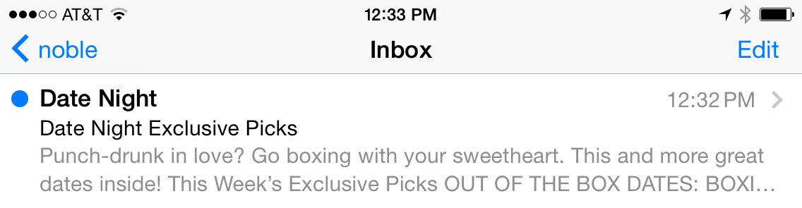
<td class="mobileBanner" align="center" width="100%">
   <p>Punch-drunk in love? Go boxing with your sweetheart. This and more great dates inside!</p>
   <a href="https://www.example.com" target="_blank"><img class="resImage" src="http://www.nobledesktop.com/nl-date-night/img/header.png" width="680" ALT="Date Night"></a>
Save the file.
-
Preview date-night-exclusive-picks.html in a browser. We’ll keep reloading this file, so leave it open.
Notice the preheader text is displayed above the Date Night header image (or over it in the small mobile layout), and is already styled because it’s targeted by our general paragraph style.
We want to hide this text with CSS. Return to your code editor.
-
Give the paragraph a class of preheader as shown in bold below:
<p class="preheader">Punch-drunk in love? Go boxing with your sweetheart. This and more great dates inside!</p> -
In the desktop CSS styles (outside of any media query), under the p rule, add the following new rule (around line 37):
.preheader { font-size: 2px; } -
Save the file and reload the browser.
At the top of the desktop layout, the preheader looks like a tiny squiggle, as it’s practically invisible. If a desktop email client displays the preheader, it would only add what would appear to be a 2 pixel margin on the top.
Resize the browser window until it switches to the 1-column mobile layout. The tiny text displays on top of the mobile-optimized banner and is barely noticeable. Our email looks pretty good, even in this worst-case scenario.
It’s time to make the preheader invisible. Return to your code editor.
-
Add the new properties shown below in bold:
.preheader {
   display: none;
   color: #ffffff;
   font-size: 2px;
}
Setting display to none should hide the text. Just in case an email client decides to show the preheader, we’ve made the text white. This makes our teaser even less noticeable than it was when we last previewed it.
-
Save the file and reload the browser. Resize the browser window to make sure the preheader is invisible in all 3 layouts.
Even though we hid the preheader in the email, it will still be displayed in a mail app’s inbox.
Inlining the CSS with Mailchimp’s Inliner
We are done, so it’s time to inline all of our desktop CSS, primarily so the email will look nice in all versions of Gmail. Mailchimp provides a free inliner, so let’s use it.
Let’s grab all the code in our email so we can paste it into the inliner tool. Return to your code editor.
Copy all the code in date-night-exclusive-picks.html.
In a new browser tab, go to Mailchimp’s free inliner tool at: templates.Mailchimp.com/resources/inline-css
Paste your code into the field that says Paste your HTML here to convert.
-
At the bottom, click the Convert button. Don’t worry, the tool will not inline your media queries—it is smart enough to leave them alone.
Boom! Mailchimp displays the inlined version at the bottom of the page.
Copy all the inlined code.
Switch back to your code editor.
Create a new file. (In most code editors, go to File > New or File > New File.)
Paste the inlined code into the document.
Save the file as inlined-date-night-exclusive-picks.html. Make sure to save it in the yourname-Responsive Email Class > 2-Column Layout folder.
- Scroll to the
<body>, which starts around line 128. -
Scroll down and examine the inlined results. For instance, our inlined preheader looks like this:
<p class="preheader" style="color: #ffffff;font-family: sans-serif;font-size: 2px;line-height: 140%;margin-bottom: 0;margin-top: 0;display: none;">Punch-drunk in love? Go boxing with your sweetheart. This and more great dates inside!</p>This code shows that Mailchimp’s inliner tool worked. It applied the general p rule, but overrode some of those properties with the more specific rule we wrote in the CSS for the .preheader. Smart!
-
We need to keep the media queries in the embedded CSS at the top of the file, but we no longer need the desktop styles (outside the media queries). From the body rule that starts around line 8 to the end of the .followCell p rule around line 54, delete the general styles so the area under the style tag looks like this:
<style>
   @media only screen and (max-width: 680px) {.wrapper {
Save the file.
-
Preview inlined-date-night-exclusive-picks.html in a browser. Great—as expected, it looks just like the email we’ve been coding, but with the added benefit that the general styles will display properly on some desktop clients like Gmail.
We have a nicely styled, working responsive email that is ready to send once the placeholder hrefs are replaced with real URLs.
Don’t forget that some email clients will strip out (or may not understand) media queries. Those users should receive the desktop version of our email, shrunk down to the screen size of their device. For an overview of which clients support media queries, Litmus has a nice list at tinyurl.com/litmus-mq but keep in mind that clients are often being updated and support may change at any given moment!
And that’s a wrap! Close all the files in your code editor and browser.
