Enhance your HTML & CSS skills with this comprehensive tutorial covering styling form elements, targeting inputs with attribute selectors, and the ::placeholder pseudo element.
This exercise is excerpted from Noble Desktop’s past front-end web development training materials and is compatible with updates through 2022. To learn current skills in web development, check out our coding bootcamps in NYC and live online.
Topics Covered in This HTML & CSS Tutorial:
Styling Form Elements, Targeting Inputs with Attribute Selectors, the ::placeholder Pseudo Element
Exercise Preview
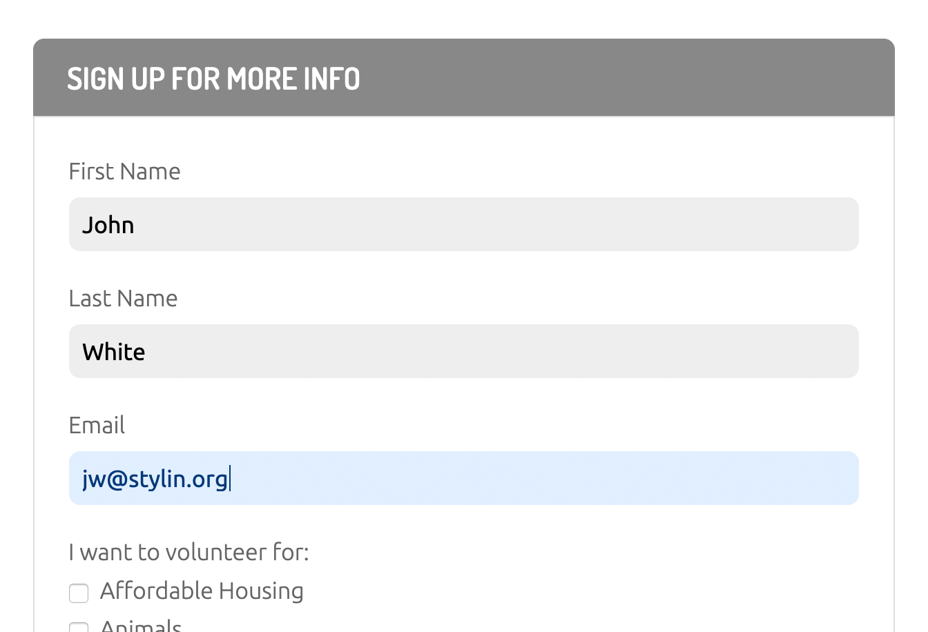
Exercise Overview
In this exercise, you’ll learn new things about styling forms as well as practice techniques you’ve been learning in previous exercises.

This exercise will focus on styling the front-end of the form, not programming the back-end functionality. Creating a functioning form requires knowledge of a back-end programming language such as PHP, Ruby on Rails, Node.js, etc.
Getting Started
- In your code editor, close all open files to avoid confusion.
- For this exercise we’ll be working with the Helping Hands Forms folder located in Desktop > Class Files > Advanced HTML CSS Class. Open that folder in your code editor if it allows you to (like Visual Studio Code does).
- Open volunteer.html from the Helping Hands Forms folder.
-
Preview volunteer.html in a browser.
This page has some standard form elements, but they look bad because we have not applied any styling yet.
Leave the page open in the browser.
Looking over the Form Content
- Return to volunteer.html in your code editor.
-
Find
<form action="" class="volunteer-form">and take a moment to look over the form code inside it, noticing the following:- Each input has a label, which is connected by its ID.
- There are different types of inputs such as text, email, checkbox, and submit.
- The fieldset groups together related elements, in this case a set of checkboxes.
- In addition to inputs, there is also a textarea (which is a multi-line input).
Just after the start of the body tag, there’s a nav which contains a form that has one search input.
Styling the Labels & Inputs
Let’s put the text labels and text fields onto their own lines.
- Open main.css from the css folder (in the Helping Hands Forms folder).
-
Below the .form-heading rule, add a rule for labels in the form:
form > label {
   display: block;
   margin: 20px 0 5px;
}
By using a direct descendant selector, we avoid styling the checkbox labels in the nested fieldset. We want to keep those labels next to their checkboxes.
The shorthand above sets a 20px top margin, 0 left/right, and 5px on bottom.
- Save the file and reload the page in your browser. Notice the text labels are now on their own line, with the text fields below them. Now let’s improve the text fields.
- Return to main.css in your code editor.
-
Below the form > label rule, add a new rule for text inputs:
input[type="text"] {
   display: block;
   width: 100%;
}
NOTE: By default, inputs are set to display as inline. We’re changing them to display as block to ensure they are on their own line and that we’ll be able to set size, padding, etc. like we do on block elements.
-
Save the file, reload the page in your browser, and notice:
- The First Name and Last Name text fields are the full width of the column.
- The Email text field is not the full width like the other fields, because its type is email, not text like our CSS rule targeted.
- The textarea below Anything else you’d like to add? is not on its own line because we didn’t target textareas.
- Return to your code editor.
-
Edit the input selector as shown in bold, making sure you don’t miss the commas!
input[type="text"], input[type="email"], textarea { display: block; width: 100%; } - Save the file and reload the page in your browser. The email field and textarea should both be 100% wide and on their own lines.
- Return to your code editor.
-
Add more styling to make them look better:
input[type="text"], input[type="email"], textarea { display: block; width: 100%; background: #eee; border: none; border-radius: 8px; padding: 10px; margin-bottom: 20px; } -
Save the file, reload the page in your browser, and:
- Notice the text fields should have a gray background, no border, and rounded corners which better matches the rest of the page’s design.
- There’s too much space above First Name, so let’s fix that.
- Return to your code editor.
-
Below the form > label rule, add this new rule:
form > label:first-of-type { margin-top: 0; } -
Save the file, reload the page in your browser, and:
- Notice the space above First Name should look better.
- Try to resize the textarea below Anything else you’d like to add? and notice that when you adjust the width, it can get wider than the column or become too small. It would be better if you could only adjust the height, not the width.
- Return to your code editor.
-
Let’s style the textarea. Above the aside section rule, add the following new rule:
textarea { min-height: 120px; resize: vertical; } -
Save the file, reload the page in your browser, and:
- Notice the textarea is initially a bit taller.
- Resize the textarea and notice that you can only change the height, not the width.
- Click into a text field and it may get a blue outline. How this looks differs across browser. If you don’t like the way this looks, we can get rid of it.
- Return to your code editor.
-
Below the textarea rule, add the following new rule:
input[type="text"], input[type="email"], input[type="submit"], input[type="search"], textarea { outline: none; } - Save the file and reload the page in your browser.
Click into any of the fields and notice no more blue outline.
Changing Background Color on Focus
With no blue outline, it’s hard to know which field your cursor is in, so we should make some other visual indication of which field the cursor is in.
- Return to your code editor.
-
Above the aside section rule, add the following new rule:
input:focus,
textarea:focus {
   background: #e1efff;
   color: #02387a;
}
NOTE: This rule targets the inputs and textarea when they are focused on (selected by a mouse or keyboard).
-
Save the file, reload the page in your browser, and:
- Click into any of the text fields and type something to see their color change! When you click out of a field, it goes back to the original color. Neat effect!
- The fieldset has a border and some spacing by default, but let’s remove that.
Styling the Fieldset
- Return to your code editor.
-
Above the aside section rule, add the following new rule:
fieldset { border: 0; margin: 0; padding: 0; } -
Save the file and reload the page in the browser.
- The border around the list of checkboxes is gone.
- Let’s remove the bullets next to the checkboxes.
- Return to your code editor.
-
Our form contains a list (ul tag) with all the checkboxes. We gave that a class of interests-list so we can style it. Below the fieldset rule, add the following new rule:
.interests-list { list-style-type: none; margin: 0; padding: 0; } - Save the file and reload the page in the browser. It’s getting close, but we could use more space between the checkboxes and the text label to the right.
- Return to your code editor.
-
Below the .interests-list rule, add the following new rule:
input[type="checkbox"] {
   margin-right: 5px;
}
Save the file and reload the page in the browser. The form is looking good, except for the Sign Me Up button.
Styling the “Sign Me Up” Button
- Return to your code editor.
-
The Sign Me Up button is an input with type=
"submit"which we can use to target it. Below the input[type="checkbox"] rule, add the following new rule:input[type="submit"] { font-family: Dosis, sans-serif; font-weight: 600; font-size: 20px; text-transform: uppercase; background: #6bb359; color: #fff; padding: 10px 20px; border: none; border-radius: 8px; } - Save the file and reload the page in the browser. Much improved! Let’s make the button change color on hover.
- Return to your code editor.
-
Below the input[type=
"submit"] rule, add the following new rule:input[type="submit"]:hover, input[type="submit"]:focus { background: #449d44; } -
Save the file, reload the page in your browser, and:
- Hover over the Sign Me Up button to see it darken.
- In the navbar at the top right of the page notice there’s an unstyled search field. Let’s make that look better.
Styling the Search Field
- Return to your code editor.
-
Above the aside section rule, add the following new rule:
nav input[type="search"] {
   width: 160px;
   padding: 6px 15px;
   border-radius: 50px;
   border: 1px solid #a4c1e6;
   -webkit-appearance: none;
}
NOTE: Setting -webkit-appearance to none removes an inner shadow on iOS.
-
Save the file and reload the page in the browser.
That looks better. Now let’s style the Search placeholder text.
- Return to your code editor.
-
Below the nav input[type=
"search"] rule, add the following new rule:nav input[type="search"]::placeholder { color: #4197ff; opacity:.5; line-height: normal; }NOTE: Unlike other browsers, Firefox reduces the opacity of placeholder text. If you don’t want opacity, set it to 1 to make Firefox consistent with other browsers. The line-height fixes the vertical alignment on iOS.
Save the file and reload the page in the browser. The Search placeholder text should now be blue (it was dark gray).
Minimum Type Size for Mobile Optimized Forms
If the font size of a text field is less than 16px, iOS will zoom in on the text field when you click on it. That can be annoying because you have to zoom back out when done typing. Style text fields as 16px or bigger to avoid this.
