Master the art of creating a slide-down navigation menu with our in-depth HTML & CSS tutorial, complete with an exercise preview, an overview, and step-by-step guidance featuring screenshots and code snippets.
This exercise is excerpted from Noble Desktop’s past front-end web development training materials and is compatible with updates through 2022. To learn current skills in web development, check out our coding bootcamps in NYC and live online.
Topics Covered in This HTML & CSS Tutorial:
Creating a Slide-down Menu, Making the Logo & Menu Button Slide Down with the Page Content
Exercise Preview
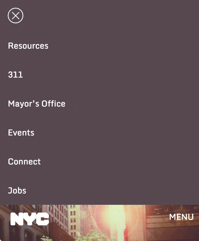
Exercise Overview
In a previous exercise we built an off-screen navigation that slid in from the side (overlaying the page content). In this exercise, you’ll tweak the HTML and CSS of that page to change the navigation so it slides down from the top of the screen, and pushes the page content down, rather than covering it.

Getting Started
- This exercise builds on concepts covered in exercise 5D (Off-Screen Side Nav Using Only CSS). We recommend you finish that exercise before starting this one.
- For this exercise we’ll be working with the Slide-Down Top Nav folder located in Desktop > Class Files > Advanced HTML CSS Class. Open that folder in your code editor if it allows you to (like Visual Studio Code does).
- Open index.html from the Slide-Down Top Nav folder.
- Preview index.html in a browser.
- Resize the browser window to a narrow mobile styling, with the MENU button at the top right.
- Click the MENU button to notice the nav slides in from the side. The hide/show functionality works, but we want to style the page differently.
- Leave the browser open at this size, so you can reload it throughout the exercise.
- In your code editor, open main.css from the css folder.
Changing the Navigation’s Appearance
- In the max-width: 700px media query, find the nav rule.
- Delete the width and left properties.
-
Change position to relative so you end up with the following rule:
nav {
   position: relative;
   height: 100%;
   overflow-y: auto;
   z-index: 100;
   transition: all.2s ease;
}
NOTE: We need to specify a relative position, so the z-index will keep the nav above the invisible overlay that lets users click anywhere outside the nav to close it.
- Save the file and reload your browser.
- The nav is now at the top instead of the side. That’s good, but we want it to be hidden right now. Let’s fix that.
-
Return to main.css in your code editor.
In the unchecked state, we want the nav to be hidden. We can achieve this by changing the nav element to have no height. Because we want to use CSS transitions, we can’t use the height property (browsers cannot animate from height 0 to auto using transitions). Luckily we can use max-height instead!
-
In the nav rule, set height to 0 and change it to max-height, as shown below in bold:
nav { position: relative; max-height: 0; overflow-y: auto; z-index: 100; transition: all.2s ease; } -
Now that we’ve reduced the max-height, we need to hide anything that overflows outside of it. Change the overflow-y property as shown below:
nav { position: relative; max-height: 0; overflow-y: hidden; z-index: 100; transition: all.2s ease; } - Save the file and reload your browser. Great, the nav is hidden again.
- Click the MENU button to see nothing happens. That’s because we need to change what the :checked pseudo-class rule does.
- Switch back to main.css in your code editor.
-
Find the #nav-checkbox:checked ~ nav rule and replace the left property with the code shown below in bold:
#nav-checkbox:checked ~ nav {
   max-height: 30em;
}
NOTE: For the transition to work we must specify the height of the element being animated. We are using a max-height value that’s slightly larger than the element we are transitioning. Through experimenting, we found that 30em works well.
- Save the file and reload your browser.
-
Click the MENU button to see the nav slide down from the top. Neat! There are two things we still need to do:
- The NYC logo disappears, but we want it to slide down with the rest of the page’s content.
- The menu opens a bit too quickly for our taste. We’d like to slow it down a little.
- Let’s slow down the transition first. Return to main.css.
-
In the nav rule, edit the transition’s timing as shown below in bold:
nav { position: relative; max-height: 0; overflow-y: hidden; z-index: 100; transition: all.5 s ease; } - Save the file and reload your browser.
Click the MENU button to see the nav opens a bit slower.
Floating the Logo
The last thing we need to do is fix the positioning of the NYC logo, so it moves down with the rest of the page content.
- Switch to index.html in your code editor.
- Notice that the logo comes before the nav. We want it below the nav in this layout (so it’s with the rest of the page content).
- Select the logo and cut it.
-
Paste it below the closing nav tag, as shown below in bold:
</nav> <img src="img/nyc-logo.svg" class="nyc-logo" ALT="NYC Logo"> <h1>New York City</h1> - Save the file and reload your browser.
- Click the MENU button. Hmm, the logo is still hidden. Let’s examine our CSS positioning of this element.
- Switch back to main.css.
- In the general styles, find the rule for .nyc-logo.
- Notice that the logo has an absolute position. It’s currently 15px from the top of the screen. We’ll need to remove that positioning and instead make it float left (so it will still be to the left of the MENU button when the nav is closed).
-
Edit the .nyc-logo rule as shown below in bold. Don’t miss adding margin- to both top and left!
.nyc-logo { width: 75px; float: left; margin- top: 15px; margin- left: 20px; } - Save the file and reload your browser.
- Test out the mobile nav to see it’s working great.
- Resize the window larger so you can see the desktop styles (with the navbar across the top).
- Oh no, the logo isn’t in the right position anymore. That’s because we edited the general rule.
- Return to main.css.
-
In the min-width: 701px media query, after the nav ul li rule, add this new rule:
.nyc-logo { position: absolute; top: 15px; left: 20px; margin: 0; } - Save the file and reload your browser to see that the NYC logo is positioned correctly on the desktop.
- Resize the window down to the mobile styles, and test out your nifty slider nav!
After you click the MENU button, notice that the MENU button disappears. We don’t mind this, because users have a close button and they can click anywhere on the page to close the nav. But if you want the MENU button to move down the page like the logo does, continue on to the optional bonus section.
Bonus: Making the MENU Button Slide with the Page
Fixing the MENU button is very similar to how we fixed the logo.
- Switch to index.html in your code editor.
- Around line 14, select the menu-button label’s line of code.
- Cut it.
-
Paste it below the nyc-logo img, as shown below in bold:
<img src="img/nyc-logo.svg" class="nyc-logo" ALT="NYC Logo"> <label for="nav-checkbox" class="menu-button">MENU</label> - Save the file.
- Return to main.css.
-
In the max-width: 700px media query, edit the .menu-button rule as shown below in bold. Don’t miss adding margin- to both top and right!
.menu-button { float: right; margin- top: 10px; margin- right: 10px; color: #fff; cursor: pointer; -webkit-user-select: none; -moz-user-select: none; -ms-user-select: none; user-select: none; } - Save the file, reload your browser.
Click the MENU button and notice the MENU button moved down the page and is still visible. Awesome, you’re all done!
