Discover how to create and optimize a scrollable section of a webpage with this comprehensive HTML & CSS tutorial, covering everything from basic setup to advanced styling adjustments.
This exercise is excerpted from Noble Desktop’s past front-end web development training materials and is compatible with updates through 2022. To learn current skills in web development, check out our coding bootcamps in NYC and live online.
Topics Covered in This HTML & CSS Tutorial:
Creating a Horizontal Scrollable Area
Exercise Preview
Photos courtesy of istockphoto, unizyne, Image #19302441, Marcello Bortolino, Image #17472015, Sergey Kashkin, Image #318828, Sveta Demidoff, Image #2712135.

Exercise Overview
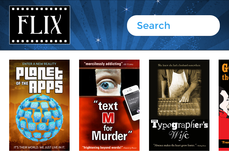
In this exercise you’ll learn how to make one section of a page scrollable. You’ll even optimize it to add the “native” scroll bounce people expect on iOS devices.
Styling the Horizontal Scroll Area
- We’ll be switching to a new folder of prepared files for this exercise. In your code editor, close all open files to avoid confusion.
- For this exercise we’ll be working with the Flix Scrollable Area folder located in Desktop > Class Files > Advanced HTML CSS Class. Open that folder in your code editor if it allows you to (like Visual Studio Code does).
- Open index.html from the Flix Scrollable Area folder.
-
Preview index.html in a browser.
For now we’ve only started the mobile version of this page, so make your window narrow like a mobile device.
Notice the movie posters are currently stacked on top of each other. Our design calls for the movie posters to be on a single scrollable line. On smaller devices, we want users to be able to scroll from left to right if all the movie posters don’t fit on-screen. First let’s get the movie posters in a single line.
- Return to your code editor.
- Open main.css from the css folder (in the Flix Scrollable Area folder).
- The movie posters are in an unordered list that has a movies class applied to it. Find the .movies li rule. This targets the list items in our movies unordered list and sets their size and spacing.
-
Add the following bold code to get all the movie posters on one line:
.movies li { display: inline-block; width: 99px; margin-right: 11px; } -
Save the file, then reload the page in your browser.
The posters are now on the same line, but make the browser window narrow and notice that the movie posters wrap to a second line. On smaller devices we want to prevent this behavior.
- Switch back to your code editor.
-
Directly above the .movies li rule, find the .movies rule. This targets our movies list. Add the following bold code:
.movies { background-color: #fff; padding: 15px; margin: 0; white-space: nowrap; } -
Save the file, reload the page in your browser, and:
Make the browser window narrow so you can see that the movie posters no longer wrap to a second line.
There’s a new problem though. Now that the posters don’t fit, scroll the page to the right to see it looks weird because the posters are wider than everything else. The problem is the whole page gets scrolled, but we only want the posters section to scroll.
- Switch back to your code editor.
-
Add the following bold code to the .movies rule:
.movies {
   background-color: #fff;
   padding: 15px;
   margin: 0;
   white-space: nowrap;
   overflow-X: auto;
}
NOTE: overflow-X refers to the X-axis (which is horizontal scrolling). The auto value will only add scrollbars if they are needed.
-
Save the file, then reload the page in your browser.
Only the poster area scrolls now. This works on desktop browsers, which typically show a scrollbar. Mobile browsers typically will not show a scrollbar. On touch devices, users swipe over the area to scroll it!
Optional Bonus: Removing Extra Margin
Each movie poster has 11px of margin on the right. That creates the space between the movie posters. It also adds extra space on the far right, because there is already padding all around the movies section. We can remove that unwanted space with 1CSS rule.
- Switch back to your code editor.
-
Below the .movies li rule add the following new rule:
.movies li:last-child { margin-right: 0; } - Save the file, then reload the page in your browser.
Scroll to the far right of the posters, and notice the margin to the right of the last poster now matches the margins between all the other posters.
Visually Indicating Scrolling
We purposely designed the size of the posters so that the right-most poster will be partially cut off (on most devices). That implies there is more for the user to scroll and see. In your designs, if you think cutting something off doesn’t imply scrolling well enough, consider adding a visual indicator or instructions below the scrollable area.
