Delve into this comprehensive HTML and CSS tutorial, which provides an in-depth exploration of CSS3 transitions, transitioning position coordinates, adding easing with transition-timing-function, and custom easing with Ceaser.
This exercise is excerpted from Noble Desktop’s past front-end web development training materials and is compatible with updates through 2022. To learn current skills in web development, check out our coding bootcamps in NYC and live online.
Topics Covered in This HTML & CSS Tutorial:
Transition-property & Transition-duration, Transition Shorthand & the All Keyword, Transitioning Position Coordinates, Adding Easing with Transition-timing-function, Custom Easing with Ceaser
Exercise Preview

Exercise Overview
In the portfolio page we’ve been working on, the hover styles abruptly change at the moment the user hovers over. In this exercise, you’ll smooth out these changes by adding CSS3 transitions. Transitions animate properties (such as opacity and color) much like “tweening” does, making the browser show the in between states over a given time.

Getting Started
- We’ll be switching to a new folder of prepared files for this exercise. In your code editor, close all open files to avoid confusion.
- For this exercise we’ll be working with the Transitions folder located in Desktop > Class Files > Advanced HTML CSS Class. Open that folder in your code editor if it allows you to (like Visual Studio Code does).
- Open index.html from the Transitions folder.
-
Preview index.html in a browser.
Hover over the links in the header (John Schmidt and the links in the navbar) to see that they immediately change to green on hover. Let’s make the color fade in instead of abruptly changing.
Leave the page open in the browser so we can come back to it later.
Transition-Property & Transition-Duration
A CSS transition needs to know two things: what property to transition and how much time the change should take. It may seem counterintuitive at first, but transitions are declared in the rule for the object you wish to change rather than on the “trigger” rule (i.e., the hover). This is because the browser needs to know what to do before it starts transitioning. This also frees you up to trigger the transition from other additional pseudo classes like :focus or :active or even trigger the transition via JavaScript.
- Switch back to your code editor.
- Open main.css from the css folder (in the Transitions folder).
-
In the header a rule, add the code shown below in bold:
header a {Code Omitted To Save Space
text-transform: uppercase;
   transition-property: color;
   transition-duration: 2s;
}
NOTE: These two properties are fairly self-explanatory:
- You’re telling the browser to transition the color property on this element.
- You’re setting the transition’s duration to last for 2 seconds.
You can enter a transition-duration in seconds (s) or milliseconds (ms). 2s is the same as 2000ms. We will make the effect faster after some testing.
- Save the file, then reload the page in your browser.
- If you previewed in Chrome or Safari, you may have noticed John Schmidt and nav links had a weird color transition when the page loaded. We’ll fix that in a moment.
- Hover over any of the nav links at the top of the page. Instead of immediately toggling to green, the color takes 2 seconds to smoothly transition.
- Hover off of the element to see the color slowly transition back to white.
- Hover over John Schmidt. The text color smoothly transitions, but the shadow immediately and abruptly shifts position. We can fix that by telling the text-shadow to transition along with the color.
- Switch back to main.css in your code editor.
-
We can add multiple transition-property values by separating them with commas. As shown in bold, tell the browser to transition the text-shadow as well:
header a {Code Omitted To Save Space
transition-property: color, text-shadow; transition-duration: 2s; } - Save the file, then reload the page in your browser.
Hover over John Schmidt to see that this time, the color and the text-shadow both change simultaneously. Much nicer!
Fixing a Problem on Page Load
As of this writing, Chrome and Safari have a bug that makes transitions fire on page load. They should not, and Firefox does not do this. Safari only does it on the initial page load, but not when you hit refresh. Chrome does it on page load and whenever you hit refresh.
The best workaround we have found is to initially disable all transitions during page load, then turn them back on after the page has loaded. This will require a tiny bit of JavaScript, but don’t worry… we’ve written all the code for you to use!
- Switch back to your code editor.
- Open prevent-transition-flicker.html from the snippets folder (in the Transitions folder).
-
There’s comments in this file to tell you what to do, but we’ll walk you though the steps. Copy the line of code under STEP #1:
<style>.preload * {transition:none!important;}</style> - Switch to index.html.
-
Paste it at the end of the head tag, as shown below:
<link rel="stylesheet" href="css/main.css"> <style>.preload * {transition:none!important;}</style> </head> -
On the body tag add
class="preload", as shown below:<body class="preload"> - Switch back to prevent-transition-flicker.html
-
Copy the line of code under STEP #3:
<script>document.getElementsByTagName("body")[0].classList.remove("preload");</script> - Close prevent-transition-flicker.html.
- Switch to index.html.
-
Paste the code after of the start of the body tag, as shown below:
<body class="preload"> <script>document.getElementsByTagName("body")[0].classList.remove("preload");</script> <header> -
Save the file, then reload the page in your browser.
- In Chrome and Safari, you should no longer see the transition when the page loads!
- Hover over John Schmidt and the transition should still work.
-
What does this code do?
- The preload class is used to set everything in the page to transition:none; (for page load) to disable all transitions. (The * selector means any element.)
- Once the page has loaded, JavaScript then removes the preload class from the body tag, which removes transition:none; so transitions can work again!
Transition Shorthand & the All Keyword
Now we can get back to working on our transitions. Let’s see how to combine the two transition properties into one, using shorthand.
- Switch back to main.css in your code editor.
- At the end of the header a rule, delete the transition-duration line.
-
As shown below, change transition-property to transition and add back in duration values as shown in bold:
header a {Code Omitted To Save Space
text-transform: uppercase;
   transition: color 2s, text-shadow 4s;
}
NOTE: Transition shorthand is the property you wish to transition, followed by the duration (followed by an optional delay, which we’re not using).
- Save the file, then reload the page in your browser.
-
Hover over John Schmidt to see the color transitions in 2 seconds, but the shadow takes 4 seconds.
We’re only transitioning 2 properties, but what if we wanted to change 5 properties at once? The code could become unwieldy, but instead we can use the all keyword.
- Switch back to main.css in your code editor.
-
In the transition property, switch to all and shorten the duration so the change happens faster:
transition: all 300ms; Save the file, then reload the page in your browser. Hover over John Schmidt or the nav links so see a much better speed (with less code).
Animating the Description Overlays
- Hover over one of the four featured art images to see the hover we added in the last exercise. This goes straight from an opacity of 0, to an opacity of 1 on hover.
- Because opacity values are numeric (unlike the equally accessible visibility property), we can transition them. Switch back to main.css in your code editor.
-
In the .category.description rule, add the following transition:
.category.description {Code Omitted To Save Space
opacity: 0; transition: all 1s; } - Save the file, then reload the page in your browser.
-
Hover over one of the featured art images to watch the description subtly fade in.
One problem with this is mobile users don’t get the benefit of being able to hover, so they will not see the label and therefore won’t know what each image links to. No worries! With a little tweak we can make this awesome for mobile and desktop users alike. We can initially show the label at the bottom of the photo, and then on hover slide it up to fully cover the photo.
- Switch back to main.css.
-
We now want to always see the text overlay, so remove opacity from both rules as shown below:
.category.description {Code Omitted To Save Space
padding-top: calc(33.33%—4rem/2); transition: all 1s; }.category a:hover.description { } -
Initially we want the label to be at the bottom of the photo. That means we need to move the top edge down so the overlay is only as tall as one line (keep in mind our line-height is 4rem). Edit the rule for .category.description as shown in bold:
.category.description {Code Omitted To Save Space
top: calc(100%—4rem); right: 0; bottom: 0; left: 0; padding-top: calc(33.33%—4rem/2); transition: all 1s; } -
On hover, the top should move all the way back up to the top of the photo, so in the .category a:hover.description rule add the following:
.category a:hover.description { top: 0; } - Cut the
padding-top: calc(33.33%—4rem/2);line from the .category.description rule. -
Paste it into the :hover rule, so you end up with the following code:
.category.description {Code Omitted To Save Space
top: calc(100%—4rem);
   right: 0;
   bottom: 0;
   left: 0;
   transition: all 1s;
}.category a:hover.description {
   top: 0;
   padding-top: calc(33.33%—4rem/2);
}
That extra space above the text is only needed when the overlay expands to be the full height of the photo.
-
Save the file, then reload the page in your browser, and:
- Notice the labels are visible at the bottom of each photo. Now everyone can see what these are without having to do anything!
- Hover over the photo and watch the overlay expand up. Cool!
NOTE: In older versions of Microsoft Edge (before switching to the Chrome rendering engine), CSS transitions do not work with calc(), therefore the overlay won’t animate. Everything else works (and the page still looks decent) so we’re fine with Edge being different. If you’re not OK with that, you’ll have to figure out a fixed amount that doesn’t require using calc(). That may require more media queries, etc. Now that Edge has switched to using Chrome’s rendering engine (where the transitions work), we think this code works well enough as it is.
Adding Easing with Transition-Timing-Function
Easing changes the rate of speed of an animation, going slower or faster at certain times. With the transition-timing-function property, we can use: ease, linear, ease-in, ease-out, ease-in-out, and cubic-bezier (which allows you to define your own timing curve). The default is ease, but let’s try some others.
- Switch back to main.css in your code editor.
-
In the .category.description rule, add the following bold code:
.category.description {Code Omitted To Save Space
transition: all 1s; transition-timing-function: linear; } - Save the file, then reload the page in your browser.
- Hover over one of the images. A linear ease moves at a constant speed for the entire animation, which is very robotic. Let’s try some other options.
- Return to main.css in your code editor.
- Delete the line of code you just wrote.
-
Let’s incorporate the ease into the shorthand. Add an ease-in function to the end of the shorthand as shown in bold:
.category.description {Code Omitted To Save Space
transition: all 1s ease-in; } - Save the file, then reload the page in your browser.
Hover over one of the images. It’s very subtle, but ease-in will start slow, then go faster at the end. It “eases into” the animation. It works, but the basic eases are a bit ho-hum and very subtle.
Custom Easing with Ceaser
There are ways to customize the transition-timing-function (ease). Trying to figure out the coordinates of complex cubic Bézier curves is quite a headache, but luckily for us, developer (and former Noble Desktop instructor) Matthew Lein put together Ceaser (CSS Easer = Ceaser), a handy code generator that outputs CSS snippets with cubic-bezier coordinates you can easily customize.
- In a new browser tab/window, go to matthewlein.com/tools/ceaser
-
From the Easing menu, choose easeOutExpo.
This list of presets includes approximations of most Penner Equations. You can also create your own custom easing curve using the graph.
Penner Equations
Robert Penner is a Flash developer who is well-known for his open source Flash innovations. The “Penner easing functions” are a de facto standard that now power numerous animation libraries in multiple languages, from jQuery to the GreenSock Animation Platform (GSAP), to CSS and more. For more info visit robertpenner.com/easing
- Set the Duration to 300 (that’s 300 milliseconds or 0.3 seconds).
- Click the Height button a few times to preview the look of this animation.
-
Select the transition values as shown below and copy it.
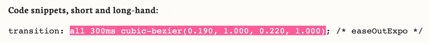
- Switch back to main.css in your code editor.
-
In the rule for .category.description, replace the transition’s current values by pasting in the custom cubic-bezier values so the code looks like this:
.category.description {Code Omitted To Save Space
transition: all 300ms cubic-bezier(0.190,1,000,0.220,1,000); } - Save the file, then reload the page in your browser.
Hover over the photos and notice the animation starts out fast and slows down at the end, so the transition feels snappier.
Optional Bonus: Adding Focus Selectors to Hovers
It’s often a good idea to add a :focus selector to any :hover selector. To save time we didn’t do that, but let’s do it now
-
Find the .category a:hover.description rule and change the selector to the following. Don’t miss the comma after the first part!
.category a:hover.description,.category a:focus.description {Code Omitted To Save Space
} -
Find the .logo-wrapper a:hover rule and change the selector to the following. Don’t miss the comma after the first part!
.logo-wrapper a:hover,.logo-wrapper a:focus {Code Omitted To Save Space
}
