Delve into this comprehensive tutorial on HTML & CSS, covering topics such as testing transforms with DevTools, adding scale transform & transitioning it, transform origin, rotate & skew transforms, and using the translate transform to nudge elements.
This exercise is excerpted from Noble Desktop’s past front-end web development training materials and is compatible with updates through 2022. To learn current skills in web development, check out our coding bootcamps in NYC and live online.
Topics Covered in This HTML & CSS Tutorial:
Testing Transforms Using the DevTools, Adding a Scale Transform & Transitioning It, Transform Origin, Rotate & Skew Transforms, Using the Translate Transform to Nudge Elements
Exercise Preview
Exercise Overview
In this exercise you’ll learn how to use CSS to transform elements. You can scale them up or down, skew (tilt) them, rotate them, and translate (move) them. Transforms can even be animated when combined with CSS transitions!

Testing Transforms Using the DevTools
- We’ll be switching to a new folder of prepared files for this exercise. In your code editor, close all open files to avoid confusion.
- For this exercise we’ll be working with the Transforms and Transitions folder located in Desktop > Class Files > Advanced HTML CSS Class. Open that folder in your code editor if it allows you to (like Visual Studio Code does).
- Open index.html from the Transforms and Transitions folder.
-
Preview index.html in Chrome (we’ll be using its DevTools).
In the previous exercise, we added some nifty transitions that smooth out property changes. While these effects look great by themselves, we can make the page even more exciting using transforms. Transforms are often combined with transitions, but they don’t have to be.
- Before we see how transforms and transitions work together, let’s add a basic transform in the DevTools. CTRL–click (Mac) or Right–click (Windows) on any of the large featured art images and select Inspect.
- In the Elements panel of DevTools, the description div should be selected. Click on the
<a href="#">above it. - In the Styles panel, there may be two .category a rules, find the .category a rule with the box-shadow property.
- Click once to the right of the last property position: relative to add a new property.
-
Type transform: scale(.5)
The scale() transform sizes the element up or down. We are telling the browser to scale the element down to be 0.5 times (50%) its initial size.
- Notice that the photos have immediately scaled down to half of their original size. However, everything else on the page is still in the same place it was. This shows that transforms do not remove elements from the flow of the document.
-
Change the scale value in DevTools to be twice the normal size:
transform: scale(2); -
Yikes, those are too huge! However, the layout is still unaffected even when the photos are larger than normal. To see this more clearly, scale the elements to 140% of their initial size:
transform: scale(1.4); Close the DevTools, but leave the page open in Chrome.
Adding a Scale Transform & Transitioning It
Let’s scale both the featured art images and the overlays up on hover, using CSS transitions to create a smooth hover animation.
- Switch back to your code editor.
-
Open main.css from the css folder (in the Transforms and Transitions folder).
We want to add a scale transform when the user hovers over links inside our category divs. This will size up both the images and the overlays that have a class of description.
-
Below the .category a rule, add the following new rule:
.category a:hover,.category a:focus { transform: scale(1.2); } - Save the file.
- Return to index.html in the browser and reload the page.
-
Hover over one of the large photos on the left of the page (either Oil or Mixed Media). The transform works but notice these two issues:
- The image immediately enlarges to be 1.2 times its natural size, and does not have a smooth animated transitioned.
- The image is layered behind the image to its right. Hover over one of the images on the right to see it’s layered above the left image (as we want all images to behave).
- Let’s solve the stacking problem first. Leave the page open in the browser so we can come back to it later.
- Return to main.css in your code editor.
-
All of the links inside category divs are nested at the same level in the code. Elements that are further down the page will layer on top of the previous elements. To make sure that the :hover always stacks on top, add the z-index as shown in bold:
.category a:hover,.category a:focus { transform: scale(1.2); z-index: 10; } -
Save the file, then reload the page in your browser.
- Hover over all of the images to see that they are now always on top. Our z-index is working!
- Let’s add a transition to create a smoother effect.
-
Return to main.css in your code editor.
We’re already transitioning the .description elements. So let’s add the same transition to the .category a elements.
-
In the .category.description rule, copy the transition property:
transition: all 300ms cubic-bezier(0.190,1,000,0.220,1,000); -
Remember that transitions go on the element that will be transitioned, not the state that triggers it. As shown in bold, paste the code into the .category a rule:
.category a {Code Omitted To Save Space
position: relative; transition: all 300ms cubic-bezier(0.190,1,000,0.220,1,000); } -
Save the file, then reload the page in your browser.
- Hover over the images to see they now have an animation transition!
- This large size was good to test, but let’s make it more subtle.
- Switch back to main.css in your code editor.
-
Change the .category a:hover transform’s value from 1.2 to a more subtle 1.05 as shown in bold.
.category a:hover,.category a:focus {
   transform: scale(1.05);
   z-index: 10;
}
Save the file, then reload the page in your browser.
Hover over any of the large images to see that the transform/transition combo looks more elegant now that they aren’t sizing up as much.
Transform-Origin
By default, elements transform from their center, but we can change the transformation’s origin (reference or registration point).
Switch back to main.css in your code editor.
-
In the .category a rule, add the following bold code:
.category a {Code Omitted To Save Space
transition: all 300ms cubic-bezier(0.190,1,000,0.220,1,000);
   transform-origin: center bottom;
}
The X (horizontal) position comes first, followed by the y (vertical) position. This code tells the element to scale from its horizontal center and vertical bottom.
- Save the file, then reload the page in your browser.
Hover over any of images to see it scale up from the bottom edge’s center point.
Transform Origin Values
The value describes the horizontal and vertical positions. You can define values for the transform-origin property using the following:
- Keywords (left, right, or center for the horizontal position and top, bottom, or center for the vertical position) such as (right bottom).
- Percentages: 100% 100% is the same as the previous example.
- Pixel values: 100px is 100 pixels from both the top and left. This approach is the most exact.
- A combination of these approaches such as 50% bottom for 50% horizontal at bottom.
Rotate & Skew Transforms
In addition to scaling, we can also rotate and tilt elements.
- Switch back to main.css in your code editor.
-
In the .category a:hover,.category a:focus rule, add rotate() as follows:
transform: scale(1.05) rotate(25deg);Here, you’re tipping the image 25 degrees to the right on the hover. A negative value would tip the image to the left. It is important to note that there is no comma between the scale and rotate transforms. These are space separated values.
- Save the file, then reload the page in your browser.
- Hover over one of the images to see a dramatic clockwise rotation that starts from our specified transform-origin. Let’s tone that down.
- Switch back to main.css in your code editor.
-
Modify the rotation with the following negative value:
transform: scale(1.05) rotate(-2deg); - Save the file, then reload the page in your browser.
- Hover again to see a more tasteful counterclockwise rotation.
- Let’s try another transform. Switch back to your code editor.
-
Tilt the elements on their horizontal axis by adding the following skewX() effect:
transform: scale(1.05) skewX(25deg); - Save the file, then reload the page in your browser.
- Hover over an image. That’s interesting, but doesn’t work with our design.
- Switch back to main.css in your code editor.
-
Skew the elements vertically (on the y-axis) by changing X to Y as shown in bold:
transform: scale(1.05) skewY(25deg); - Save the file, reload the page in your browser, and test out the effect.
- Switch back to main.css in your code editor.
-
You can combine X and Y coordinates by using the skew() effect. The X coordinate is listed first and both values are separated by commas. Skew both coordinates counterclockwise by adding the following bold negative coordinates:
transform: scale(1.05) skew(-5deg, -5deg); - Save the file, then reload the page in your browser.
Hover over the images to see the elements do a disco-style “dance”. Not what we want, but interesting to see.
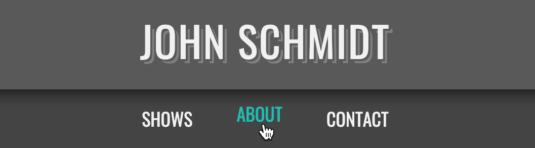
Using the Translate Transform to Nudge the Nav Links up
- Below John Schmidt at the top of the page, hover over the links in the navbar. They currently have a color transition thanks to our transition. Let’s also nudge them slightly upwards on hover.
- Switch back to main.css in your code editor.
-
In the .category a:hover,.category a:focus rule, delete the second transform so you end up with:
transform: scale(1.05); -
Below the nav a rule, add the following new rule that translates (moves) the elements on the y-axis (vertically):
nav a:hover,
nav a:focus {
   transform: translateY(-5px);
}
NOTE: Negative values move an element upward. Positive values do the opposite.
- Save the file, then reload the page in Chrome.
Hover over any of the navigation links to see the element smoothly animate upwards as the text color changes due to the transition/transform combo. Nice and subtle!
Fixing Anchor “Flutter” by Translating a Child Element
There is a downside to the approach we just used, which will be most apparent if you are viewing the page in Firefox.
Preview index.html in Firefox.
-
Place the cursor so it just barely enters one of the links from the bottom, as shown below:

-
The text should be flickering in color and fluttering up and down. Move the cursor horizontally along the very bottom edge of the nav to see the unexpected movement. Yikes, that’s distracting!
The flutter effect is happening as we hover over the bottom edge because we are moving the anchor tags upward. Once the anchor passes above the cursor, the hover style becomes inactive so it moves back to its normal position. The cursor is still at the bottom of the anchor so the event fires again, and so on and so forth.
- Leave the page open in Firefox so we can reload it once we make changes.
- Return to index.html in your code editor.
-
Wrap a span tag around the text in each link in the nav, as shown in bold:
<nav> <ul> <li><a href="#"><span> Shows</span></a></li> <li><a href="#"><span> About</span></a></li> <li><a href="#"><span> Contact</span></a></li> </ul> </nav> - Save index.html.
- Let’s update the CSS to match the change. Switch to main.css.
-
Add span to the nav a:hover, nav a:focus selector:
nav a:hover span, nav a:focus span { transform: translateY(-5px); } - Save the file.
-
Switch back to Firefox, reload the page, and:
- Hover over the nav links to see that they are not moving up.
- This is because span tags are inline elements, which do not respond to transforms.
- Switch back to main.css in your code editor.
-
Below the nav a rule, add the following new rule:
nav a span { display: inline-block; } -
Switch back to Firefox, reload the page, and:
- Hover over the very bottom of the nav links to see that they once again move up, but without the bad flicker.
- While the transform is working properly, we’ve lost the transition because our transitions were applied to nav links, not the span.
- Return to main.css in your code editor.
-
In the nav a span rule, add the code shown in bold:
nav a span { display: inline-block; transition: all 300ms; } - Save the file and preview it in Chrome.
-
Hover over the nav links. Notice the text slides up nicely, but the color transition happens after that. We want them to transition at the same time.
Firefox does not have this issue, but Chrome and Safari do. We’re not exactly sure why this is happening, but sometimes we’ve seen issues with transition all. We only need to transition our transform, so let’s try being more specific.
-
In the nav a span rule, change all to transform:
nav a span { display: inline-block; transition: transform 300ms; } - Save the file and preview it in Chrome.
Hover over the nav links one final time to see the nice smooth transition of movement and color at the same time!
