Learn how to animate a panorama background photo and make it responsive to any screen size using CSS3 in this exercise.
This exercise is excerpted from Noble Desktop’s past CSS training materials and is compatible with CSS updates through 2017. To learn current skills in web development, check out our coding bootcamps in NYC and live online.
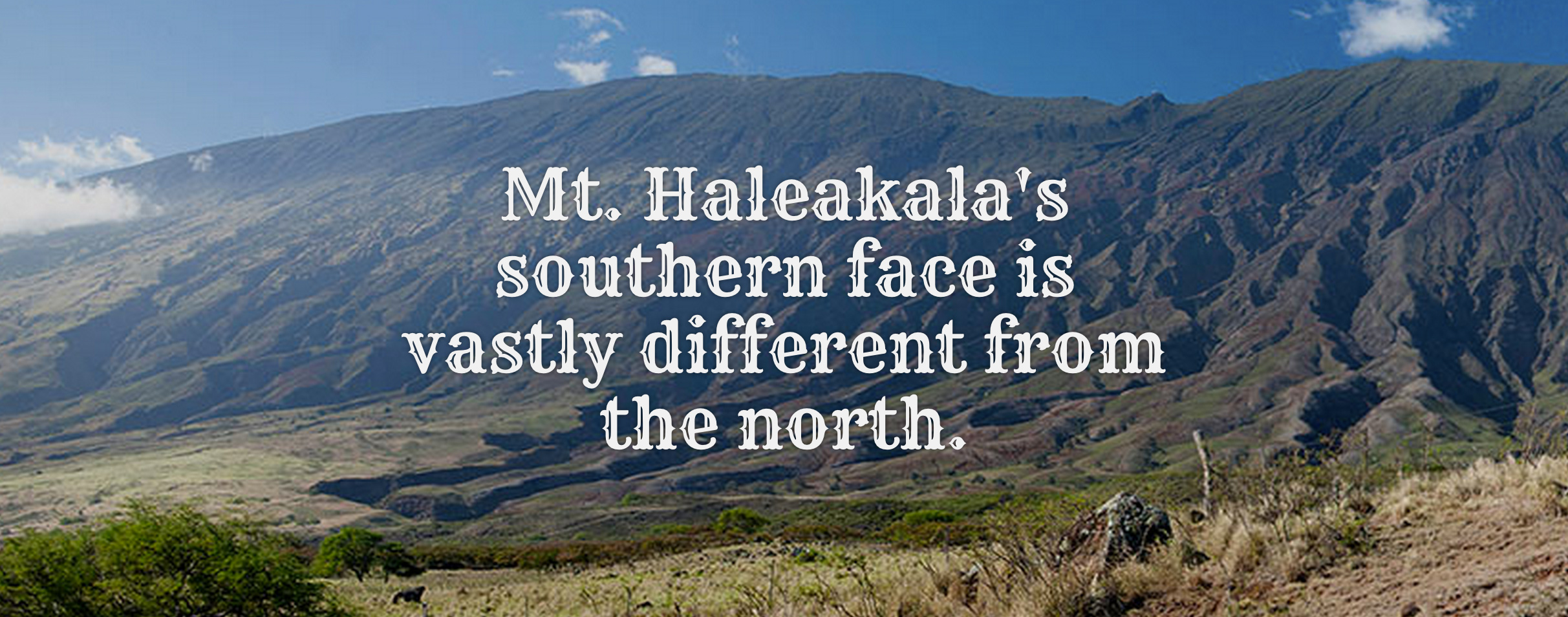
Exercise Preview
Exercise Overview
The first thing you’ll do in this exercise is animate the panorama background photo, so it pans back and forth. You’ll then finish up the layout by making it responsive, so it adapts to any size screen.
-
If you completed the previous exercise, style.css should still be open, and you can skip the following sidebar. If you closed style.css, re-open it now. We recommend you finish the previous exercises (1A–1B) before starting this one. If you haven’t finished them, do the following sidebar.
If You Did Not Do the Previous Exercises (1A–1B)
- Close any files you may have open.
- On the Desktop, go to Class Files > Responsive CSS3 Scrolling Effects.
- Delete the Hawaii folder if it exists.
- Duplicate the Hawaii YouTube Done folder.
- Rename it to Hawaii and if possible, open it in your code editor.
Animating the Panorama Background
Right now we have a very wide image in the panorama segment of the page, and we can only see a small portion of the vista. We want to make the background image scroll slowly from left to right.

We can’t use a transition on this element because we’re not changing between two different states. Instead, we have to create a CSS animation.
-
Scroll down to the bottom of style.css and add the following code at the very end of the document:
@keyframes moving-bg { } -
Define the animation’s starting and ending keyframes by adding this bold code:
@keyframes moving-bg {
   0% {
      background-position: 0;
   }
   100% {
      background-position: 100% 0;
   }
}
The above positions are indicated by X, y coordinates. This code means that the starting position keyframe will be at 0 (the upper left corner of the image), and the ending position keyframe will be at the point when all of the image (100%) has moved to the right. The X position of the image will change from 0 to 100% while the y position remains constant (at zero), thereby achieving the “panning” effect with our very long, narrow background image.
-
Find the .feature-wrap.panorama class (around line 98). Add the background animation to the class with the following bold code:
.feature-wrap.panorama { padding: 10% 0; background-image: url(../img/panorama.jpg); animation: moving-bg 20s linear infinite alternate; } -
A breakdown of the line of code you just wrote:
-
moving-bgis the name of our animation. -
20sis the length of the animation, 20 seconds. -
linearstands for linear easing, ensuring that the animation moves smoothly. -
infinitemeans the animation will repeat infinitely. -
alternatemeans that, once the animation ends, it will repeat in the alternate direction (i.e., go left to right, then right to left) for a seamless look.
-
- Save the file and preview index.html a browser to see the photo behind the Mt. Haleakala text should be moving!
- Return to your code editor.
-
The animation is working in modern browsers, but we can add a -webkit vendor prefixed version to support more (older) browsers. Copy the
animationline of code you just wrote and paste a copy as shown below:.feature-wrap.panorama { padding: 10% 0; background-image: url(../img/panorama.jpg); animation: moving-bg 20s linear infinite alternate; animation: moving-bg 20s linear infinite alternate; } -
Add the -webkit vendor prefix to the first one, as shown below in bold:
-webkit-animation: moving-bg 20s linear infinite alternate;
animation: moving-bg 20s linear infinite alternate;
NOTE: How long you include a -webkit vendor prefixed version of this property will depend on how long you want to support older browsers. For info about browser support refer to caniuse.com/#feat=css-animation
- The keyframes we made are for the non-vendor prefixed animation property. We also need to create keyframes for the -webkit-animation property we just added. Scroll to the bottom of style.css.
- Copy the multiple lines of code for the
@keyframesblock of code. -
Paste the keyframes once below. You should have two identical versions of the following chunk of code:
@keyframes moving-bg { 0% { background-position: 0; } 100% { background-position: 100% 0; } } -
Add the -webkit vendor prefix to the first one, as shown below in bold:
@-webkit- keyframes moving-bg {Code Omitted To Save Space
}
@keyframes moving-bg {
Code Omitted To Save Space
} Save the file and reload the browser. Take a moment to admire your excellent work! You just created a CSS3 animation from scratch!
Disabling the Fixed Background Images on Mobile Devices
In a previous exercise we made the background images remain fixed to the window as we scroll, creating a cool scrolling effect. As we mentioned in that exercise, that scrolling effect won’t work on mobile devices, or can cause display issues on iOS. Let’s see how we can disable that effect on mobile devices.
- Return to style.css in your code editor.
-
Using CSS media queries we can change the styling of elements based on the size of the web browser. Above the first set of keyframes type the following bold code:
@media (max-width: 600px) {

}
@-webkit-keyframes moving-bg {
NOTE: This code is a CSS media query. Any styles placed inside the media query will not be applied, unless the media query is true. This media query means “for any browsers 600 pixels wide or less, use the following styles.” A browser wider than 600 pixels would not use the styles we’re about to code.
-
Add the following bold code:
@media (max-width: 600px) {
   .feature-wrap.photo {
      background-attachment: scroll;
   }
}
NOTE: When two CSS rules target the same element in the same way, they are equally specific. When specificity is equal, a later rule overrides an earlier rule. This rule comes farther down in the code, so it overrides a rule above that sets background-attachment: fixed;
- Save the file and preview it in Chrome (so we can use it’s DevTools).
- Resize the browser window so it’s large (more than 600 pixels) and notice that the photo backgrounds are still fixed to the page as you scroll.
- Resize the browser to be smaller than 600 pixels wide, and notice the backgrounds now scroll along with the page. This will work properly on mobile devices.
- Resize the window as large as you can make it.
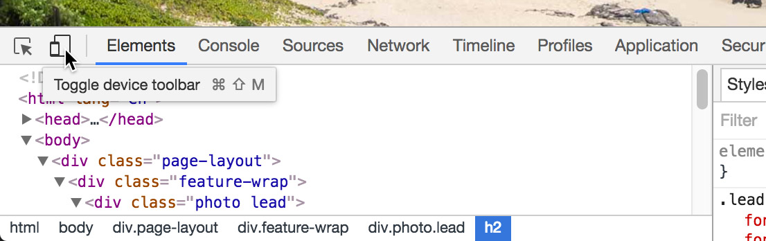
- To open the DevTools, CTRL–click (Mac) or Right–click (Windows) on the page and choose Inspect.
-
As shown below, at the top left of the DevTools window, click the Toggle device toolbar button
 :
:
-
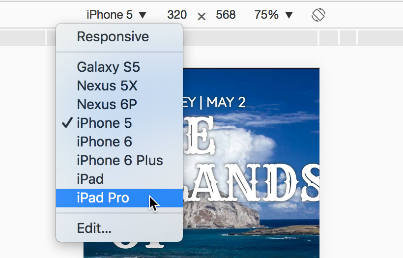
As shown below, at the top left of the emulator you can choose a device. As shown below, choose the iPad Pro.
- Reload the page to make sure it’s displayed properly.
-
Scroll the page to see that the background images are fixed. While it appears to work fine in here, Chrome is emulating the iPad Pro size, not the iOS Safari rendering engine. On the iPad these images will be sized wrong and look bad.
While our CSS media query took care of a large majority of mobile devices, some tablets (such as the iPad) are bigger than the 600px we used and will still have the fixed background attachment (which is a problem on these devices). We could make the media query larger to accommodate them, but the iPad Pro is 1366px when held horizontally. If we make the media that large, we’d disable the scrolling effect for many desktop users who could see it! That’s not a good solution.
CSS can’t differentiate between desktop and mobile devices, so we’ll need to use a bit of JavaScript. Don’t worry if you don’t know JavaScript, we’ve written the code for you!
- Keep the page open in Chrome with the Device Toolbar open so we can reload it after making some changes.
- Switch back to your code editor.
- Open Hawaii > snippets > mobile-detection.html
- Select all the code in the file.
- Copy the code.
- Close mobile-detection.html.
- Switch to index.html in your code editor.
- Find the
<body>tag around line 14. -
Paste the code just below the body tag:
<body>
<script>
   var isMobile = navigator.userAgent.match(/(iPhone|iPod|iPad|Android)/);
   if( isMobile!= null ) {
      document.body.className += ' ' + 'mobile';
   }
</script>
This code detects iPhone, iPod, iPad, or Android devices. If it detects one of those mobile devices, it adds a mobile class to the body tag that we can use to create styles specific to mobile devices.
Detailed Explanation: When you visit a website, a line of text (called a user agent string) is reported to the browser. Our JavaScript searches that text for iPhone, iPod, iPad, or Android. If it finds one, it returns what it finds, otherwise nothing (null) is returned. If it finds one of those devices, we add a mobile class to the body tag. We can then use CSS to target mobile devices with the mobile class added by JavaScript!
- Save the file.
- Return to style.css.
-
Find the .feature-wrap.photo rule (which starts around line 88) and below that add the following bold code:
.feature-wrap.photo {
   background-repeat: no-repeat;
   background-position: center;
   background-size: cover;
   background-attachment: fixed;
}
.mobile.feature-wrap.photo {
   background-attachment: scroll;
}
NOTE: This rule will only be applied if JavaScript detects an iPhone, iPod, iPad, or Android device. If someone has JavaScript disabled, the other CSS rule we created in the 600px media query will still take care a lot of mobile devices.
-
Switch back to Chrome and reload the page.
NOTE: While Chrome does not use the iOS Safari rendering engine, this emulator does spoof the user agent string so the page will think that it’s on an actual iPad Pro (which means our JavaScript should work).
- Try scrolling now, and you should see the background images scroll with the page, so it will now work properly in mobile phone and tablets.
- Close the DevTools window by clicking the X at the top right.
- Reload the page to make sure it’s displayed properly.
Try scrolling again, and if the window is more than 600px wide the background images should be fixed. Now the fixed scrolling effect works everywhere we want it to, and is turned off anywhere it won’t work. Awesome!
Creating Responsive Layouts with CSS Media Queries
The page is looking pretty good, but when the browser window is small, the text is a bit too large. If someone viewed the site on a mobile browser, the headlines might cover too much of the photos. Let’s improve the text sizes based on browser size.
- Return to style.css in your code editor.
-
Above the (max-width: 600px) media query add the following new media query shown in bold:
@media (max-width: 1024px) { } @media (max-width: 600px) { -
Add the following bold code to make the photo highlight text resize in small browser windows:
@media (max-width: 1024px) { .feature-wrap.text { font-size: 2em; } } - Save the file and reload the browser. Scroll down to the panorama or photo stack. View the browser at a small size and then at a size larger than 1024 pixels wide, noticing the responsive changes in text styles.
- While the browser is still narrower than 1024 pixels, take note of the panorama animation you created earlier. It’s now scaled down to a smaller size and doesn’t have very far to pan in either direction. Let’s make the panorama larger at this size.
-
Return to style.css in your code editor and at the bottom of the media query, add the following bold code:
@media (max-width: 1024px) {.feature-wrap.text { font-size: 2em; } .feature-wrap.panorama { padding: 15% 0; } } - Save the file and reload the browser to see the improved panorama at this size.
The zooming YouTube video doesn’t look as great on small browsers, particularly in the “pre-zoom” state when the video is only 40% of the browser’s width. Let’s remove the zooming video from small browsers. - Switch back to style.css in your code editor.
-
Add the following bold code to remove the zooming feature from browsers smaller than 1024 pixels wide:
.feature-wrap.panorama { padding: 15% 0; } .zoom { width: 100%; } } - Save the file and reload the browser. Make the browser window smaller than 1024 pixels wide and notice that the zoom feature disappears. However, the space around the video needs to be fixed. Also, when you hover over the video, the space around it changes. Let’s fix both of these issues.
- Return to style.css in your code editor.
-
Add the following margins to the .zoom rule you just added:
.zoom { width: 100%; margin: 0 25px 0; } -
This should also apply when we hover over .zoom so add the following bold code. Don’t miss the comma after the first .zoom!
.zoom,.zoom:hover { width: 100%; margin: 0 25px 0; } - Save the file and reload the browser. Make sure your browser window is narrower than 1024 pixels wide, then try hovering over the YouTube video to make sure the problem is fixed. Looking good!
- Let’s create more break points with more alternate styles for smaller browsers. Return to style.css in your code editor.
-
Add a new media query before @media (max-width: 600px) with the following bold code:
@media (max-width: 850px) {

}
@media (max-width: 600px) {
NOTE: We make all pages work on mobile devices, but some of the effects are targeted only to desktops. While we could have used a mobile first approach to build this page, we thought it more appropriate to use a desktop first approach because desktop users get most of the effects. In the end it will work on all devices, but the desktop first approach means the media queries will use max instead of min- width and start with large widths and progressively get smaller as you read down the code.
-
This media query will apply only to browsers less than 850 pixels wide. Let’s modify the text size and margins at this break point. Add the following bold code:
@media (max-width: 850px) { .feature-wrap.text { font-size: 1.5em; margin: 0 5%; } } -
Save the file and reload the browser. Make the browser narrower than 850 pixels and notice the subtly smaller text sizes and margins.
While in the browser at this size, take a look at the panorama photo again. Earlier, in the 1024 pixel media query, we specified that the panorama should have more padding to make the image larger. Let’s further increase the padding of the panorama now that we are at 850 pixels or less.
-
Return to style.css in your code editor and add the following bold code:
@media (max-width: 850px) {.feature-wrap.text { font-size: 1.5em; margin: 0 5%; } .feature-wrap.panorama { padding: 20% 0; } } -
The behavior of the photo stack at this size could use refinement. Add the following bold code to the 850 pixel media query, which will refine margins and center the text in the photo stack:
.feature-wrap.panorama { padding: 20% 0; } .feature-wrap.stack.text { width: auto; margin: 0 5%; font-size: 3.5em; text-align: center; } } - Save the file and reload the browser. Make the browser narrower than 850 pixels—but wait! The text in the photo stack has strange margins, and it’s not centered like we wanted. The problem is specificity: we did not match all the exact class names that we defined earlier.
- Return to editing style.css in your code editor.
-
Fix the issue by adding the following bold code, paying special attention to the commas at the end of the first two lines:
.feature-wrap.stack.text,.feature-wrap.stack.text.right,.feature-wrap.stack.text.left{ width: auto; margin: 0 5%; font-size: 3.5em; text-align: center; } - Save the file and reload the browser, resizing the browser window to be narrower than 850 pixels. Take a moment to admire the new centered text on the photo stack!
- Return to style.css in your code editor.
-
At 600 pixels we want the font size to decrease again, and the callout text, rather than being an absurdly narrow column, will occupy the full width of the browser. We already have a media query for 600px, so we can add our styles to it. Add the following bold code to fix the behavior of the callout class:
@media (max-width: 600px) {.feature-wrap.photo { background-attachment: scroll; } .callout { float: none; margin: 0; width: auto; } } - Save the file and reload the browser. Try making the window narrower and wider than 600 pixels and see how the callout column (near the top of the page) changes responsively!
- Return to style.css in your code editor.
-
Let’s create one more rule to make the photo stack text even smaller for browsers under 600 pixels. Add the following bold code:
.callout { float: none; margin: 0; width: auto; } .feature-wrap.stack.text,.feature-wrap.stack.text.right,.feature-wrap.stack.text.left { font-size: 2.5em; } } -
Save the file and reload the browser. Notice the way the photo stack text changes responsively when you resize the browser window!
The webpage is complete but if you would like to continue to use media queries to add even more refinement to the web-font typography at different break points, continue on!
Optional Bonus: More Media Query Refinements
We can fine-tune typography to our heart’s content by using media queries, and here are a few more ways we could refine the page.
- Return to editing style.css in your code editor.
-
Add the following bold code to the 1024px media query:
@media (max-width: 1024px) { .lead h1 { font-size: 3.2em; }.lead h2 { font-size: 1.45em; }.lead h3 { font-size: 0.95em; }.feature-wrap.text { - Save the file and reload the browser. Try resizing the browser window slowly, from a very large window to a very small window, and keep an eye on the way the feature head behaves responsively. No matter the browser size, every viewer will have a customized appearance!
- Return to style.css in your code editor.
- Copy the styles for .lead h1,.lead h2 and .lead h3 that you just typed.
-
Paste them in the 850 pixel media query as follows:
@media (max-width: 850px) { .lead h1 { font-size: 3.2em; }.lead h2 { font-size: 1.45em; }.lead h3 { font-size: 0.95em; }.feature-wrap.text { -
Change the values as follows:
@media (max-width: 850px) {.lead h1 { font-size: 2.4em; }.lead h2 { font-size: 1.05em; }.lead h3 { font-size: 0.75em; } -
Save the file and preview index.html in a WebKit browser (either Safari or Chrome) if you aren’t already.
Resize the browser window. Notice the headings over the lead (first photo) should look better across the various sizes.
Webkit Font Smoothing
We have one final typographic refinement to take care of. Take a quick look at the heading that says THE ISLANDS OF HAWAII. Don’t the letters look a bit fat, especially around the “cut-outs” in the typeface? WebKit browsers automatically make web fonts a bit “chubbier, ” so to make the Rye font on our site look a bit truer to the original, we can change the anti-alias settings.
Return to style.css in your code editor.
-
Find the .lead h1 rule around line 32 and add the following bold code:
.lead h1 {
   font-family: 'Rye', cursive;
   font-weight: 400;
   font-size: 3.6em;
   line-height: 1em;
   text-transform: uppercase;
   margin: 1% 10% 0 10%;
   -webkit-font-smoothing: antialiased;
}
Copy the line of code you just wrote.
-
Find the other place we used the Rye font, in the .feature-wrap.text rule starting around line 119, and paste the code as follows:
.feature-wrap.text { font-family: 'Rye', sans-serif; font-size: 3em; line-height: 1.1em; color: #f1f1f1; text-align: center; margin: 0 25%; text-shadow: 0 4px rgba(0,0,0,0.5); -webkit-font-smoothing: antialiased; } -
Save the file and reload index.html in a WebKit browser such as Chrome or Safari. Take note of what the “cutouts” in the Rye font look like before and after the reload. They should be more noticeable and truer to the original font.
The webpage is now complete, with refined web-font typography and a plethora of exciting CSS3 features!
NOTE: There is some debate as to whether the -webkit-font-smoothing setting should be used. It does not affect all browsers so the type will render differently in Firefox, for example. But type renders differently on Mac vs. Windows, so that’s part of the nature of the web. It’s good to know about, but it’s up to you to decide whether or not you want to use it.
