Get an in-depth understanding of how to create, customize and adjust a repeat grid design in Adobe XD, including changing content, aligning text, arranging objects, and more, with our detailed tutorial.
This exercise is excerpted from Noble Desktop’s past web design training materials and is compatible with Adobe XD updates through 2020. We now teach Figma as the primary tool for web and UX & UI design. To learn current skills in web design, check out our Figma Bootcamp and graphic design classes in NYC and live online.
Topics Covered in This Adobe XD Tutorial:
Creating a Repeat Grid, Customizing the Content, Adjusting the Design
Exercise Preview
Exercise Overview
In designs there are often elements that repeat (a list of users, a grid of products, etc.). XD has a great feature called Repeat Grids that makes designing these elements much easier, as you’ll see in this exercise!

Creating a Repeat Grid
- In Adobe XD, go to File > Open from Your Computer or hit Cmd–Shift–O (Mac) or CTRL–Shift–O (Windows).
- Navigate into Desktop > Class Files > Adobe XD Class > Repeat Grid and double–click on NYC Attractions.xd to open it.
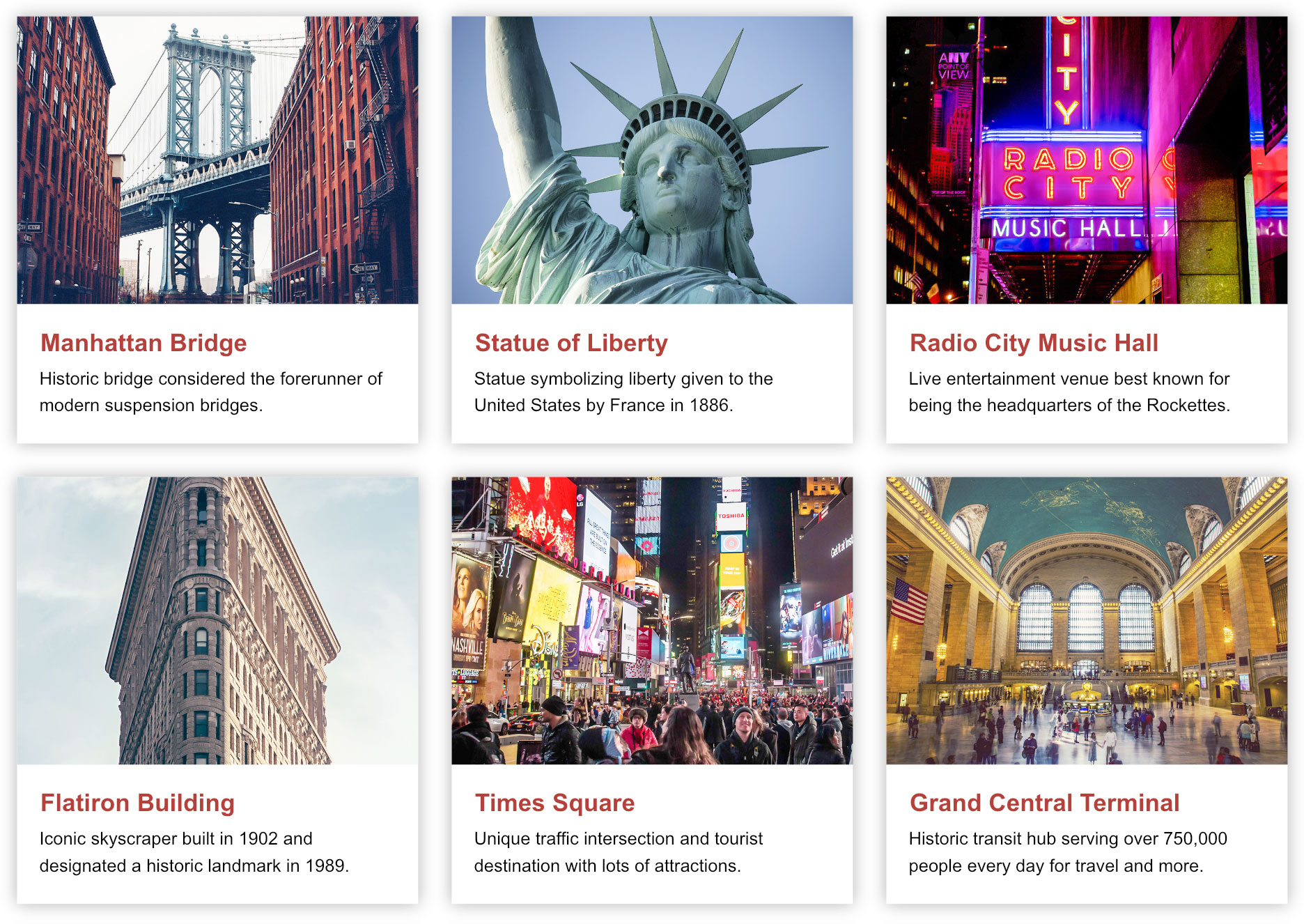
- Notice that below the main column of text is a photo with a heading (Manhattan Bridge) and a short description. This is one of the NYC Attractions we want to feature, but we have 5 more that we’d like to add to create a grid of 3 columns and 2 rows.
- Zoom in so you can see the Manhattan Bridge content, but make sure you can see the full width of the layout grid to its right as well as some space below it.
-
Drag a selection around the three things for the attraction:
- The bridge photo.
- The Manhattan Bridge heading.
- The short description below (Historic bridge considered…).
- In the Property Inspector, click the Repeat Grid button (near the top).
- There are now two handles (one on the right and one on the bottom). Drag the right handle to the right to reveal two more sections of content (you should end up with three sections in total).
- Drag the bottom handle down to reveal a second row. Wow, that was easy!
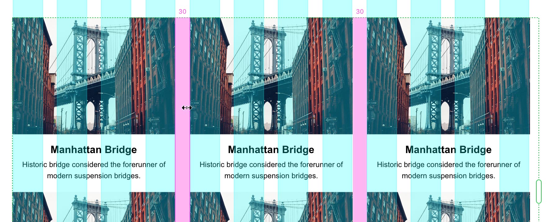
- Let’s change the space between the sections. Hover over the space between the columns so you see a pink highlight.
-
When the column space gets a pink highlight, drag to the right to increase the space so the right side lines up with the last aqua column (as shown below). If you watch the number at the top of the space, it should say 30 to match the layout grid.
-
Let’s adjust the space between rows the same way. Hover over the space under the first row. When you see the pink highlight drag down (or up) until the number on the left says 30 (to match the column spacing).
NOTE: As of this writing, you cannot type in a specific amount for the grid spacing. The only way to adjust it is by dragging.
Customizing the Content
If all the content had to be the same photo and same text this wouldn’t be useful to make a convincing design. Let’s see how we can change the content for each element within the grid.
- The first item will remain the Manhattan Bridge, so let’s edit the second item. In the top row, double–click on the Manhattan Bridge heading in the middle column.
- The text box should be selected, so double–click on it again to make the text editable. (Alternatively you could hit Return (Mac) or Enter (Windows).)
- Type Statue of Liberty and hit Esc to select the text box again.
-
Notice the other elements were not changed, because content can be changed across each item within the grid.
We don’t want to have to manually type in all the headings, so luckily there’s a way to update them all with a single drag and drop! In this design the headings are one text box and the description is another text box. As you’ll see in a moment, that’s important for this to work.
- We must drag and drop the new content from the Desktop. Keep the current file open and visible in XD, but switch to the Desktop (the Finder on Mac or Windows Explorer on Windows).
- Navigate into Desktop > Class Files > Adobe XD Class > Repeat Grid.
- Make sure you can see the Desktop window and one of the sections of the repeat grid at the same time.
-
Notice we have provided two plain text (.txt) files:
- text1-headings.txt
- text2-descriptions.txt
Each file has 6 lines of text (to correspond to the 6 items in our grid). The first line of text will be placed into the first grid item. The second line will be placed into the second grid item, and so on.
- Drag text1-headings.txt onto any of the Manhattan Bridge headings. (The text box in XD will highlight blue so you know you’re targeting the correct element.)
- All headings should now be unique!
- Let’s do this again for the descriptions below the headings. If you switched back to XD, switch back so you can see the Desktop window and XD in the background.
- Drag text2-descriptions.txt onto any of the descriptions below a heading.
- Now all the descriptions should be unique.
- All that’s left is the photos. If you switched back to XD, switch back so you can see the Desktop window and XD in the background.
- In the Repeat Grid folder go into the photos folder.
- Drag 4-flatiron.jpg onto the photo above the Flatiron Building heading.
- Notice that every other photo has been changed. This lets you create an alternating pattern that’s slightly more convincing than all photos being the same. This might be fine for a quick early stage mockup, but we have all the appropriate photos so we can do better.
- On the Desktop, in the photos folder select all the photos (click on 1-manhattan-bridge.jpg and then Shift–click on 6-grand-central.jpg).
- Drag the selected files onto any of the photos in XD, it does not matter which one.
-
Now all the photos should be different, and correct for the text that’s below them.
XD imports the photos in alphabetical or numerical order. We put a number at the beginning of each file (1,2, 3, etc.) so they will import in the proper order.
NOTE: Now that we have customized all the photos, if you drop a single file onto a photo in XD, only that photo will be updated. That’s nice in case you need to change one of the items in the grid later.
- Click on an empty part of the artboard or canvas to deselect the grid and admire your work so far.
Save the file.
Adjusting the Design
Now that we have real content, we can continue to refine the design and all items in the grid will update!
- If the Libraries panel is not already open, at the bottom left of the window click the
 icon.
icon. - Let’s make a couple changes to the text styling. Double–click on any of the headings on the grid to select the heading text box.
- In the Libraries panel, click directly on the red box for the red color swatch (clicking on the name does not work).
-
Notice that all the headings became red.
In repeat grids design changes are global, while content changes are not.
- With the heading text box still selected, hold Shift and click on the description below it so both text boxes are selected.
- In the Property Inspector, click the Align Left button
 .
. -
Click on an empty part of the artboard or canvas to deselect the grid.
Once again all the grid items have updated, changing to left aligned text.
- Zoom to 100% by hitting Cmd–1 (Mac) or CTRL–1 (Windows).
- Let’s make a bigger design change. We want to make each item in the grid look like a card, with a white background and drop shadow. We must go into the grid before drawing the rectangle, so double–click on the Manhattan Bridge heading to select it.
- In the Toolbar select the Rectangle tool
 .
. -
As shown below, drag a rectangle over the Manhattan Bridge photo and text, aligning it with the Bootstrap Grid columns (it should end up being 360px wide). The white box will appear over all the items as you draw!
- With the white box selected, choose Object > Arrange > Send to Back.
- In the Toolbar, choose the Select tool
 .
. - In the Property Inspector, uncheck Border.
- In the Property Inspector, check on Shadow.
- Click on Shadow to open the color picker.
- To the far right of Hex, set transparency to 30%.
- Click on Shadow again to close the color picker.
- Below Shadow, set X:0 Y:0 B:15
- Look closely at the shadow (or lack thereof) on each side of the white box. The shadow is visible on the bottom and right, but missing on the top and left. On the top and left it’s being cropped off by the repeat grid container, but we can fix that.
- With the white box still selected (so we know we’re in the repeat grid), press Cmd–A (Mac) or CTRL–A (Windows) to select all.
- The white box, photo, and two text boxes should now be selected.
-
We need to move it to the right a total of 15 pixels, which is the size of our shadow:
- Hold Shift and hit the Right Arrow key once to move them over by 10 pixels.
- Press the Right Arrow key 5 more times to move them another 5 pixels.
-
We also need to move it down 15 pixels:
- Hold Shift and hit the Down Arrow key once to move them down by 10 pixels.
- Press the Down Arrow key 5 times to move them another 5 pixels.
-
Click on an empty part of the artboard or canvas to deselect the grid and see that the shadow is now visible on all four sides of the first white box.
NOTE: You can also drag them into position, but using keystrokes is more precise. If you move it too far over you’ll end up having a problem with the right/bottom side of the grid cutting off content.
- The content no longer aligns with the layout grid. We can move the whole repeat grid container to fix that. Click once on the grid to select it. (Do not double–click on it to go into the grid!)
- Hold Shift and hit the Left Arrow key once to move it by 10 pixels.
- Press the Left Arrow key 5 times and now the repeat grid should once again be aligning with the layout grid.
- We don’t need to see the layout grid anymore, so let’s hide it. Hit Cmd–Shift–
'(Mac) or CTRL–Shift–'(Windows) to hide the layout grid. - Let’s fix some spacing issues around the text. To select the white box behind Manhattan Bridge, double–click in the area between the photo and the Manhattan Bridge heading.
- With the white box selected, pull the bottom-middle handle down so the space below the text looks like it matches the space between the photo and the heading.
- Click once on the Manhattan Bridge heading to select that text box.
- Hold Shift and click on the description below it so both text boxes are selected.
- Hold Shift and hit the Right Arrow key twice to move them over.
- With the text boxes still selected, drag the right-middle handle in to create some space on the right side of the text.
- Now that an individual card looks good, let’s fix some issues with the grid. Click on an empty part of the artboard or canvas to make sure nothing is selected.
- Click once on the grid to select it. (Do not double–click on it to go into the grid!)
-
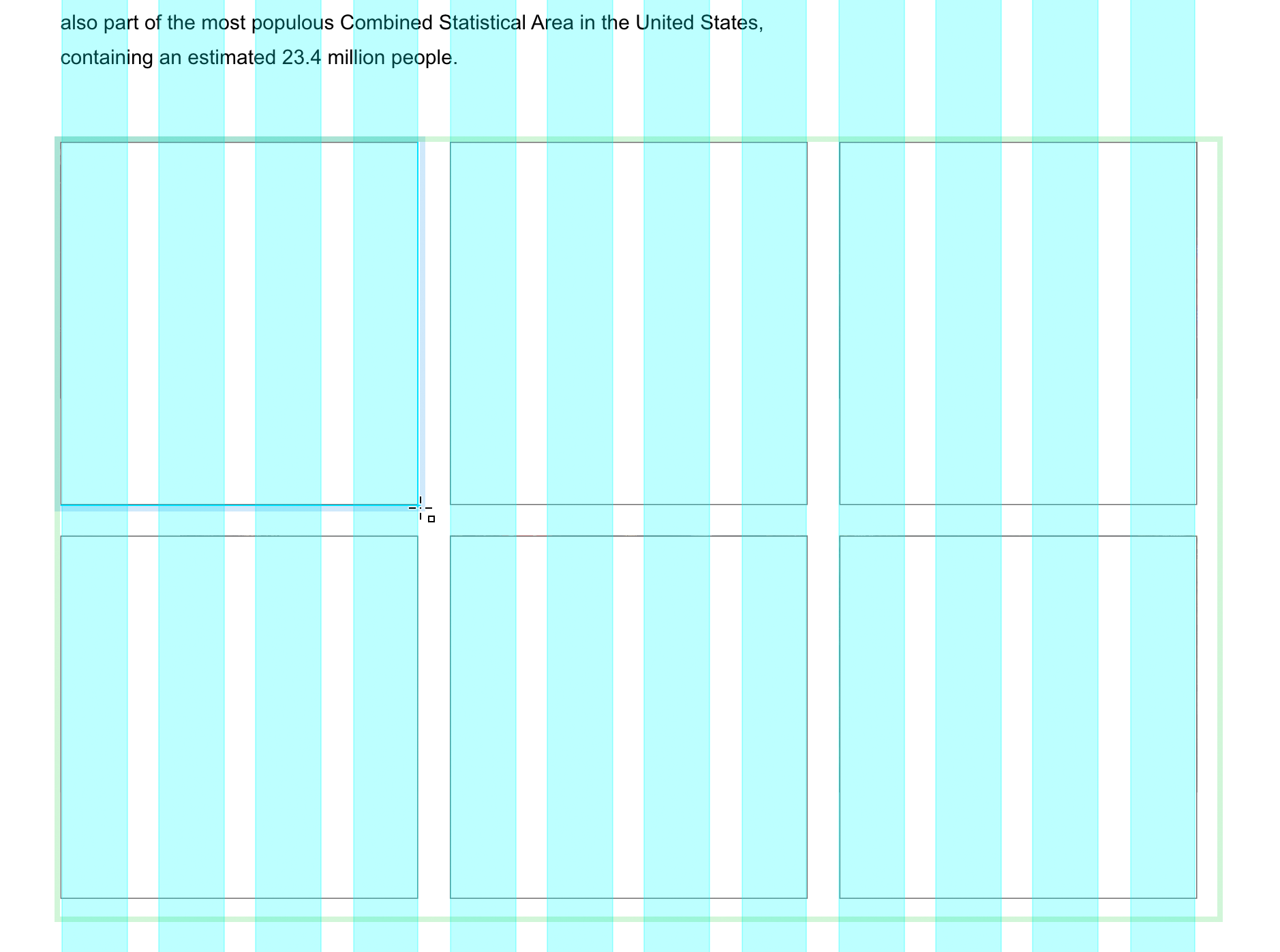
The right side is slightly cut off. Drag the right handle out until you can see all of the third card. Be careful that you don’t drag too far or else:
- You may start to see some shadow from a potential fourth column.
- The Flatiron Building may disappear from the second row, because it moved into a fourth column that you can’t really see.
- Hover over the space below the top row. When you see the pink highlight drag down until the space is 30 (look for the number on the left).
- The bottom is also cut off, so drag the bottom handle until you can see all of the second row (but not too far that you start seeing some shadow from a potential third row).
- Click on an empty part of the artboard or canvas to deselect and admire your work!
Save the file and close it.
