We launched a major website redesign earlier this month and we’d like to share some insights into the process. We’ll be discussing UX improvements, user testing, how to handle lots of content, CSS grid, flexbox, and speed.
A Major Improvement to the UX (User Experience)
We completely overhauled the visual look of the site, but one of the primary goals was to make the site easier to use. The last time we redesigned our website, we taught fewer classes. We simply outgrew that design.
Our previous registration process required multiple screens and was too complicated. We knew we could make it faster and easier, and we've already seen improved conversion rates. You can now see all class dates directly on a class page (at both the top and bottom of the page, so they are easy to find). One click and the class is added to your cart.
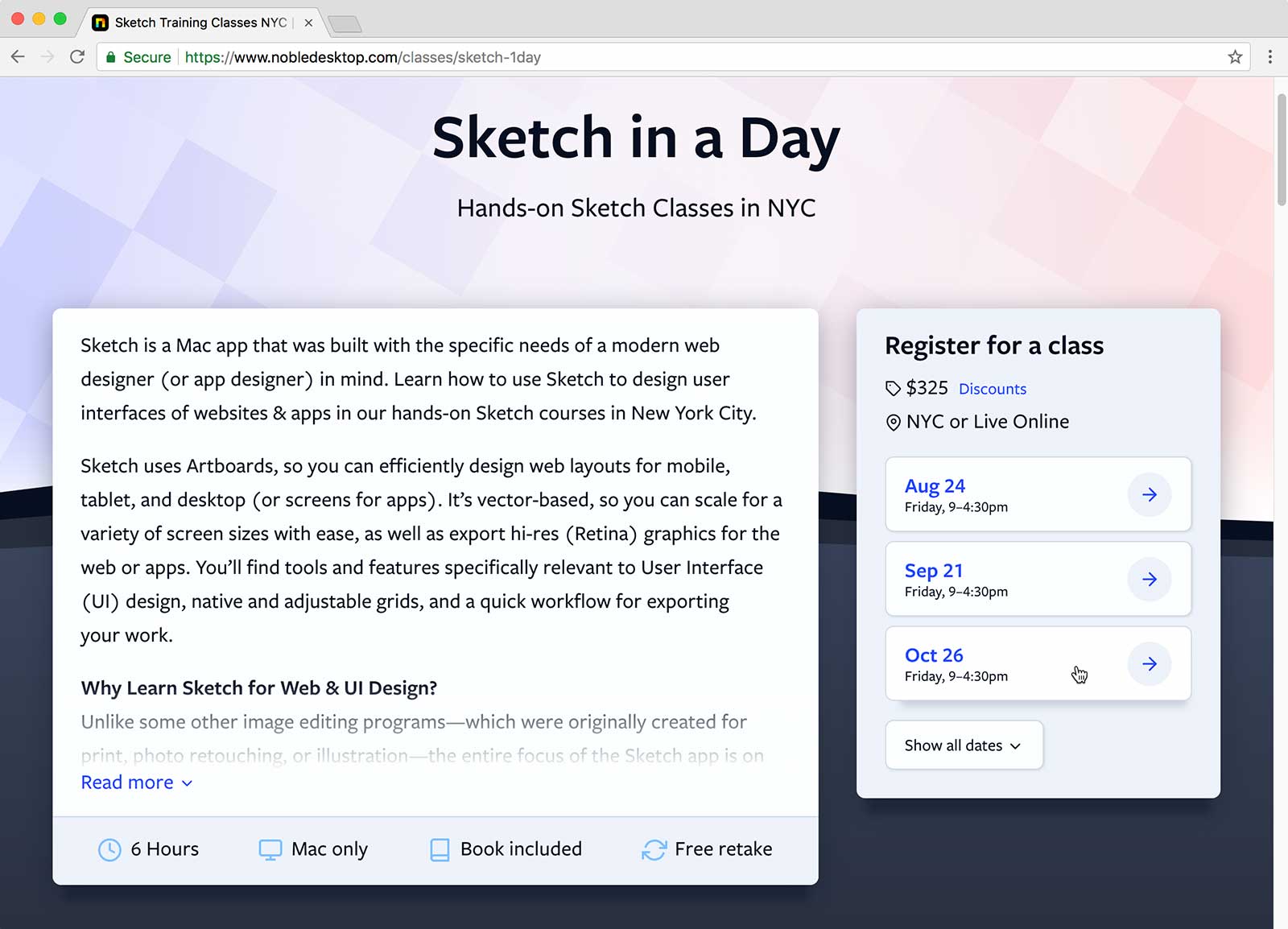
An even bigger improvement is for certificate programs which contain multiple classes. Previously you couldn't see the dates on the certificate page and had to go to another screen to select the certificate program. Now you see all the dates, and one click adds all the appropriate classes to your cart. The results we've seen in just a few weeks prove what we already knew, simple and easy = more conversions.
Insights from User Testing
We invited users (new and previous students) to come into Noble and asked them to perform certain tasks on our website. As we observed them, we learned some interesting things.
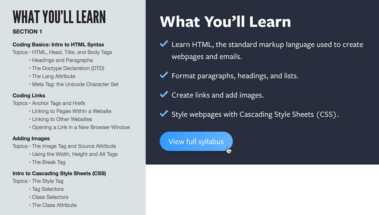
One example, is in our previous design we showed the entire class syllabus. It was very detailed and was overwhelming to some people that didn’t understand all the technical info that it contained. In our redesign, we still provide a link to view all this info (because some people will want to see it), but we condensed the essentials into a much easier to understand bulleted list. This makes the information easier to understand and scan, as well as helping the page from being overwhelmed with too much info.
Another improvement we made based on feedback, was reducing the number of screens and questions asked during the checkout process. We focused on making it faster and easier to checkout.

If you’re not currently incorporating user testing into your design process, we highly encourage you to start. You don’t even know what you’re missing out on.
Handling Lots of Content
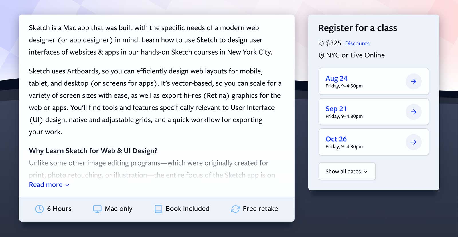
Some times you need a lot of content, both for users and search engines. So how do you have all the content but not overwhelm users, especially on mobile devices where pages can require a lot of scrolling? In our class pages we wanted a place to write a longer class description if needed, but didn't want to make people (especially on mobile) have to scroll to see some of the other useful info lower on the page. We added a “Read more” link to reveal the extra content if people want to read it. We did the same thing with class dates. We show a few of the next class dates, with the option to “Show all dates”.
CSS Grid & Flexbox
For the coders out there, we’re using CSS grid and flexbox where appropriate. This made it easier and faster to build layouts, and do things that would have been much harder without them. Browser support for flexbox is very good. Browser support for CSS grid is not as good, but good enough for us to use it. It works on all modern browsers, except Internet Explorer has partial support with vendor prefixing.
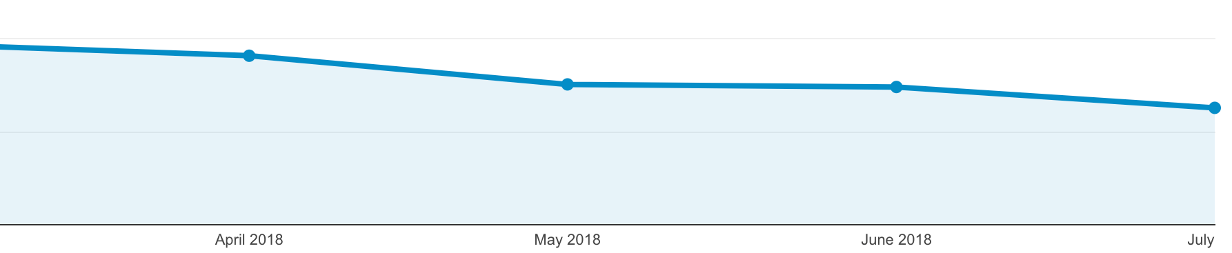
In June 2018 (prior to the launch of our redesign) Internet Explorer was only only 3.59% of our total traffic and that number has been shrinking each month.
Because Internet Explorer (IE) is such a small number of visits, we choose to not focus on it. A lot of the layout doesn't work properly in IE, but the major site features should work. No one has unlimited resources and time, so we had to make a decision. It just didn't make financial sense to put the extra time into supporting a dying browser (Microsoft Edge has replaced IE).
Speed
Starting in this month (July 2018) Google Using page speed in mobile search ranking, so we really focused on getting the site as fast as possible. We reduced the number of files and concatenated (combined) files whenever possible. We also implemented HTTP/2. While HTTP/2 reduces some of the overhead of multiple files, loading fewer files still makes a site load faster. If you want learn more about HTTP/2 read this article.
The worst offenders were remarketing JavaScripts. Two remarketing scripts were making over 30 connections! They only loaded around 100k, but it doubled the number of connections so we removed them. Compared to our previous design, the new pages are a bit bigger total download (because we have more Retina @2x graphics), but because we majorly reduced the number of files we’re loading, total load times have been reduced.
We’re Not Done
We still have more plans for the site, which we’ll roll out as they are completed. Design is iterative, and we will continue improving the site based on user feedback and our own ideas.

