Attention graphic and UX designers! Accessibility is a major, and fast-growing dimension of contemporary communication design.

Why is Accessible Design a Critical Asset in Your Design Skillset?
The coming together of economic, demographic, and technological changes have made it necessary and possible to make sure that blind, deaf, motor impaired, and cognitively-challenged people can access content online. Those changes include the following:
- Many jobs today, especially in countries like the United States, no longer require physical skills that were necessary a generation ago.
- Built-in features in web browsers and video channels read content aloud or provide closed captioning for deaf or hearing-impaired people.
- Society finds it unacceptable to keep blind, deaf, and other disabled people locked out of engagement with web content.
And here’s a big plus: we have all become accustomed to the “collateral” benefits of accessible design. When you are in a loud place watching TV, you rely on closed captioning, whether you are hearing-impaired or not. When you want to dial down the strain on your eyes from reading an article online, you might activate a browser extension that reads a page aloud, even if you are not blind.
All these changes have made stakeholders more aware of the value of insisting that digital graphic designs and user interfaces be accessible to everyone. Accessibility (abbreviated A11y because it has 11 letters) means stakeholders reach more people with products, services, and messages. And there is a growing feeling throughout society that accessible design is the right thing to do.

The “bottom line” here? Learning to create accessible designs is a major, essential component of preparing yourself to get, or advance within a career in UX/UI and graphic design.
So what does that mean? The two most essential elements of accessible design are making content usable by blind or vision-impaired, and deaf or hearing-impaired people.
Designing for Blind / Vision-Impaired Users

Blind and vision-impaired people can get web page text content read aloud to them by browsers. What browsers do not do, by themselves, is interpret illustrations. These two basic realities define the key tasks of graphic designers and UX/UI designers. Those tasks are proper HTML5 semantic markup for everything on a page, and proper alt (alternative) text parameters for images.
Using HTML5 Semantic Markup
Best practice use of HTML5 makes it possible for screen-reader software (or additional hardware like that pictured above) to provide a more coherent audio version of a page. Headings can be given special emphasis when read aloud by a screen reader. Images, forms (and form elements), and tables with rows and columns of data can be read coherently.
Using best practices to code text content includes these techniques you learn in your HTML classes:
- Have only one H1 heading on a page to clearly identify what the page is about.
- Use H2, H3, H4, H5, and H6 headings to convey content hierarchy (so that H2 headings introduce important new themes, H3 headings introduce less important topics, and so on).
- Use semantic elements like header, footer, article, aside, and figure instead of generic to define types of content.
Best practices for form design include:
- Structure form inputs with labels and defining input focus so that form input can be “tabbed” through from a keyboard.
- Use proper input types (like email or number) so that blind or vision-impaired users will get audio clues if there is a problem with what they enter into a form field.
- Use input labels to identify what input is being asked for.
Again, these are techniques you will learn in your graphic design or user interface/user experience (UX/UI) certificate programs, including the ones offered by Noble Desktop.
Best practices for accessible navigation include defining link targets with substance, and avoiding “click here.”
Accessible design for vision-impaired people also includes testing types for color contrast and font size. The contrast between the background color and text color on the one hand, and font size on the other, work together as an equation.
Providing Alt Text
Arguably the single most valuable tool in making web content accessible to blind or vision-impaired people is the conscientious use of the HTML alt parameter to define text that is read out loud. The alt parameter is defined within the HTML image tag.
Alt text should:
- Describe what is in the photo, but only what is in the photo (do not add new additional information).
- Be no longer than 125 characters (as a general rule, there is no technical limit but keeping Alt text to 125 characters or less provides a more fluid reading experience).
- Should not duplicate captions, blind and vision-impaired people will hear the captions in their screen readers.
- Be a simple "" (open and close quotation marks with nothing in between) to indicate a decorative illustration that cannot or need not be translated into text for people who can’t see it.
For example, a blind person reading this article online might hear “A MacBook with lines of code on its screen on a busy desk” when the following image is placed on a page.

BTW, a heads-up to graphic designers who will not be coding HTML: you have an essential role to play in creating alt text. When images are designed (or acquired) for online content, it is important to attach alt text in the earliest stages of design. Trying to figure out alt text for an image as it is being coded in HTML is unnecessarily time-consuming, disruptive to design-to-development workflow, and likely to result in inaccuracies.
Testing for Visual Accessibility
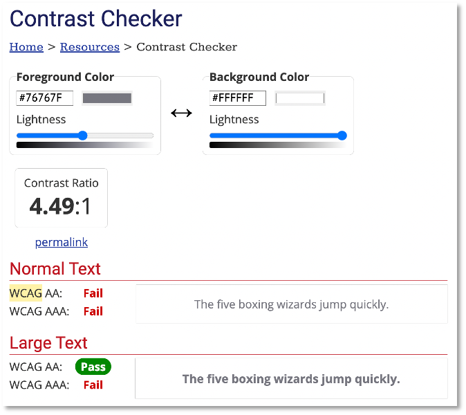
There are many free online tools to test visual accessibility. The WebAIM (Web Accessibility In Mind) site provides an easy-to-use contrast checker tool to determine whether or not a combination of type color, background color, and font size meets different levels of compatibility with Web Content Accessibility Guidelines (WCAG).
For example, the combination of colors shown here meets basic (AA) WCAG standards for larger, heavier type, but not for smaller, lighter type.
Designing for Deaf / Hearing-Impaired Users

The most widely applicable technique for making web content accessible to deaf or hearing-impaired people is closed captioning. As noted in the introduction to this article, closed captioning has the added value of making audio more intelligible to people without impaired hearing, under all kinds of conditions (like noisy environments).
In general, graphic and web designers can rely on their cohorts who produce and deliver video to provide closed captioning. Auto-generated closed captioning, like that provided by YouTube, is better than nothing, but is not very accurate and provides a much less than optimal experience. An accessibility-conscious UX designer will make a case to stakeholders that it is worth the investment to produce an accurate transcript of video content.
Closed captioning and transcripts can provide a readable version of audio or video content. But accessible designers should also assist hearing-impaired and deaf users with other assistance as well.
At the top of the list is avoiding autoplay settings for audio or video. A deaf person reading a page in a coffee shop needs an indication that his or her computer is making noise. Computer operating systems and browsers have settings that disable autoplay sounds, but those features are not fool-proof. So when a stakeholder insists on autoplay, an accessibility-conscious UX/UI designer will make a compelling case for avoiding that.
Beyond Vision and Sound
Deafness and blindness are widely recognized and clearly identifiable disabilities. There is a relatively widespread recognition in society of the need to make content available to blind and deaf people.
But accessible design also includes making content accessible to people with motor skill impairments (who cannot use a mouse or touch screen, for example). Or people with cognitive impairments (like dyslexia or autism). Extending accessible design into these realms is a relatively new frontier. In part two of this series, you’ll learn how graphic and user experience designers can address those needs.


