Explore our detailed tutorial on Mobile and Responsive Web Design, covering topics such as Input types, making CSS background gradients fill the page, and an interactive HTML5 exercise on creating a functional search field.
This exercise is excerpted from Noble Desktop’s past web design training materials. We now teach Figma as the primary tool for web and UX & UI design. To learn current skills in web design, check out our Figma Bootcamp and graphic design classes in NYC and live online.
Topics Covered in This Mobile & Responsive Web Design Tutorial:
Input Types (search & Email), Making CSS Background Gradients Fill the Page
Exercise Preview

Photos courtesy of istockphoto, unizyne, Image #19302441.

Exercise Overview
HTML5 has new input types and attributes that you can use in forms. In this exercise you’ll see how HTML5 input types improve mobile usability.
Search Fields
- We’ll be using a new folder of provided files for this exercise. Close any files you may have open in your code editor to avoid confusion.
- For this exercise we’ll be working with the Flix Forms folder. Open that folder in your code editor if it allows you to (like Sublime Text does).
- Open index.html from the Flix Forms folder.
- Preview index.html in a browser.
- Notice there is an empty white text field in the header at the top of the page. This is a search field, but users don’t know that because it doesn’t say Search anywhere! We haven’t done any styling to it yet, so it’s also not positioned properly. You’ll do that soon, but first let’s make this a more functional search field.
- Switch back to index.html in your code editor.
-
Find the form element, starting on line 18:
<form> <input type="text"> </form> -
Let’s add in some placeholder text. Add the following bold code:
<form> <input type="text" placeholder="Search"> </form> - Save the file.
- Preview index.html in a modern desktop browser such as Safari, Google Chrome, or Firefox, or in a mobile browser. The search box in the header at the top of the page should now say Search inside it (but when you start typing, the Search placeholder text disappears).
-
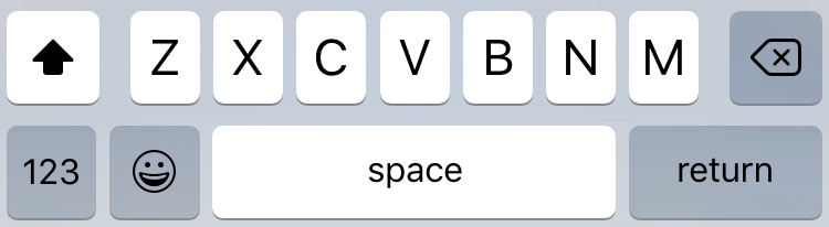
If you can preview in Safari in the iOS Simulator (or an iOS device), click into the search field. As shown below, notice the gray return button in the keyboard (older systems had a Go button). (If the keyboard does not appear, try hitting Cmd–K to open it.)
NOTE: We’re using iOS as an example, but other systems such as Android or Windows Mobile often do something similar.
- Let’s see what happens when we change the type of this field. Switch back to index.html in your code editor.
-
Change the type from text to search as shown below:
<form> <input type="search" placeholder="Search"> </form> -
Notice the
<form>does not have an action specified yet? A working search field would have an action (to connect to some type of back-end functionality). Starting in iOS 8, Safari requires an action for the keyboard to reflect the search type we just set. Add the following bold code to the form tag:<form action="">NOTE: We don’t need to fill in what the action is yet (that can be done later), but we do need the action attribute.
- Save the file.
-
If possible, preview the page in Safari in the iOS Simulator (or on an iOS device). Click into the search field. As shown below, notice that the keyboard now has a blue Search button instead of a gray return button!
Before:
After:
-
The search field now has rounded corners on iOS (shown below on the left) but not on Safari for the desktop (shown below on the right). Adding the search type made Safari on iOS change to rounded corners. We like the rounded corners, and we need to position the search field, so let’s style customize the CSS.

Photos courtesy of istockphoto, unizyne, Image #19302441.
- In your code editor, open main.css from the css folder inside the Flix Forms folder.
-
After the header.logo rule (which starts on line 62) add the following:
input[type="search"] {
   font-size:.75rem;
   float: right;
   border: 0;
   padding:.4em 1em;
   margin-top: 25px;
   width: 120px;
   outline: 0;
   border-radius: 20px;
}
NOTE: Remember how we just added a
type="search"attribute to the search field? This CSS rule uses that attribute to find any form input that’s a search field. We don’t even need to add a class or ID to the element. Save the file and preview index.html in a desktop browser and if possible, the iOS Simulator. It should look better and have rounded corners on all platforms.
Preventing Page Zoom
-
On iOS, when you click into the search field, the page will zoom in a bit if you’re on a smaller screen such as an iPhone 5. (If you have the page open in the iOS Simulator, click into the search field to see this for yourself.)
If you cancel out of the search, you’d have to zoom back out to see the full page. This isn’t ideal, and we can prevent this from occurring. This only happens when the text is smaller than 16px. We styled this field to be 0.75rem, which makes it 12px (16 X 0.75 = 12) which is triggering the zoom.
Go to main.css in your code editor.
-
Around line 68 change the font-size:
input[type="search"] {
   font-size: 1rem;
Save the file. Now iOS will no longer zoom in on the search field. (If you have the page open in the iOS Simulator, reload the page and click into the search field to see this for yourself.)
Styling Placeholder Text
While we’re styling the search field, let’s change the color of the placeholder text.
- We’ve saved the CSS code so you can copy and paste it. In your code editor, open placeholder.css from the snippets folder inside the Flix Forms folder.
- Select and copy all the code.
- Close the file. You should be back in main.css.
- After the
input[type="search"]rule you just added, paste the code. - Save the file and preview index.html in a browser or in iOS Simulator. You should see that the placeholder text is now red.
- Let’s change the color to something that better suits the page. Switch back to main.css in your code editor.
- Change red to
#2ba0eein all three rules you just pasted. - Save the file and preview index.html again to see the new subtle blue color.
Email Fields
- Let’s look at another form. In your code editor, open login.html from the Flix Forms folder.
-
Find the email form label element (starting on line 20):
<label> <div>Email</div> <input type="text"> </label> -
Change the type to email as shown below:
<label> <div>Email</div> <input type="email"> </label> -
Save the file and preview login.html in iOS Simulator or on an iOS device. Click into the Email field. As shown below, notice there is an @ symbol and period which it didn’t have before. This makes typing email addresses easier!
Before:
After:
Fixing the Page’s Background Gradient
While this isn’t directly related to forms, login.html has a CSS gradient issue that we’d like to address.
- Preview login.html in a desktop browser and make the window fairly narrow and as tall as possible. Notice that the radial gradient ends at the bottom of the text and starts repeating down the remaining empty area, similar to the way a background image repeats. We want the gradient to fill the whole page rather than repeat.
- In your code editor, switch back to main.css.
-
On line 14, find the body rule and add the following bold code:
body {
   font-family: Montserrat, sans-serif;
   color: #fff;
Code Omitted To Save Space
background-image: -o-radial-gradient(circle, #215A96,,000); background-attachment: fixed; } - Save the file.
Preview login.html in a desktop browser. The gradient now fills the entire page without repeating. Try resizing the browser window to see that the gradient always fills the entire background as we intended.
