Learn how to utilize Layer Styles in Symbols and Nesting Symbols in this comprehensive Sketch tutorial, and discover how to powerfully enhance your designs with these techniques.
This exercise is excerpted from Noble Desktop’s past web design training materials and is compatible with Sketch updates through 2021. Noble Desktop now teaches Figma as the primary tool for web and UX & UI design. To learn current skills in web design, check out our Figma Bootcamp and graphic design classes in NYC and live online.
Topics Covered in This Sketch Tutorial:
Using Layer Styles in Symbols, Nesting Symbols
Exercise Preview

Exercise Overview
In this exercise, you’ll learn how symbols are even more powerful when you use layer styles within them, and when you nest symbols within other symbols.

Using Layer Styles in Symbols
- In Sketch, go to File > Open Local Document.
- Navigate into Desktop > Class Files > Sketch Class > Pulse and double–click on Symbol Nesting.sketch to open it.
- On the Autumn Collection artboard, select the top left product Distressed Denim Jacket.
-
This is a symbol we made and it contains the following:
- Photo
- Product name and price
- “Add to Bag” button
- Heart icon at the bottom right of the photo
- The heart icon will allow a user to favorite a product, and we’d like to show an example of how this would look on one of these products. If we changed the heart in the symbol it would update all instances, which we would not want. To allow us to change the appearance in only one instance we’ll have to use layer styles.
- Double–click on the Distressed Denim Jacket product photo to edit the symbol.
- Click on a blank area of the canvas to deselect.
- Select the heart icon at the bottom right of the photo.
- We need to create styles for the two appearances this heart will have (selected and deselected). To save the current appearance, in the Inspector on the right, find the menu that says No Layer Style.
- Below that menu click the Create button
 to create a style.
 -
Name it favorite/deselected and hit Return to apply.
NOTE: Adding favorite/ at the beginning will create a favorite folder!
- Now let’s create the selected style. In the Inspector, under Fills, set Hex to #FF,000 and hit Return to apply it.
- In the Inspector, above Fills change Opacity to 100%. (Not the Fill opacity, but the Opacity above the Style area.)
- In the Inspector, click the Create button below the style menu.
- Name it favorite/selected and hit Return to apply.
- We want the deselected style to be the symbol’s default appearance. In the Inspector, click on the style menu (currently says selected) and choose deselected.
- At the top left of the canvas, click the Back to Instance button.
- Select the top right product Ivory Loose Knit Sweater.
- In the Inspector, notice there’s now a Favorite override!
- Click on the menu below Favorite and choose selected.
The heart in the artboard should now be red.
Nesting Symbols
- In the Sidebar, select the Nav Menu artboard.
- Choose View > Zoom To > Selection to make the Nav Menu artboard fill the screen.
- Click somewhere outside the artboard so nothing is selected.
-
In the middle of the artboard, notice there’s an empty space with an icon next to the word Text.
Here we want to make 3 links, each which have a different icon. To do this we can use a symbol, but an important thing to note is that the icon we have here is a symbol. By nesting a symbol inside another symbol we’ll gain some nice flexibility.
- Click once on the icon to the left of Text to select the icon.
- In the Sidebar, rename nav-icon/person to Icon (this will be the name we see later in the Inspector’s Override option for the symbol).
- Drag it above the Text layer so it will be in the correct order in the overrides list.
- Hold Shift and click once on the word Text so both the icon and text are selected.
- In the Toolbar, click the Create Symbol button
 (or choose Layer > Create Symbol).
 -
In the dialog that appears:
- Name it link with icon
- Set the menu below the name to No Layout.
- Check on Send Symbol to “Symbols” Page.
- Click Create.
- We want 3 of these links, so with the symbol still selected on the artboard go to Arrange > Make Grid.
-
In the Inspector, set the following:
- Cells: 1 and 3
- Spacing: 0 and 20
Click Finish when done.
- The top of these 3 links should still be selected. In the Inspector’s Overrides section, below Text type Sign In and hit Return.
- On the artboard, double–click on the second link’s text and type in Saved Items.
- On the artboard, double–click on the third link’s text and type in Your Store.
- Click once on the second link Saved Items.
-
In the Inspector’s Overrides section, click on the menu below Icon and:
- Notice there are 3 icons (heart, map-pin, and person) we prepared for you.
- Choose heart.
- Notice on the artboard that the heart is short and looks distorted. That’s because it’s artboard is not the same size as the original symbol. Let’s fix that.
-
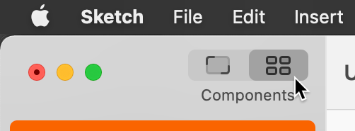
At the top-left of the Toolbar, click on the Components button
 .
.
- In the middle of the Toolbar, click on the Symbols
 .
. - Double–click on the person symbol to edit it.
- You’ll now be on the Symbols page with the person symbol selected. In the Inspector notice the W (width) is 16 and H (height) is 18.
- Zoom in and scroll down to the nav-icon/heart symbol artboard below.
- Click on the artboard name nav-icon/heart to select it.
- Notice the width is the same, but the height is different.
-
Change H to 18 so it matches the other icon.
The nav-icon/map-pin symbol is already the correct size, so we don’t have to do anything to it.
- At the top-left of the Sidebar, under Pages click on Screens.
- Notice the heart icon for Saved Items should now look better (it’s not squished up).
- Select the Your Store link.
- In the Inspector change the Icon to map-pin.
- Click somewhere outside the artboard so nothing is selected.
Save the file and close it.
