Delve into this comprehensive Sketch tutorial, covering topics from creating a new file to importing text, and learn how to navigate grid systems for optimal design and coding efficiency.
This exercise is excerpted from Noble Desktop’s past web design training materials and is compatible with Sketch updates through 2021. Noble Desktop now teaches Figma as the primary tool for web and UX & UI design. To learn current skills in web design, check out our Figma Bootcamp and graphic design classes in NYC and live online.
Topics Covered in This Sketch Tutorial:
Creating a New File, Inserting Artboards, Setting up a Layout Grid, Creating Colored Backgrounds for Text, Importing Text
Exercise Preview
Exercise Overview
Designers often use grids to help align elements and create a consistent visual structure for the layout. Web developers often use a grid system to code the website. While grids are not required, they are especially helpful when designing responsive sites (sites optimized for mobile phones, tablets, and desktops). Grids can streamline the workflow so the design is easier to create, and then easier to code.

In this exercise, you’ll learn how to start a new Sketch file and create a custom grid. Then you’ll use a pre-made Bootstrap grid (a popular grid system) to create a simple 2-column layout.
Creating a Blank New Sketch File
-
Launch Sketch.
NOTE: This book has been tested with Sketch 83.2 on macOS Big Sur. If you’re using an older or newer version, most things should still work the same or similarly. Sketch has an updated interface for macOS Big Sur. On older systems it will look a bit different, and we’ll do our best to note those differences.
- Choose File > New (or hit Cmd–N).
In macOS Big Sur & later only: The toolbar at the top of the window defaults to an icon only view. Let’s add text labels to make it easier to know what each button does. Right–click (or Control–click) anywhere on the toolbar (that goes across the entire top of the window) and choose Icon and Text.
-
To get started we need to add an artboard. In the Toolbar at the top of the window, on the left click the Insert button
 and select Artboard.
NOTE: The Insert button and the Insert menu do essentially the same thing.
- The panel on the right is called the Inspector. At the top of the Inspector there’s a menu of preset categories. From that menu choose Apple Devices.
- You should now see a list of Apple device presets, so click on iPhone 13.
- In the Toolbar, click the Insert button and choose Artboard.
- In the Inspector on the right, click on iPad 10.2
". - Let’s insert one last artboard, this time with a keystroke. Press the A key.
- At the top of the Inspector, go into the presets menu and choose Responsive Web.
- Click on Desktop.
- We want a slightly wider size than this preset, so keep the artboard selected. If you deselected it, go to the Sidebar (on the left) and click on Desktop.
-
In the Inspector on the right, change W (Width) to 1280 and hit Return.
NOTE: All measurements in Sketch are in pixels, which is what we use in web and UI design. 1280 pixels is a common width for small desktops.
Setting up a Layout Grid to Design on
- Make sure the Desktop artboard is still selected. If it’s not, you can select it in either the canvas or sidebar (the panel on the left of the screen).
- Choose View > Zoom To > Selection to make the Desktop artboard fill the screen.
-
To show the layout grid, choose View > Canvas > Show Layout.
Grid systems typically have specific gutter amounts and column widths. If the web developer you’ll be working with is using a particular grid system, it’s best to use a matching grid. For our design we’ll use the popular 12-column Bootstrap grid. To learn more about it visit getbootstrap.com/docs/4.5/layout/grid
-
Let’s customize our grid to match Bootstrap’s desktop-size grid. Choose View > Canvas > Layout Settings.
TIP: You can also click the Toolbar’s Zoom percentage (in macOS Big Sur) or the View button
 (in prior versions of macOS) and choose Layout Settings.
 - Make sure Columns is checked.
- Make sure Rows is NOT checked.
-
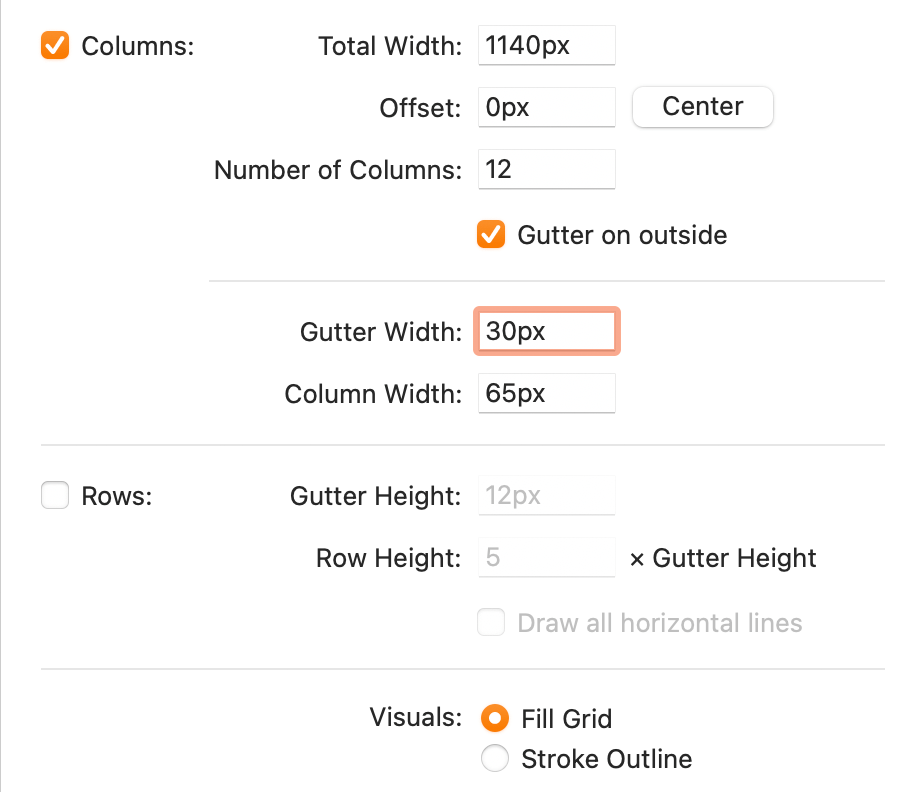
Set Total Width to 1140px.
Page Versus Container Width
Bootstrap’s grid (onto which we place content) is 1140 pixels wide for desktops, with 30px gutters (15px on each side of a column). Our artboard is 1280 pixels wide (a common small desktop). We want some empty space around the content, so a content area of 1140px fits comfortably into a 1280px wide screen.
-
Set Number of Columns to 12 if it isn’t already.
NOTE: Text and images will usually span multiple columns in the grid, so it’s important for the total number of columns to be easily divisible. 12-column grids are popular because designs are usually broken down into 2,3, or 4 columns. When a grid is 12 columns wide, it can be easily divided in half, thirds, or fourths.
- Click the Center button (so the grid will be centered based on the new width).
- Set the Gutter Width to 30px and hit Tab. (The Column Width will automatically be recalculated for you.)
-
You should end up with the settings shown below (ignore the Offset value because the Center button positioned it properly regardless of that number):
- Click Confirm.
- To scroll around, hold the Spacebar (so the cursor becomes a hand
 ) and drag to scroll.
 We’re done with this file and won’t be using it. Close the file and don’t save (Delete) any changes if it asks.
Starting a Simple Layout
To save you time and work, we have prepared a file for you that has the mobile and tablet grids set up.
- Hide or minimize Sketch, so you can see the Desktop (Finder).
- Go into Class Files > Sketch Class and click once on Bootstrap 4 Grid Template—Phone, Tablet, Desktop.sketch to select it.
- Hit Cmd–D to duplicate it.
- Rename the copy to yourname-About Page.sketch
- This page is about NYC, so drag it into the NYC folder.
- Go into the NYC folder and double–click yourname-About Page.sketch to open it.
- Choose View > Zoom To > Fit Canvas, to see all three artboards.
-
Notice there are artboards (and Bootstrap’s grid) for phone, tablet, and desktop.
Dan Rodney, a Noble Desktop instructor, created this Bootstrap 4 grid Sketch file. His template (and future updates) are available at danrodney.com/blog/sketch-bootstrap4-grid where he also includes a version with all 5 screen sizes (although you typically don’t need them). For more info about Bootstrap’s different grid sizes, see the sidebar at the end of the exercise.
- Let’s set a background color for all of the artboards. The left panel is called the Sidebar. In the Sidebar, click on the Phone artboard.
- In the Sidebar, Shift–click on the Desktop artboard to select all 3 artboards.
- In the Inspector on the right, check on Background color.
- Click on the color box
 to open the color picker.
 - Set Hex to 77aadd and hit Return to apply it.
- To close the color picker, press Esc or click anywhere outside it.
- Click on a blank area of the canvas or Sidebar to deselect the artboards.
- Let’s start with the desktop design. In the Sidebar, select Desktop.
Go to View > Zoom To > Selection.
Designing Colored Backgrounds for Text
The desktop will have two columns: a main column on the left and a sidebar column on the right. Let’s create background colors for them, starting with the sidebar.
-
We want to see both the layout columns and red guides in between the columns:
- If you don’t see the shaded layout columns, choose View > Canvas > Show Layout (or hit CTRL–L).
- If you don’t see red guides in between the columns, choose View > Canvas > Show Rulers (or hit Control–R).
-
Text and image content typically aligns with the columns. Backgrounds (such as colors, patterns, or photos) typically aligns at the midpoint between those columns. This template has red guides marking those midpoints.
The gutters (empty space between the grid’s 12 columns) are 30 pixels, so there’s 15px from the column to the center gutter guide. This will provide some nice padding around the text we’ll add a bit later.
- Hide the layout columns, by choosing View > Canvas > Show Layout (or hitting CTRL–L).
- In the Toolbar, click the Insert button and select Shape > Rectangle.
-
As shown below, starting from the rightmost red guide, draw a rectangle that spans 3 columns. The top and bottom do not have to perfectly match the screenshot.
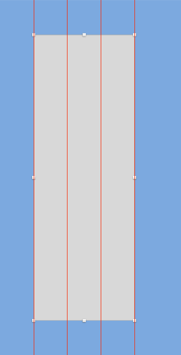
- In the Inspector, under Borders uncheck the checkbox next to Color.
- Under Fills, click the color box to open the color picker.
- Choose white and hit Esc to close the pop-up.
- Set Opacity (to the right of the Fill color) to 50% and hit Return to apply it.
- In the Sidebar double–click on Rectangle and rename it to sidebar bg.
- Let’s create the main column on the left, filling the remaining columns. Click the Insert button and select Shape > Rectangle.
-
Drag out a rectangle from the edge of the sidebar, over to the leftmost red guide (matching the height of the sidebar):
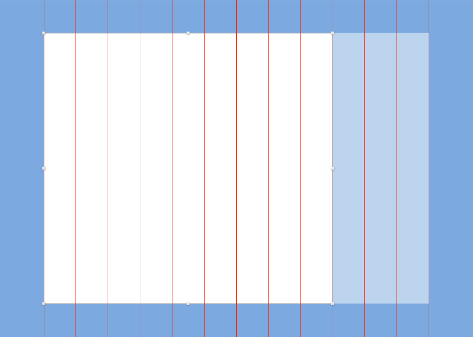
- In the Inspector on the right, under Borders, uncheck the checkbox next to Color to get rid of the border.
- Under Fills click the color box and choose white.
- Hit Esc to close the pop-up.
- In the Sidebar double–click on Rectangle and rename it to main col bg.
Do a File > Save.
Importing & Styling Text
Let’s add text over these column backgrounds, starting with the white main column.
- Hit CTRL–R to hide the rulers (guides).
- Hit CTRL–L to show the layout columns.
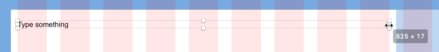
- In the Toolbar, click the Insert button and choose Text.
- Click anywhere on the main area’s white background to place the text. Don’t worry about being exact, we’ll position and resize it later.
-
With the text selected, set the following in the Inspector:
Typeface: Arial (double–click it to close the font menu) Weight: Regular Size: 16 Color: Click the color swatch and choose Black Character: Keep the default auto value. If there’s already a value there, delete it. Line: Keep the default grayed out value, which is based on the type size. Paragraph: 0 Alignment: Left 
NOTE: The above measurements are in pixels. Line is the same thing as line-height in CSS, or leading in print design.
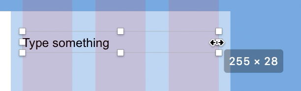
- We need to select text box so we see the resize handles. Click off the text box, and if it’s no longer selected, click again on the text box so you see the resize handles.
- We want this text box to fill all the columns in the main area’s white background. Start by dragging the text box so its left edge aligns with the first column’s left edge.
-
As shown below, drag the text box’s right resize handle so it snaps to the right edge of the last column in the main area’s white background.
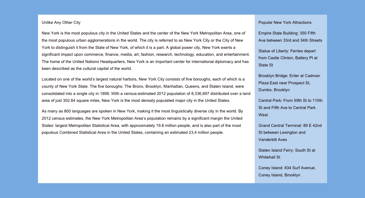
- We have the text for this column saved in a text file. Hide or minimize Sketch, so you can see the Desktop (Finder).
- On the Desktop, go into Class Files > Sketch Class > NYC and open NYC text—main.txt.
- Hit Cmd–A to select all the text, then copy it (Cmd–C).
- Close the file and go back to yourname-About Page.sketch in Sketch.
- Double–click on the text box to highlight some of the text in it.
- Hit Cmd–A to select all the text.
- Hit Cmd–V to paste the text. The height of the text box will adjust to fit the text.
- Press Esc to highlight the text box (instead of highlighting the text in the box).
- The line spacing is too tight. In the Inspector, set Line to 28.
-
Set Paragraph (spacing) to 14.
NOTE: Paragraph spacing is the space below a paragraph (margin-bottom in CSS).
- To create another text box, click the Insert button and select Text.
- In the sidebar area, click anywhere to place a text box.
- In the Inspector, notice that all the text settings except Line (line-height in CSS) have carried over from the previous text box. Convenient!
- Change Line to the setting we used previously: 28.
- Drag the text box so it vertically aligns with the top of the text in the main column, and aligns with the leftmost column in the sidebar (the 3rd column from the right).
-
As shown below, resize the text box so it spans the three grid columns in the sidebar:
- Let’s get the sidebar text we prepared for you. Switch to the Desktop.
- Open NYC text—sidebar.txt (in Class Files > Sketch Class > NYC).
- Hit Cmd–A to select all the text.
- Copy it (Cmd–C).
- Close the file and go back to yourname-About Page.sketch in Sketch.
- With the sidebar text selected (so you see the resize handles), hit Return to highlight the text.
- Hit Cmd–V to paste the text.
- Hit CTRL–L to hide the columns.
- Click on a blank area of the Desktop artboard so nothing is selected.
- To see the design at 100% (the size it will be in a web browser), go to View > Zoom To > Actual Size.
That’s it for now. Do a File > Save.
Working with Pages
Sketch files can contain multiple pages. Each page is a different canvas, onto which you add artboards. All pages can access shared assets such as styles and symbols (which you’ll learn about later). When designing a website/app with multiple pages/screens, you can use Pages to organize your file.
- At the top of the Sidebar are Pages. To the right of Pages click the plus button
 to add a new page.
 - Notice the new page is a blank canvas (where you’d add artboards).
-
If the pages section is collapsed you’ll see a menu, as shown below:
To expand the pages section, click the arrow
 next to the plus button, so you can see all pages:
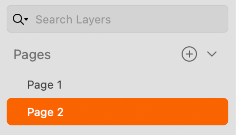
Click on Page 1 to see that your artboards are still there.
To rename a page, double–click on the page’s name.
To delete a page, Right–click (or Control–click) it and choose Delete Page.
Bootstrap 4 Grid Sizes
Below are the sizes for Bootstrap 4’s grid across various screen sizes and devices. The Gutter Width is always 30px (15px on each side of a column).
Extra Small <576px Max Container Width: None (full width of device)
Small Devices ≥576px Max Container Width: 540px
Medium Devices ≥768px Max Container Width: 720px
Large Devices ≥992px Max Container Width: 960px
Extra Large Devices ≥1200px Max Container Width: 1140px
