Learn how to adapt your desktop-sized designs for smaller screens like tablets and mobile phones with this comprehensive Sketch tutorial that covers Bootstrap’s grid, adapting for tablets and mobile phones, and more.
This exercise is excerpted from Noble Desktop’s past web design training materials and is compatible with Sketch updates through 2021. Noble Desktop now teaches Figma as the primary tool for web and UX & UI design. To learn current skills in web design, check out our Figma Bootcamp and graphic design classes in NYC and live online.
Topics Covered in This Sketch Tutorial:
Designing with Bootstrap’s Grid, Adapting the Design for Tablets, Adapting the Design for Mobile Phones
Exercise Preview
Exercise Overview
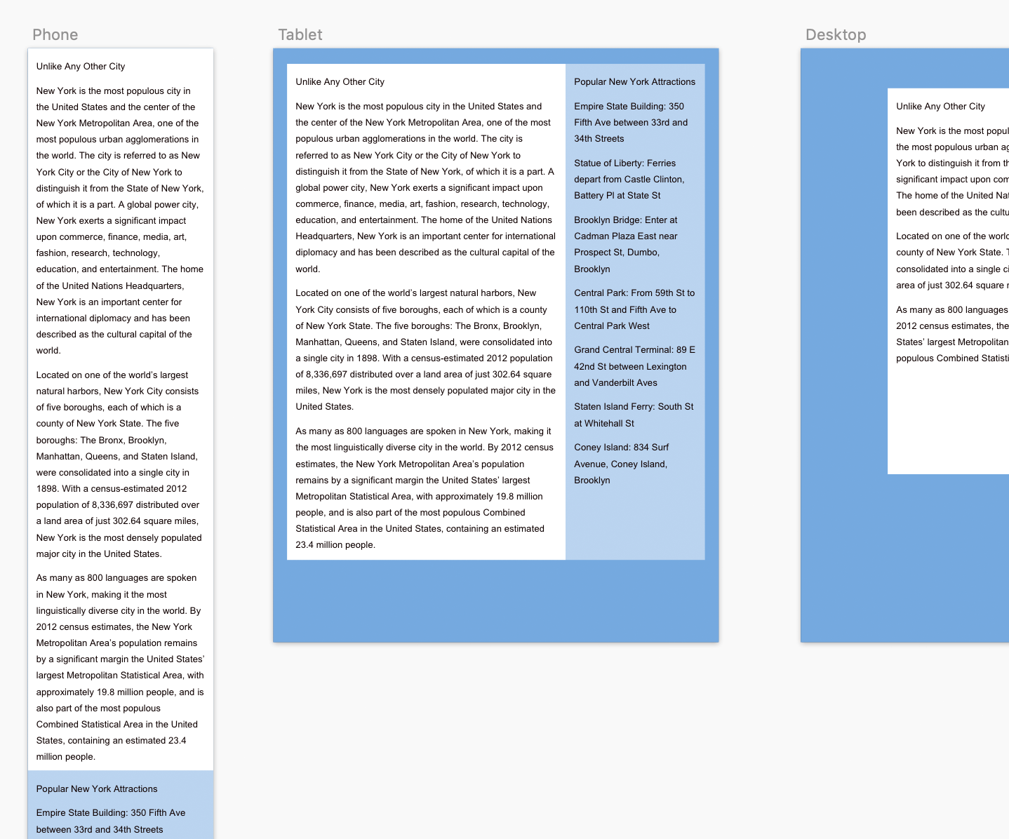
In this exercise, you’ll learn how to modify a desktop-sized design for smaller screens such as tablets and mobile phones.

Comparing Bootstrap’s Desktop, Tablet, & Mobile Grids
In the previous exercise, we used a pre-made Bootstrap template to lay out a desktop design. Let’s take a look at the tablet and mobile phone grids so we can compare them to the current desktop design.
- In Sketch, close any files you have open.
- In Sketch, go to File > Open Local Document.
-
Navigate into Desktop > Class Files > Sketch Class > NYC and double–click on About Page—Ready for Tablet & Mobile.sketch to open it.
NOTE: This file should look just like the one you’ve been working on in the previous exercise. We’re using this file just in case you played around with your design and did something different.
- Compare the Desktop and Tablet artboards. If you can’t see both of these layouts, hold Spacebar and drag to pan around the file.
-
Notice that the columns are narrower in the tablet size, but the gutters (space between columns) are the same width.
NOTE: The Tablet artboard is designed for a screen size of 768px or larger. The content container is 720px wide.
-
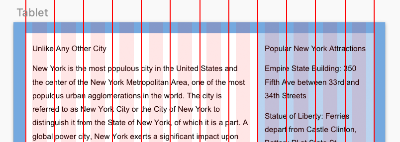
Compare the Tablet and Phone artboards. Whoa, pretty different! Multiple columns typically don’t fit onto small screens. Most things on the phone will be one column, although we’ve included two column guides which can sometimes be useful.
NOTE: Bootstrap’s grid for mobile phones is for extra small devices that are less than 576px. This Phone artboard is 320px wide, the width of an iPhone SE.
Adapting the Design for Tablets
The sidebar spans 3 columns on the desktop, but that’s a bit small for the tablet layout. Grid systems don’t require elements to span the same amount of columns across screen sizes. So on the tablet we’ll make the sidebar span 4 columns.
-
Let’s copy over the elements from the Desktop artboard. To see both artboards:
- In the Sidebar on the left, click on Tablet.
- In the Sidebar, Shift–click on Desktop.
- Go to View > Zoom To > Selection. You should only see the two artboards.
- Click on a blank area of the canvas to deselect both artboards.
-
As shown below, on the Desktop artboard drag a selection box over the sidebar text and background color by starting a drag outside the elements, and dragging until the selection box touches the background and text:
NOTE: At any point during this exercise, feel free to zoom in or out as needed using Cmd–Plus(+) or Cmd–Minus(-).
- Hit Cmd–C to copy the two elements.
- In the Sidebar, click on the Tablet artboard to select it.
- Hit Cmd–V to paste. It will be pasted in the center of the artboard.
- Hit Cmd–0 (View > Zoom To > Actual Size) to see the design at actual size.
- We need to see the red guides that mark the midpoint between the columns. If you don’t see the ruler guides, hit CTRL–R (View > Canvas > Show Rulers).
- If you don’t see the shaded column guides, hit CTRL–L (View > Canvas > Show Layout) to show them.
-
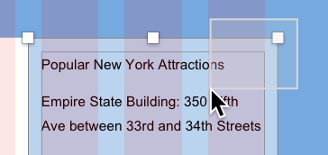
As shown below, align the sidebar’s right edge with the rightmost red guide. The top position is up to you, but refer to the image as a guide.
- Click on a blank area of the canvas to deselect.
- Let’s resize the background. Reselect only the sidebar bg.
-
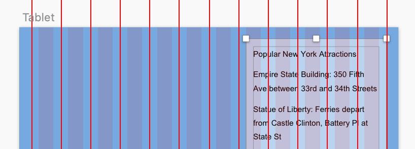
As shown below, drag the background color’s left-middle handle inward until it snaps to the 5th from right red guide:
- Click on the sidebar’s text to select it.
-
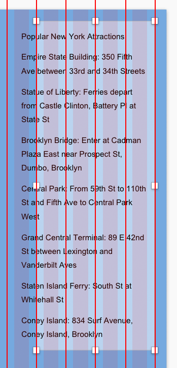
Grab the text box’s bottom-left handle and bring that in (and down) until it snaps to the column within the background color (and reveals all the text at the bottom). Don’t worry about the background color being too short. We’ll fix that soon.
- If you can’t see the Desktop artboard, scroll to it by holding Spacebar and dragging. If you have a trackpad, you can also use a 2-finger drag to scroll.
- On the Desktop artboard, drag a selection over the white background and its text so both elements are selected.
- Hit Cmd–C to copy them.
-
To paste the items onto the Tablet artboard:
- Scroll over to the Tablet artboard if needed.
- Select one of the sidebar elements on the Tablet artboard, or click on the word Tablet above the artboard (or in the Sidebar).
- Hit Cmd–V to paste.
Now you can really see how much smaller the Tablet artboard is.
-
As shown below, align the left edge with the 1st red guide. You will see a horizontal red guide at the top when you are aligned with the top of the sidebar hiding in back.
- Click in an empty area of the canvas to deselect the elements.
- Click on the main column’s white background to select it.
- Pull the background’s right-middle handle inward until it snaps to the edge of the sidebar’s background (at the 5th red guide from the right).
- Select the main column’s text box.
-
Drag the text box’s right-middle handle in until it snaps to the rightmost column in the white background area (the 8th column) so you end up with a layout like this:
- On the Tablet artboard, the main text column is not showing all its text, so pull its bottom-middle down until you can see all the text.
- On the Tablet artboard, the two background rectangles are a bit short. On the artboard, click on the main column’s white background to select it.
- Shift–click on the sidebar’s light blue background so both are selected.
- Drag the bottom resize handle down so they end a bit below the text. (If automatic snapping is not letting you get your desired size, disable Smart Guides by choosing View > Canvas > Show All Guides. Just be sure to turn it back on when you are done.)
-
Hit CTRL–R and CTRL–L to get a better look at your work.
NOTE: If you think the padding on the left and right is a bit tight, this is the least amount of padding you’d see. Larger screens will have the same width content area, but more space on the left/right sides. Padding amounts in pre-built grid systems are predefined, and you may or may not be able to customize them. You can create your own grid settings or customize the sizing of pre-made grid systems. To keep things simple, we used Bootstrap’s predefined grid.
Do a File > Save (Cmd–S).
Adapting the Design for Mobile Phones
Multiple text columns don’t fit on small screens, so we can make the mobile layout a single column, with the white main column on top.
- In the Sidebar, click on Phone, then Shift–click on Tablet.
- Choose View > Zoom To > Selection.
- Click on a blank area of the canvas to deselect both artboards.
- To fit all the content, we’ll need to make the Phone artboard taller. At the top left of the artboard click on the word Phone to select the artboard.
- Grab the bottom resize handle and drag it down a little. Visually resizing can be nice, but we need a lot more space. Let’s type in a larger height.
- In the Inspector on the right, set H (Height) to ,000 and hit Return.
- Creating the Phone layout would be the same process of copy, paste, and adjust. You just did that, so we won’t make you do it again (although you can if you want).
- Save and close the file.
Is Stacking Elements the Best Solution?
It’s easy to think that mobile layouts should just be a stack of the same elements that appear as columns on larger screens. That may not always be the best design for users though. That can lead to very tall mobile layouts. Will users scroll down to see potentially important info?
There are alternatives to stacking. Sections could be collapsed for easy scanning (a tap could reveal more info). Multiple photos could merge into a slideshow. We’re not saying those are always the proper solutions either, but just some examples to get you thinking. Think about how users will interact with your content to decide what’s best for mobile, tablet, and desktop users.
