Boost your Figma prototyping skills by learning how to add a hover state to a button and open a pop-up using an overlay in this step-by-step tutorial.
This exercise is excerpted from Noble Desktop’s Figma training materials and is compatible with Figma updates through 2023. To learn current skills in Figma with hands-on training, check out Noble Desktop's Figma Bootcamp, web design classes, and graphic design classes in-person or live online.
Topics Covered in This Figma Tutorial:
Adding a Hover State to a Button (Using Variants), Opening a Pop-Up (Using an Overlay)
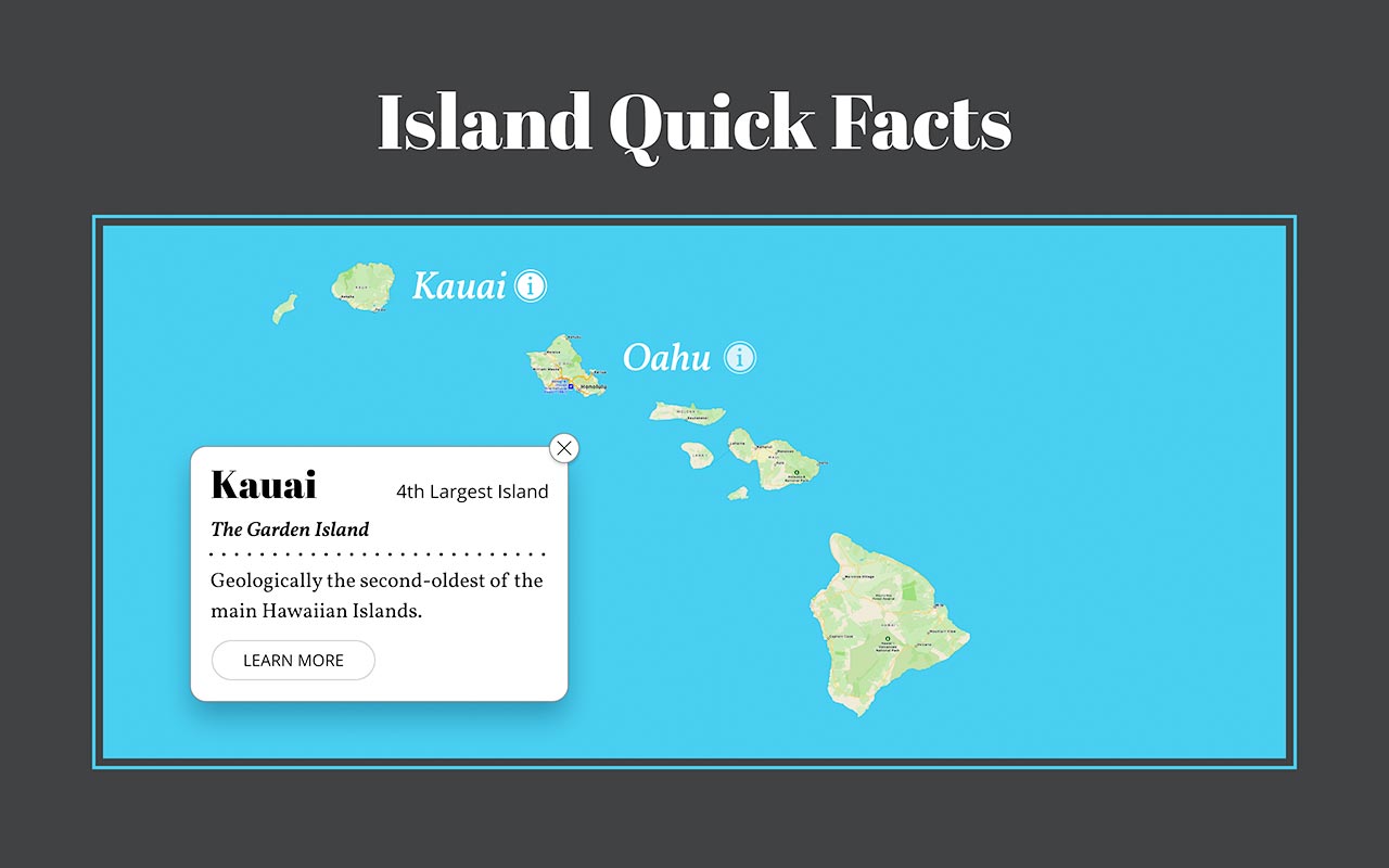
Exercise Preview
Exercise Overview
In this exercise, you’ll learn how to prototype a hover effect (when something looks different as your cursor hovers over it). You’ll also learn how to use overlays to have something new appear when you tap an object.

Opening the File
-
In Figma, if you’re not on the homescreen (file browser), do the following:
- In the Desktop app: Click the
 Home tab (Mac users can also choose File > Open File Browser).
 - In the Web app: At the top left, click the Main menu button
 and choose Back to files.
- In the Desktop app: Click the
- To open a local file, click
 Import file (may be an icon near the top right).
 -
Navigate into Desktop > Class Files > Figma Class and double–click on Hovers and Overlays.fig to choose it.
Once the file has uploaded, click Done and double–click on the file to open it.
Designing the Hover State (Using Variants)
- Zoom to 100% by hitting Shift–0.
-
In the map, click once on Kauai.
This is a group so it will also selects the circle icon to its right.
Let’s add auto layout so later when we change the text, the icon position will adjust. In the Design panel, to the right of Auto layout click the Plus(+) button.
- Now we’ll make this a component so we can use it for the other islands. In the middle of the toolbar, click Create Component
 .
. -
Notice a copy of the icon (the circle with an i) was created to the right of the button, but why?
The icon next to the text was a main component. While you can use an instance of a component inside another component, you can’t have a main component stored inside another main component.
Let’s store both of these main components (the button and icon) off the right side of this frame.
- Click on the icon (the one on the right that was created outside the button) to select it.
- Hold Shift and click on the button so both are selected.
- Drag them to the right and place them in the empty part of the canvas, below the Kauai info card.
- Click on an empty part of the canvas so nothing is selected.
- The Kauai button will be a bit hard to see, but we’ll fix that in a moment. Click on the Kauai button to select it.
-
In the middle of the toolbar, click the Add variant
 button.
- In the canvas notice a second button appearance has been created.
- In the Design panel, change Variant2 to Hover.
- Double–click on Property 1 and change it to State (hit Return (Mac) or Enter (Windows) to apply it).
- Select the island name component set by clicking its name.
-
In the Design panel, scroll down and to the right of Fill click the Plus(+) button.
- Click on the fill color that was added, and choose Black.
- Close the color picker.
Now the Kauai button is easier to see on this darker background.
- In the island name component set, click on the bottom button to select it.
- Let’s move the icon closer to the text. In the Design panel, under Auto layout, change Spacing between items
 to 7.
to 7. - Let’s also brighten the icon. In the bottom button you’re editing, double–click on the icon to select it.
- In the Design panel, under Layer change the Opacity from 70% to 100%.
- Let’s add a Kauai button back again on the Desktop frame. At the top of the left panel, click on Assets to switch to that panel.
-
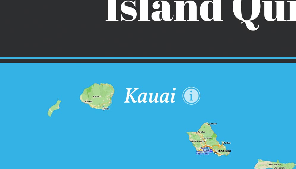
From the Assets panel, drag the Kauai button onto the map, next to the island so it’s positioned as shown below:
Making the Hover State Work
- In the right panel, at the top click on Prototype.
- In the island name component set (to the right of the Desktop frame), select the top button.
- To the right of the selected button, drag the blue circle to the bottom button.
-
In the Interaction details panel that opens on the right:
- It should be set that when you click it will change. We want that to happen when we hover, so change On click to While hovering.
- Under Animation, change Instant to Smart animate.
At the top right of the window, click Present
 or hit Cmd–Option–Return (Mac) or CTRL–ALT–Enter (Windows).
- Hover over Kauai and the circle (i) icon should move closer to the text and become a brighter white. Cool!
Close the presentation tab/window.
Making a Second Button
-
Let’s make another instance of our new button for the next island (Oahu).
Hold Option (Mac) or ALT (Windows) and drag the Kauai down to the right, and place it beside the next island below.
- On the new copy, double–click on the Kauai.
-
Now that the text object is outlined, double–click on it again to highlight the text.
- Change the text to Oahu.
- As you edit the text the circle (i) icon should remain the correct distance away because of the stack. Nice!
- Hit the Esc key once to finish editing the text.
Hit the Esc key again to deselect the component.
- At the top right of the window, click the Present button .
- Hover over both buttons to see they should both have the same style hover. The only difference should be their text.
Close the presentation tab/window.
Opening a Pop-Up (Using an Overlay)
We want the Kauai info card (which is currently to the right of the frame) to appear when we click the Kauai button, so let’s prototype that.
- To see all everything, zoom to fit all by hitting Shift–1.
- Make you’re still seeing the Prototype panel on the right.
- On the Desktop frame, click once on the Kauai button to select it.
-
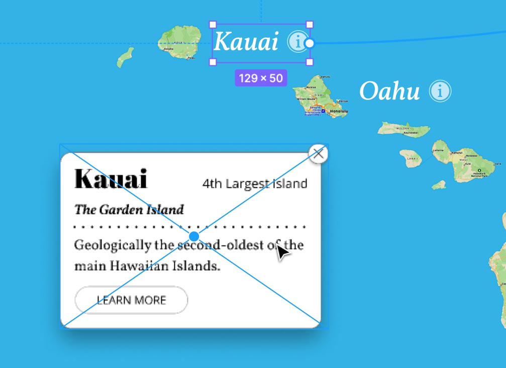
Drag Kauai button’s blue circle to the info card and notice it will NOT attach to it. Why is that?
That’s because the info card is merely a group. For this to work, it must be a frame.
- Select the info card.
- Switch to the Design panel on the right.
At the top of the Design panel, click on the menu that says Group and choose Frame.
-
Notice the drop shadow has been mostly cropped off. In the Design panel, uncheck Clip content.
Now the drop shadow should be fully visible again.
- In the right panel, at the top click on Prototype.
- On the Desktop frame, click once on the Kauai button to select it.
Drag Kauai button’s blue circle to the info card and this time it will work.
-
In the Interaction details panel that opens on the right:
- Change Navigate to to Open overlay.
- Under Overlay, change Centered to Manual.
-
Drag the overlay into the position shown below:
Close the Interaction details panel.
- At the top right of the window, click the Present button .
-
Click the Kauai button and the info card should appear. Nice!
Now we need to add a way to close the info card.
Close the presentation tab/window.
Making the Close Button Work
- In the info card frame on the right, select the close button (the circled X).
In the Prototype panel, to the right of Interactions click the Plus(+) button.
-
Below Interactions click on the Click
—>None interaction and then:- Change None to Close overlay.
- Close the Interaction details panel.
- Click on an empty part of the canvas so nothing is selected.
- At the top right of the window, click the Present button .
- Click the Kauai button to show info card.
-
Click the close button on the info card to close it.
Everything is now working as we want!
Close the presentation tab/window.
