Learn how to globally update elements on your design using Figma components in this step-by-step tutorial, including creating and editing components, overriding content, and detaching from a component.
This exercise is excerpted from Noble Desktop’s Figma training materials and is compatible with Figma updates through 2023. To learn current skills in Figma with hands-on training, check out Noble Desktop's Figma Bootcamp, web design classes, and graphic design classes in-person or live online.
Topics Covered in This Figma Tutorial:
Creating & Editing Components, Overriding Content in One Instance Vs. Globally Updating All Components, Detaching from a Component
Exercise Preview
Exercise Overview
What if you want to globally change an element such as a navigation bar or button? In this exercise, you’ll learn how components (formerly called symbols) let you reuse elements and quickly update them everywhere throughout a design.

Creating a Component
-
In Figma, if you’re not on the homescreen (file browser), do the following:
- In the Desktop app: Click the
 Home tab (Mac users can also choose File > Open File Browser).
 - In the Web app: Click the Main menu button
 and choose Back to files.
- In the Desktop app: Click the
- To open a local file, click
 Import file (may be an icon near the top right).
 -
Navigate into Desktop > Class Files > Figma Class > Pulse and double–click on Pulse—Ready for Components.fig to open it.
The design of the Home Page frame is almost complete. We’ve also created some of the content on the other screens but they are not finished. We want to reuse the navigation bar at the top of the Home Page on both of the other screens. If we merely copied and pasted it onto the other screens, changing the navbar would require updating all three places. Instead we can use components which are all linked together. Editing the component can update all places we use it!
- Zoom to 100% by hitting Shift–0.
- Let’s start by converting the navigation bar into a component so we can reuse it elsewhere in the file. Scroll so you can see the black navigation bar at the top of the Home Page frame.
- Drag a selection around the navbar (so the black background and the icons on it are all selected).
- In the middle of the toolbar, click Create Component
 .
. - In the Layers panel double–click on the Component 1 name, type in nav and hit Return (Mac) or Enter (Windows) to apply the change.
-
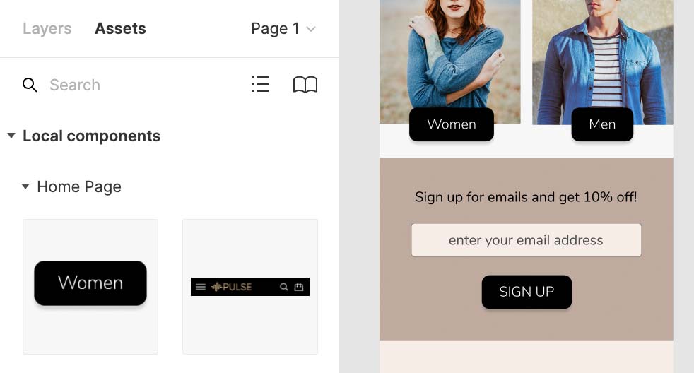
At the top of the left panel, click on Assets to switch to that panel.
Notice how the navbar component is listed here. We can drag components from here into our file, but let’s see one other way.
- At the top of the left panel, switch back to the Layers panel.
-
In the Toolbar at the top, click on Resources
 .
.- In the panel that pops up, make sure you’re viewing the Components tab.
- To use the nav component, drag it and drop it onto the top of the Autumn Collection frame.
- Drag the navbar so it snaps into the top left of the frame.
- We can also copy and paste components to reuse them. Select one of the navbars (it does not matter which).
- Copy it by pressing Cmd–C (Mac) or CTRL–C (Windows).
- Click on the Product Page frame’s name (at the top left of the frame).
-
Paste it by pressing Cmd–V (Mac) or CTRL–V (Windows).
Nice, this way it remembered the position!
Editing Components
When editing a component, you have to decide if you want to edit them all, or make individual modifications to once instance.
- Click once on the navbar on the Autumn Collection frame.
- In the Layers panel, under Autumn Collection, notice the nav icon is a
 (which indicates this is an instance).
 - Click once on the navbar on the Home Page.
-
This is the original content that we converted into a component. In the Layers panel, under Home Page, notice the nav icon is a

- A Main Component has this icon
- An Instance has this icon
NOTE: Changing a Main Component will update all instances of that component.
- A Main Component has this icon
- The search and shopping bag icons on the right of the navbar are too dark. Let’s lighten them. In the navbar on the Home Page, double–click on the gray outline of the search icon to select it. If you missed and selected the black background instead, you should be in the component now so try clicking on the search icon once again.
- With the search icon selected, hold Shift and click on the shopping bag icon so both are selected.
- In the Design panel, under Layer, change Opacity from 50% to 100%.
- Notice that all the navbars have been instantly updated!
- Let’s enlarge the 3-line menu icon (often called a hamburger icon) on the left side of the nav. Make sure you can see the 3-line menu icon on the left side of the navbar on the Home Page and zoom in on it so you can see it closely.
- If you still have the other icons selected, you’re still editing the component so you should be able to click once on the menu icon to select the group. If you deselected, you will have to double–click on the menu icon.
- With the menu icon selected, drag the right side to make it a little wider.
-
To make it taller, hold Option (Mac) or ALT (Windows) and drag the bottom down a bit.
NOTE: Holding Option (Mac) or ALT (Windows) resizes from the middle.
-
Click on an empty area to deselect.
Notice all the navbars have the updated menu icon.
Making a Button Component: Overriding Content in One Instance Vs. Globally Updating All Instances
Let’s make a reusable button component that can have any text, and see how we can resize it appropriately for different lengths of text.
- On the Home Page, find the Women button that’s a black square.
- Click once on the Women button to select the group (it’s a rectangle and text).
- CTRL–click (Mac) or Right–click (Windows) on the Women button and choose Create component.
- In the Layers panel, double–click on the women button name, type in button and hit Return (Mac) or Enter (Windows) to apply the change.
- Let’s make a button for Men to the right. Hold Option (Mac) or ALT (Windows) and drag a copy of the Women button to the right over the mens photo.
- In the copy on the mens photo, double–click on the text a couple times until it becomes editable. Then change Women to Men.
- Click off the Men button a couple times to fully deselect it.
- Click once on the Men button to select it.
-
Resize the width to make the width a bit narrower so the black space around the text better matches the Women button.
Notice the text was not distorted, so Figma is not simply scaling the button. It’s intelligently resizing the elements in the component.
-
Undo that change by hitting Cmd–Z (Mac) or CTRL–Z (Windows).
There’s a better (automatic) way to make the spacing around the text match the original button (rather than this manual approach).
- Click once on the Women button to select it.
- In the Design panel, to the right of Auto layout click the Plus(+) button.
- Notice how the Men button’s width automatically was adjusted so the black space around the text matches the Women button!
- Let’s make another button. From the Assets panel, drag the button component below the enter your email address slightly below the two buttons were you just working with.
-
Double–click on the text of the new button a couple times until it becomes editable. Then change Women to Sign Up.
Notice how the button grows from left to right, but we want it always centered.
- Undo the text change by hitting Cmd–Z (Mac) or CTRL–Z (Windows).
- Click off the button a couple times to deselect it.
- Click once on the button to reselect it.
-
In the Design panel, under Constraints:
- Notice the left line is blue, indicating it’s going to be constrained to a fixed pixel distance from the left of the frame it’s in.
- As shown below, click the middle plus button (the horizontal line of the plus, not the vertical). Now the center horizontal line should be blue, so it will be aligned centered within the frame.
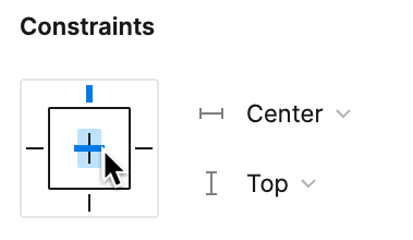
-
Double–click on the text of the button a couple times until it becomes editable. Then change Women to Sign Up.
This time the button should remain centered within the frame!
- Select the Sign Up text.
- In the Design panel, at the bottom right of the Text section, click the ••• button.
-
In the Type details panel that opens, to the right of Case click the AG button (both are capitals).
Notice that only this button’s text become uppercase, and none of the others.
- Let’s round the corners of all the buttons and make the text bold.
-
The Women button is the Main Component, so changes to it will update all the other instances of this component (unless a individual component has overridden the particular thing we’re trying to change).
Select the Women button.
-
In the Design panel, below H (height) set
 Corner radius to 10.
Notice how all 3 of the buttons (Women, Men, and SIGN UP) have been rounded!
- Double–click on the Women text in the button to select it.
- In the Design panel on the right, change the font weight from Bold to Light.
Again notice how all 3 of the buttons (Women, Men, and SIGN UP) have been updated.
Editing the Main Component
What happens if you delete the Main Component or you forget where the Main Component is? Don’t worry, you can CTRL–click (Mac) or Right–click (Windows) an Instance and:
- Choose Main component > Go to main component and Figma will show you where it is.
- If the Main Component has been deleted, you’ll choose Main component > Restore main component and a new Main Component will be created somewhere, so you can edit it.
Working with Components
Removing Local Changes (Reset to Main State)
If you’ve applied local changes to one instance and want to remove them (so it again looks like the main component), CTRL–click (Mac) or Right–click (Windows) on the component and choose Reset all changes.
Detaching from a Component
If you want to break the link between one instance and a main component (so it will no longer update when the main component is changed), CTRL–click (Mac) or Right–click (Windows) the instance and choose Detach instance.
