Websites can be viewed on a variety of devices, from mobile phones, to tablets, to desktop computers. Responsive web design detects a device’s screen size and adapts accordingly. In this book you'll be taken step-by-step through a variety of exercises that teach you about important issues for mobile-optimized websites. Learn to optimize pages so they display properly and download faster on mobile devices, how to deal with Retina (2x) displays, how to use SVG graphics, CSS media queries (break points), mobile optimized navigation, the Bootstrap framework, and more. This course workbook can be completed in any code editor. This advanced level book is for people who have experience building webpages.
Includes Downloadable Class Files (works on Mac & PC)
ISBN: 978-1-941333-21-1
Setup & Introduction
Downloading the Class Files
HTML vs. XHTML Syntax
- Differences between HTML & XHTML syntax
Before You Begin
- Choosing a code editor
- Supported browsers
- Installing & using iOS Simulator
- Recommended software
- Installing packages into Sublime Text
Section 1
Setting Up: Do This Before Other Exercises!
- Setting up your class files
Flix: Setting the Viewport Meta Tag
- The viewport meta tag
- device-width
- initial-scale
- shrink-to-fit
Flix: SVG (Scalable Vector Graphics) & .htaccess Files
- Adding SVG as an image
- Setting SVG width & height
- Configuring the web server’s .htaccess file for SVG
- Additional configuration with the .htaccess file
Flix: Mobile-Friendly Forms
- Input types (search & email)
- Making CSS background gradients fill the page
Flix: Creating a Scrollable Area
- Creating a horizontal scrollable area
- Optimizing the scrolling for iOS touch devices
Section 2
Flix: Media Queries for Retina/HiDPI Graphics
- Using media queries to load hi-res images for Retina/HiDPI displays
Mobile First vs. Desktop First
- Mobile first thinking
- Fluid widths
- Min-width vs. max-width media queries
Box Model: CSS3 Box-Sizing & Calc()
- Reviewing the box model
- CSS3 box sizing
- CSS3 calc() function
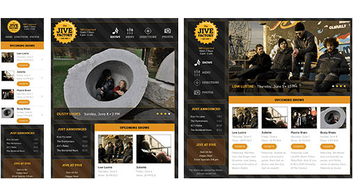
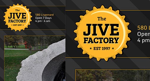
Jive Factory: Creating a Basic Wireframe
- Wireframing the basic Jive Factory layout
- Setting up “mobile first” media queries
Section 3
Jive Factory: Finishing the Wireframe
- Structuring the page for various sizes/devices
- Min & max-width media queries
- Using CSS calc() to gain control over fluid layouts
- Hiding elements for specific sizes/devices
Jive Factory: Creating CSS Gradient Patterns
- Editing the visual indicator for each media query
- Fun with RGBA
- Anatomy of a CSS gradient
- Linear-gradients & repeating-linear-gradients
- Linking to Google’s free web fonts
Jive Factory: Starting the Header
- Adding the logo & nav content
- Styling the logo & nav for various sizes/devices
Section 4
Jive Factory: SVG Sprites & Styling the Header for Desktop
- Adding SVG Sprites
- Styling the logo & nav for various sizes/devices
- Fixing opacity inheritance
Jive Factory: Final Touches & Limiting Flexible Content
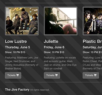
- Improving Upcoming Shows on mobile
- Constraining the design at certain breakpoints
- Centering the design at certain screen sizes
Jive Factory: Responsive Slideshow
- Getting the slideshow working
- Styling the slideshow content & controls
- Preventing hidden images from loading
Section 5
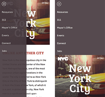
Off-Screen Side Nav Using Only CSS
- Responsive off-screen navigation
- Toggling the navigation with a checkbox
- CSS transitions
Full Screen Backgrounds & Viewport Sizing Units vh & vw
- Creating a full screen background
- Using viewport sizing units vh & vw
- Vertically aligning content
- Darkening the background image via CSS
Bootstrap: Getting Started
- Adding content & laying out the page
- Using Bootstrap’s grid system
- Creating & adjusting columns
- Adding a navbar & other components
Section 6
Bootstrap: More Elements & Nesting Grids
- Adding an email signup form
- Nesting sections
Bootstrap: Controlling Grids & Layout
- Changing the grid at specific sizes
- Showing & hiding elements at specific sizes
Bootstrap: Creating a Photo Grid
- Bootstrap’s fluid container
- Making images fill the grid
- Nesting sections
Bonus Material
Bootstrap: Skinning/Customizing Appearance
- Overriding Bootstrap’s default appearance
- Adding custom media queries
- Bootstrap’s optional theme
- Creating a fixed navbar
- Adding icons using Boostrap’s included icon font
Bootstrap: Adding a Slideshow (Carousel)
- Adding a slideshow using Bootstrap’s carousel
- Hiding the slideshow on mobile
Animating a CSS Background Gradient
- Creating a CSS animation
- Specifying which element will use the animation
Slide-Down Top Nav Using Only CSS
- Creating a slide-down menu
- Making the logo & menu button slide down with the page content
Reference Material
Links to Reference Websites
Examples of What You Learn
Why Our Books Are Unique
Our books are packed with step-by-step exercises that walk you through projects. You’ll learn by doing exercises, not reading long explanations. The goal is to give you hands-on practice with the program, getting you started quickly with the things that are most important for real life work.

