Navigate: Right/Left Arrows (or Swipe Left/Right)
Zoom Out: Press Esc (or Pinch)
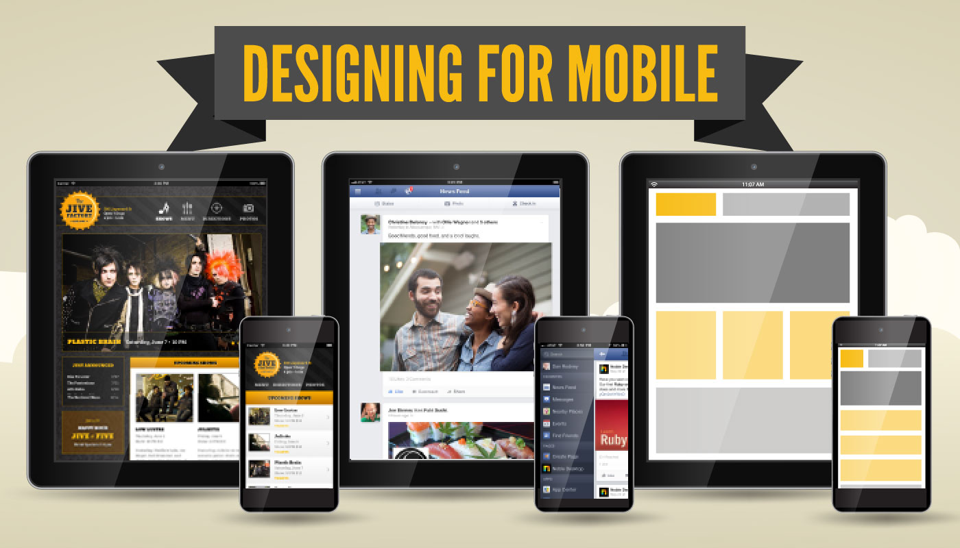
Motivation
How important is mobile?
Even if you know… your clients may not.
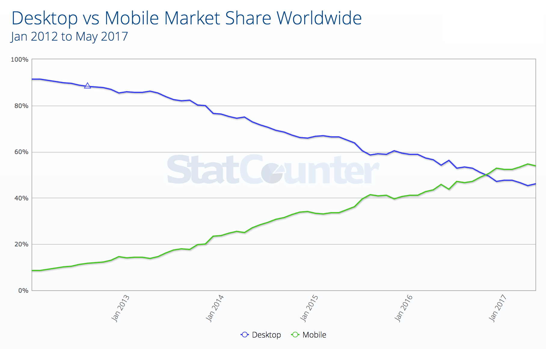
Desktop vs. Mobile Web Traffic
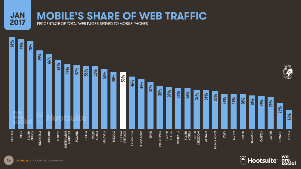
Mobile Share by Country
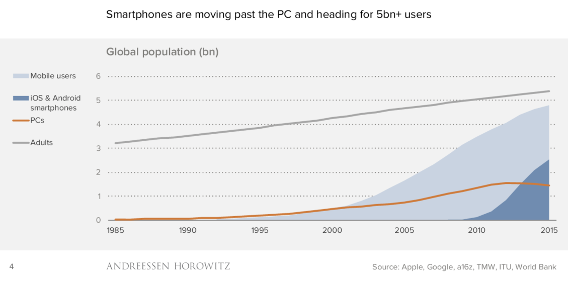
Rise of Smartphones
Mobile is the New Norm
Mobile is the primary computing platform for many people.
See why people are embracing “mobile first” design?
Now That I Have Your Attention
Let’s Talk Design!
Logos
Mobile is affecting all aspects of design.
Logos are being designed & redesigned with apps & small screens in mind.
Example #1
- Designer: Your new logo is a circle.
-
Client: What the £#*%!
How much did I pay for that?
Why A Circle?
When you see the complete usage, it starts making sense.
Each “logo” could work as an app icon.
Example #2
Doesn’t the H look like an app icon?
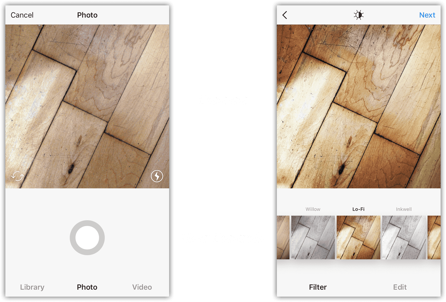
Responsive Web Design
- Separate mobile & desktop sites have 2 versions of each page.
-
Responsive sites only need 1 version of each page.
The layout will flex and change to adapt to different size screens (mobile, tablet, desktop, etc.). - Your designs must be flexible to work across many screen sizes. Elements may be next to each other on a desktop, but stacked on mobile.
Examples of Responsive Sites
How Are Designers To Handle Responsive Design?
- Spend time on wireframes (with real content) before focusing on perfecting the visuals.
- Expect more designer & developer collaboration.
- Bring developers into the process earlier.
- Move to working code mockups earlier. See what issues arise and how to handle them.
- Need to learn code? Check out our Web Design Certificate or step-by-step Workbooks.
Design is More than a Pretty Face
Design is just as much about the experience, flow and performance of a site/app.
That’s why UX (User Experience) is important.
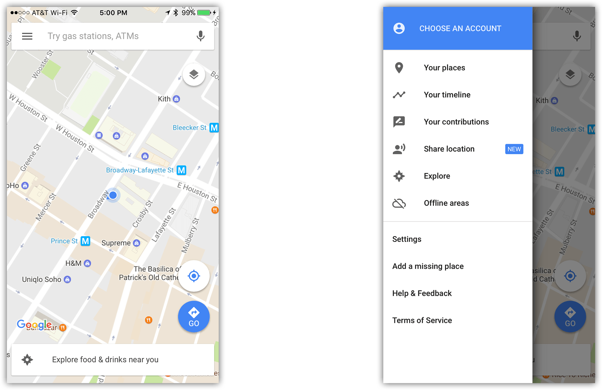
Examples of Mobile Navigation
If previewing on desktop, make the window narrow.
- Jump to bottom (not recommended): contentsmagazine.com
- Slide-down: bootstrap.com
- Fullscreen: mailchimp.com
- Off-screen nav: disney.com & spotify.com
- Bold & touch-friendly: skinnyties.com
- Priority+: dbushell.com
Mobile Design is Influencing Desktop Sites
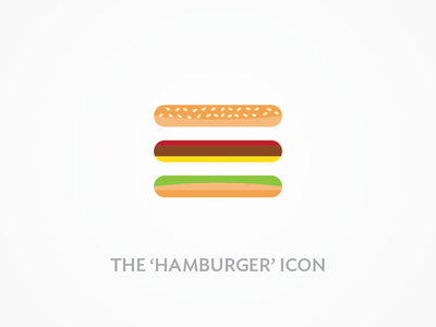
Hamburger = Menu (Icon)
Some desktop sites are now using the hamburger. Should they?
- visitcalifornia.com
- designmuseum.org
- Google Chrome (on the desktop) used the hamburger menu, but currently uses a different mystery meat icon (the kabob).
- Why and How to Avoid Hamburger Menus
- In defence of the hamburger menu
- Should you use Menu or the Hamburger icon?
Designing for Fingers & Small Screens
Finger Friendly
- Remember the thumb’s natural reach is near the bottom.
- Put content on top.
- Keep controls near bottom.
- Test on real devices. Looking at a screen doesn’t let you feel how it is to actually use your site/app.
Finger & Small Screen Friendly
- Don’t crowd controls, keep enough space.
- Hide extra features/controls. Reveal only when needed.
Creating Graphics
SVG for Websites
- Use SVG (Scalable Vector Graphics) for vector web graphics instead of PNG/GIF.
- Great browser support.
- Scale to any size without loss of quality.
- Work on any resolution device.
- Small file size, so they download fast.
Screen vs. Image Resolution
Live Demo
For Reference: Retina Web Graphics Explained (1x versus 2x)
Working in Design Apps
Sketch, Illustrator, & Adobe XD
- These are vector design apps, so design at 1x.
- Export SVG for vector graphics.
- Export 1x and 2x assets for pixel-based web graphics.
- 1x design files appear the correct size and look great on both 1x and 2x displays.
Photoshop
- Being a pixel-based app, Photoshop has unique challenges.
- There are pros and cons to working in 1x or 2x files.
Working in Photoshop
1x Files
-
1x files on a 1x screen appear the correct size.
1x files on a 2x screen appear small, so zoom to 200%.
2x Files
-
2x files on a 2x screen appear the correct size.
2x files on a 1x screen appear large, so zoom to 50%.
Working in Photoshop
1x Files
- Use smart objects as much as possible, so you’ll be able to export 2x versions.
2x Files
- Scaling a 2x file by 50% (to get the 1x) may lead to half pixels. To prevent that, work in even pixels (2, 4, 6, etc.) for font size, stroke weight, width/height, etc.
Working in Photoshop
We recommend designing in 2x Photoshop files.
Read Designing Retina Web Graphics in Photoshop for a complete comparison and explanation of why.
Minimum Button Size
- Try to maintain a minimum tappable area of 44pt x 44pt. (According to Apple’s iOS Human Interface Guidelines.)
- In pixels that’s:
1x (Low-Res): 44 pixels
2x (High-Res/Retina): 88 pixels - The tappable area should be that size, but the visual (icon, text, etc.) does not have to fill that space.
Fonts
- Make sure fonts are licensed for use in websites or apps.
- Preview on both 1x and 2x screens to avoid surprises (such as thin fonts displaying poorly on 1x screens).
Tools & Templates
Live Preview Your Design on a Mobile Device
- Sketch has Sketch Mirror for iOS and a 3rd party app Crystal for Android.
-
Photoshop has Adobe Preview CC for iOS.
Alternative: Skala Preview for iOS or Android (Mac Only). - Adobe XD has a mobile app for iOS or Android.
Bootstrap Grid Templates
Interface Templates
- Facebook Design’s iOS 10 GUI (iPhone) for Sketch, Photoshop, XD, and more.
- Facebook Design has many other free Resources.
- iOS 10 GUI Kit (iPhone & iPad) for Sketch, Photoshop, Illustrator, XD, and more.
- Android: Material Design Templates & Icon Sets
Designing Mobile Apps
- iOS Human Interface Guidelines (by Apple)
- iOS Design Guidelines (by Ivo Mynttinen)
- Android Material Design Guidelines & Resources (by Google)
App Icons
- Sketch has built in templates for iOS and Android icons (choose File > New from Template)
- iOS App Icon Template for Photoshop and Sketch
- Apple’s iOS App Icon Sizes
- Google’s Guide to Android Icon Sizes
- Android Icon Reference Chart & Size Guide
Website Favicons
- Used in browsers & when saving sites to the homescreen. Example: danrodney.com/mac
- Make them at realfavicongenerator.net
- Mobile devices account for more than 50% of email opens.
- Email Client Stats:
litmus.com
emailclientmarketshare.com
emailmonday.com
- The path of least resistance is a single-column structure.
- More complex layouts (such as multiple columns) are possible, but require more work to code.
- Support for responsive layouts has improved greatly. Gmail (a long time holdout) finally supports media queries for most people.
Learn to Build Responsive Emails
-
Check out our Responsive Email class.
- New to coding emails? Our HTML Email class will prepare you for the Responsive Email class.
One Final Thought
Make your design special & exciting!
Designing for Excitement & Delight
You’re not designing for print or a static screen.
Use animation (and sound for apps).
Animation in Websites
- Stripe Checkout (click “Show Me”)
- FullStory
- Claudio Calautti (web designer portfolio)
- LA 2024 Olympic Bid
Animation in Apps
- Yelp app (Pull down to refresh)
- The Fantastic Flying Books of Mr. Morris Lessmore
Create a Memorable “Signature” Animation
- Wow people with something they won’t forget. Unique and fun animations make an impression.
- Now You See Me 2 (Movie)
- WWF Together (World Wildlife Fund): Click the +++ button & tap an animal to get Origami Instructions!
Learn More
Photoshop for Web & UI
Sketch
Adobe XD
Web Design Certificate
Mobile & Responsive Web Design
Responsive Email