Designing Responsive Email
Navigate: Right/Left Arrows (or Swipe Left/Right)
Zoom Out: Press Esc (or Pinch)
Do’s & Don’ts
in Email Design
When Designing Email
- Focus your message
- Be concise
- Create a hierarchy
- Organize for quick reading
- Keep it legible (avoid small type)
- Make obvious calls to action
- Link out to longer additional info
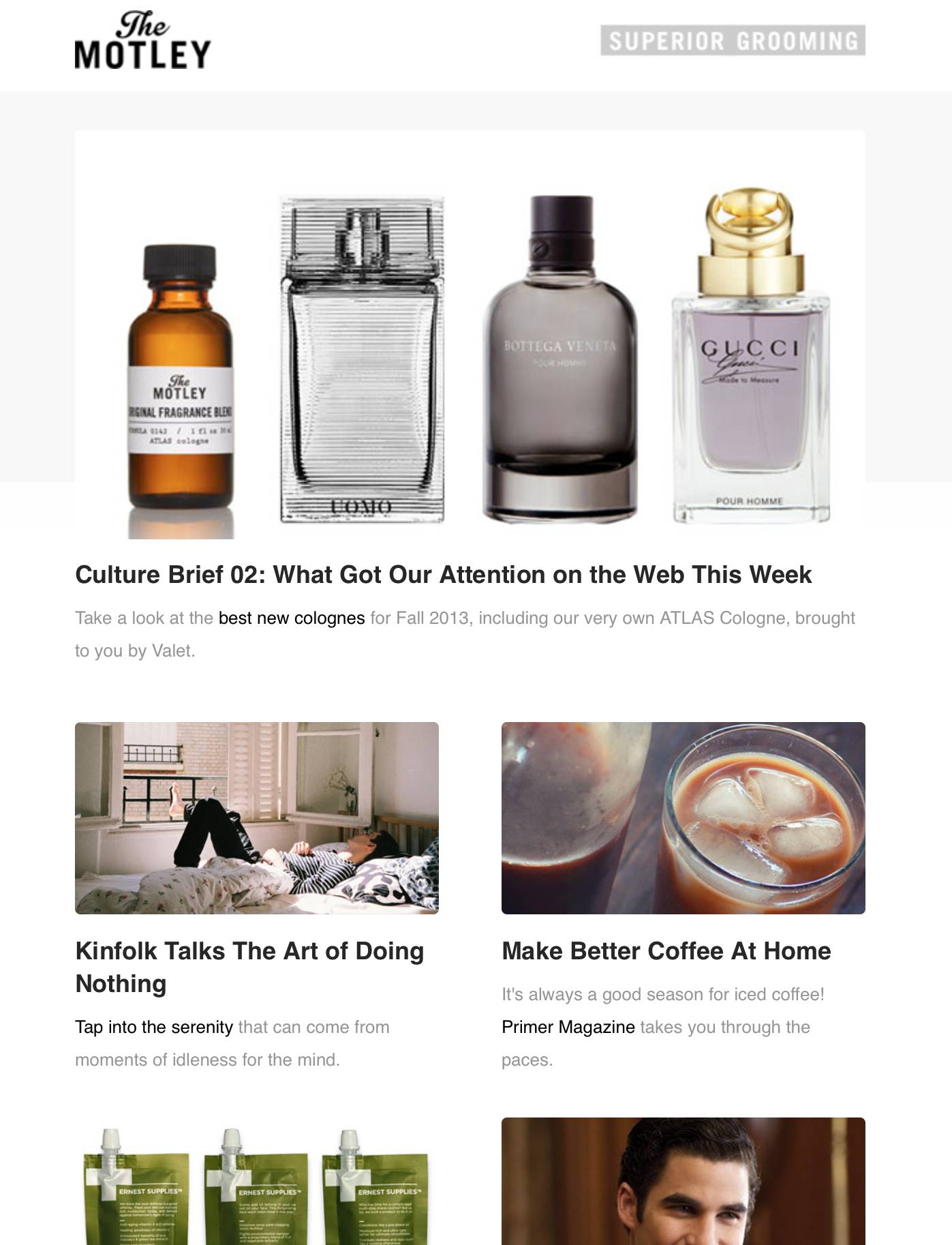
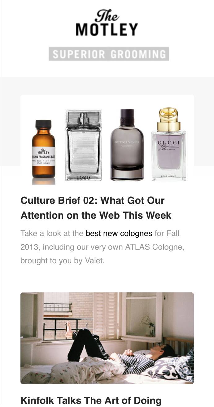
Ideal Balance of
Text & Images
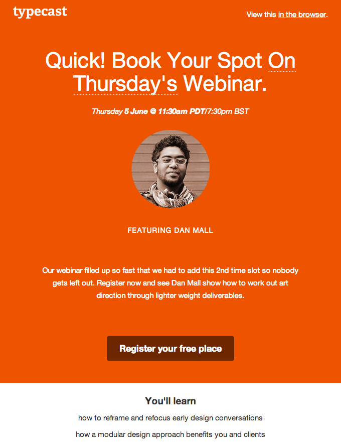
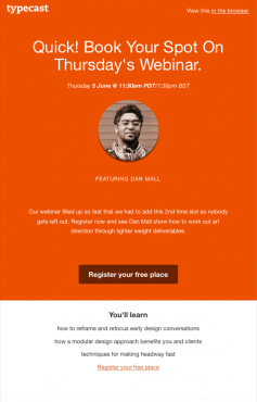
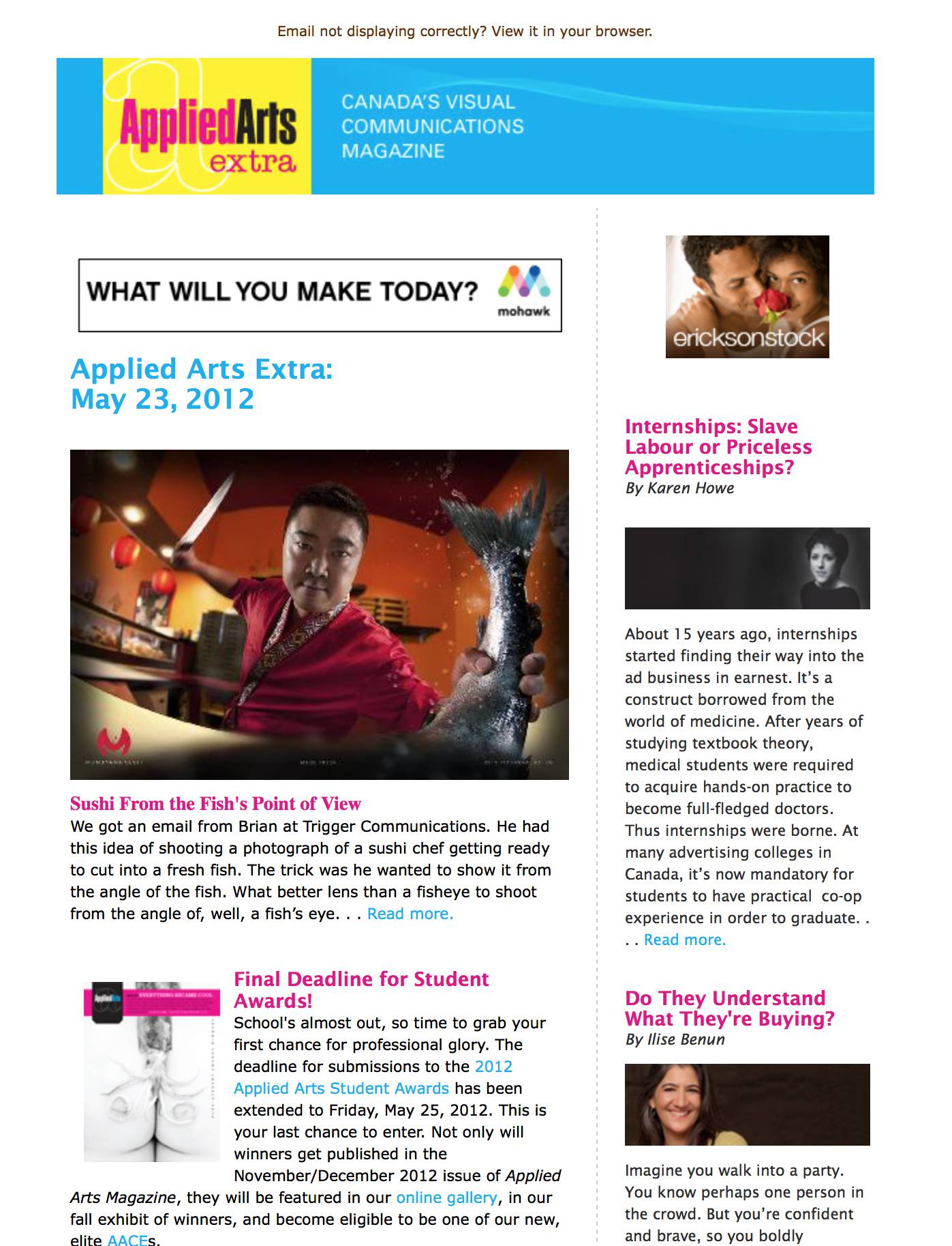
Do not use a single large image
- It will increase your spam score, increasing the chance that the email gets blocked by spam filters and not delivered.
- It will be harder to make it responsive (text may become small when scaled down onto a phone).
- If images don’t load, readers will only see alt text.
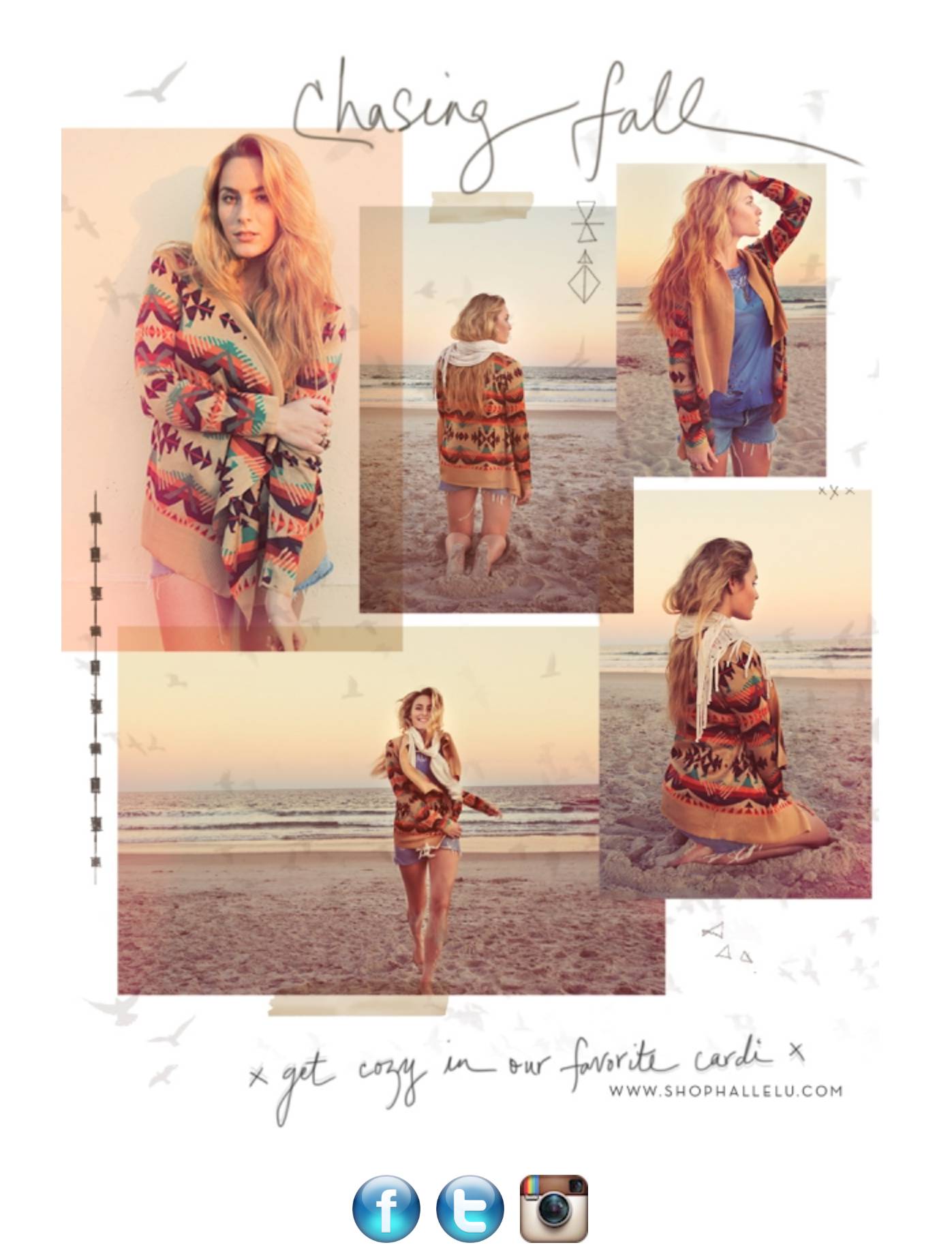
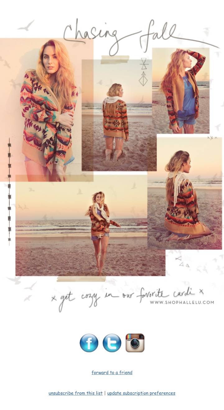
- Solution: Use text and multiple images.
When Images Don’t Load
For security, some email clients do not load images by default. Users may not load them.
- Make sure important images have alt text.
- Keep the text short. If it breaks onto 2 lines, some email clients will not display.
- Style the alt text (add text styling to the img).
- Resources: Image blocking stats & Guide to image blocking.
Designing on a Grid
HTML emails are built with tables. (Yes you read that correctly.)
Tables are made of rows & columns,
so design on a grid.
Grid-based designs are easier to make responsive.
Breaking the Grid
Seen emails that break the grid a lot?
They are typically a single image (or sliced up) and are more likely to get marked as spam.
Hard or impossible to make responsive.
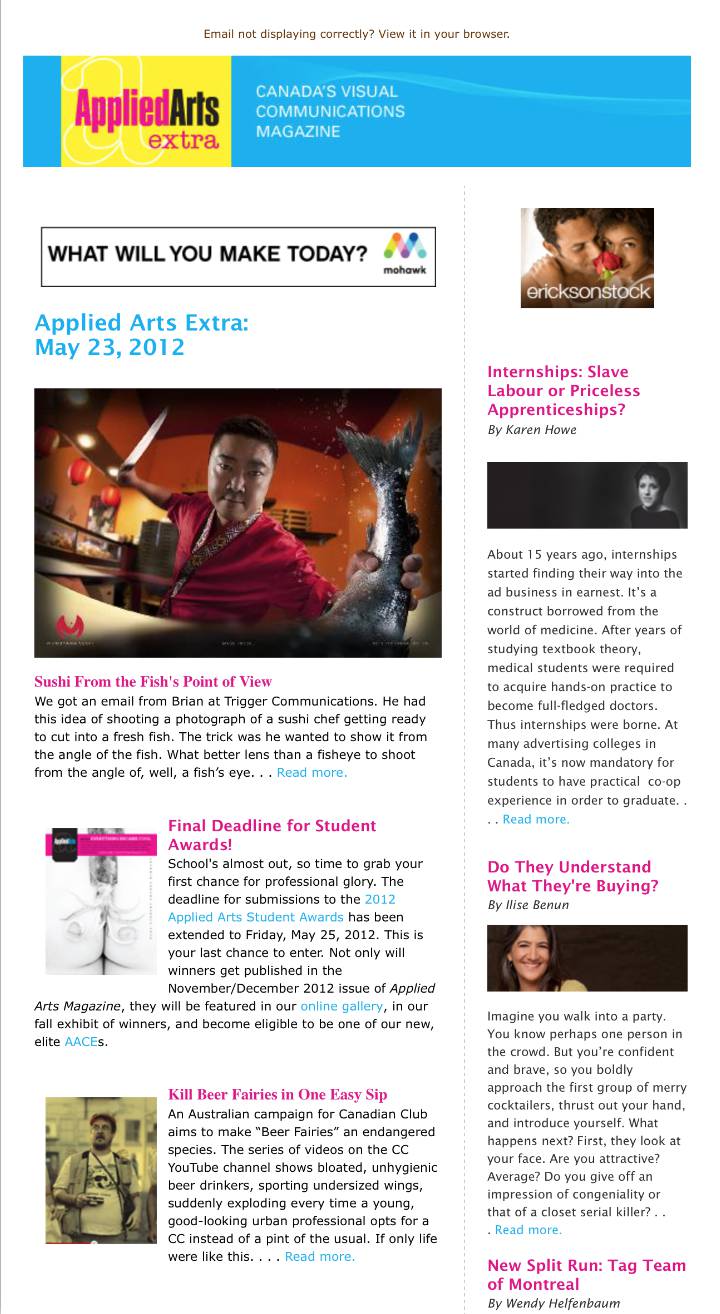
Ideal Width
Max width of 500–600px (for desktop).
Could stretch to 700px, but around 600px or narrower is ideal.
Custom Fonts
-
Only some email clients support custom fonts:
MailChimp Typography
Campaign Monitor Web Fonts in Email - If using custom fonts, test with a fallback font (trickier to code for Outlook than in webpages).
Animation
Animated GIFs
GIFs work in most email clients.
Outlook 2007 & newer only show the first frame, so plan on that when creating!
Litmus Guide (examples, email client support, and more)


Learn to Make Animated GIFs
Check out our Creating Animate GIFs in Photoshop training.
Compelling Clickthroughs &
Calls to Action
Inverted Pyramid
- Campaign Monitor: Design high-performing email campaigns
- Vero: How to Create Focused Emails That Really Convert
Calls to Action (CTA)
- Make them stand out.
- Make them large enough so they are easily tappable.
- Use actionable language:
Instead of “Click Here” use “Buy Now”
Preheader Text
- A preheader is a small amount of text that follows the email’s subject line in the inbox.
- Effective preheader text can increase open rates.
- Preheaders can be visible in the email, or hidden.
Info & Examples from Campaign Monitor
What is the Purpose of the Email?
Understand the goal & design for it.
Main Types of Email
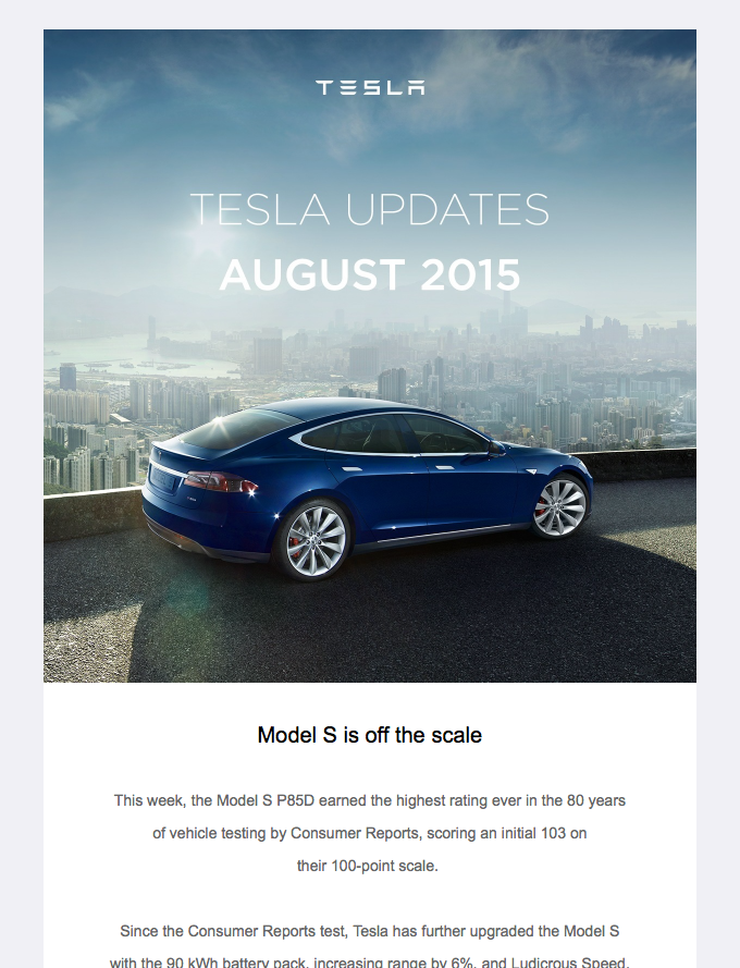
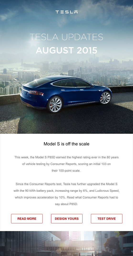
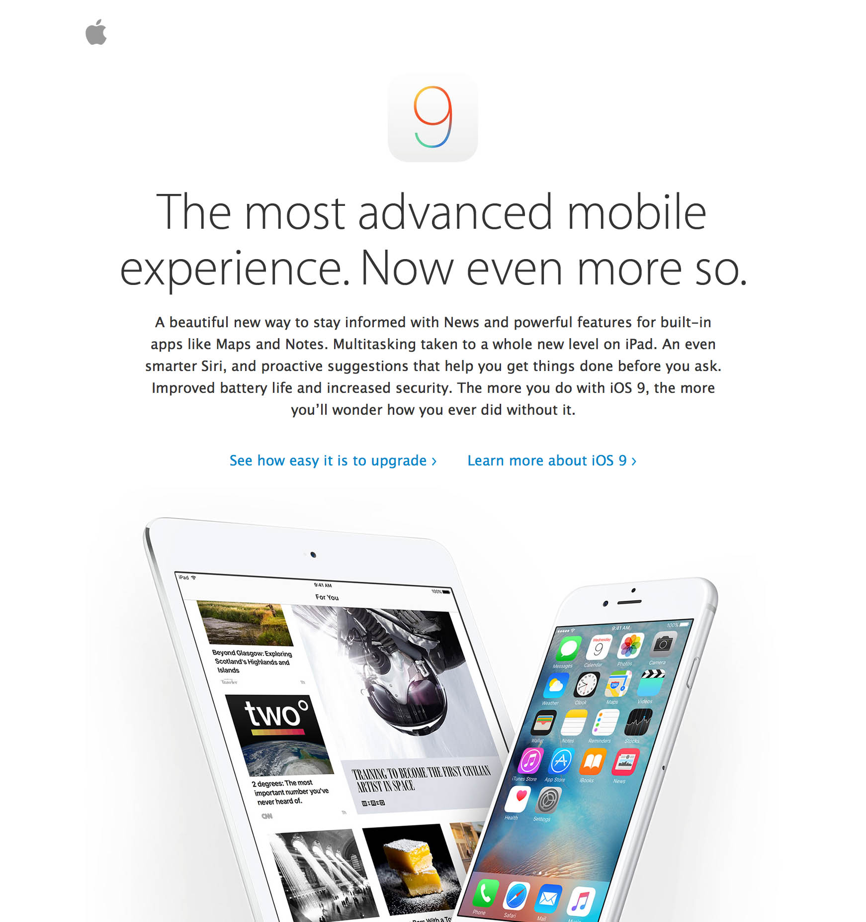
- Ecommerce: Buy Me
- Event: Join Me
- Informative: Read Me
- Transactional: Do Something
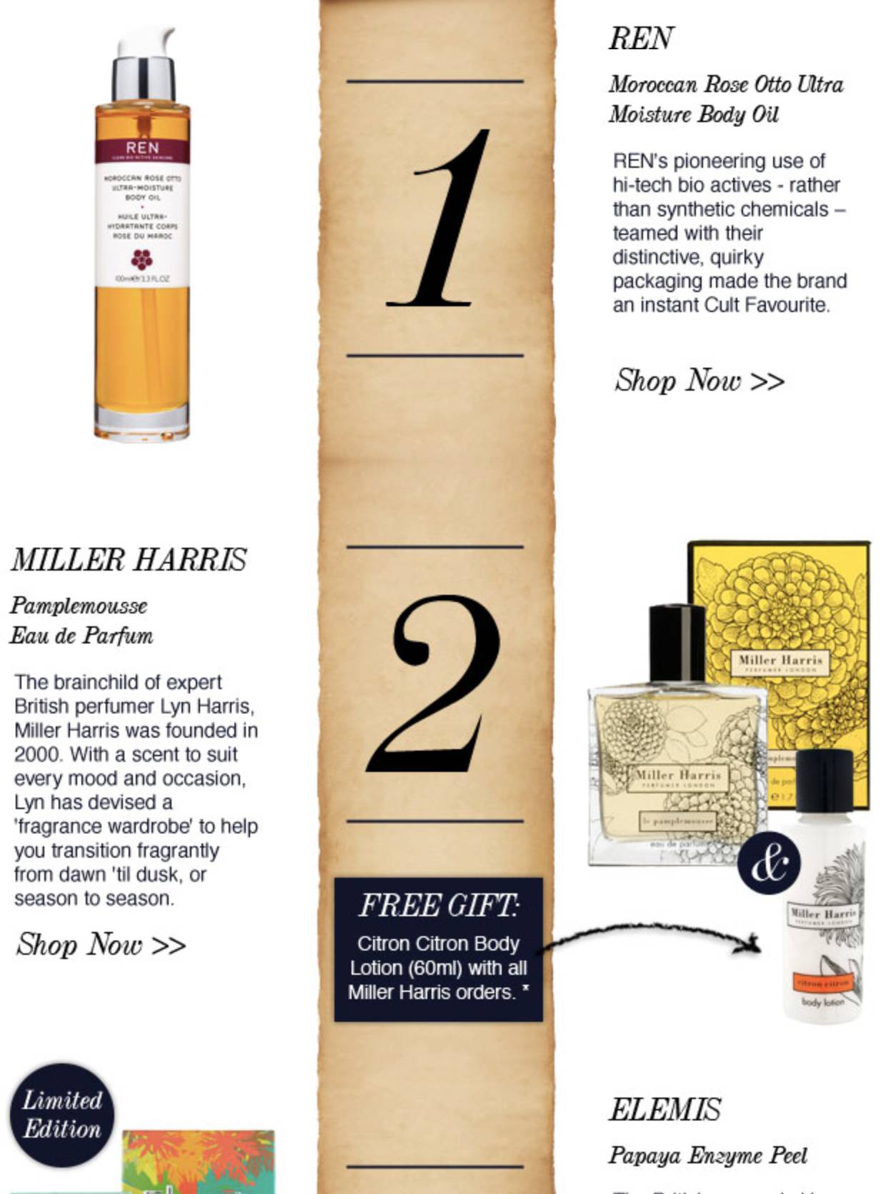
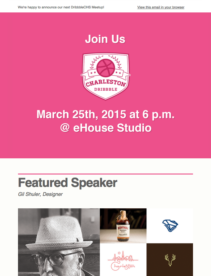
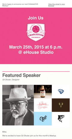
Example Emails
Example Emails: Good or Bad
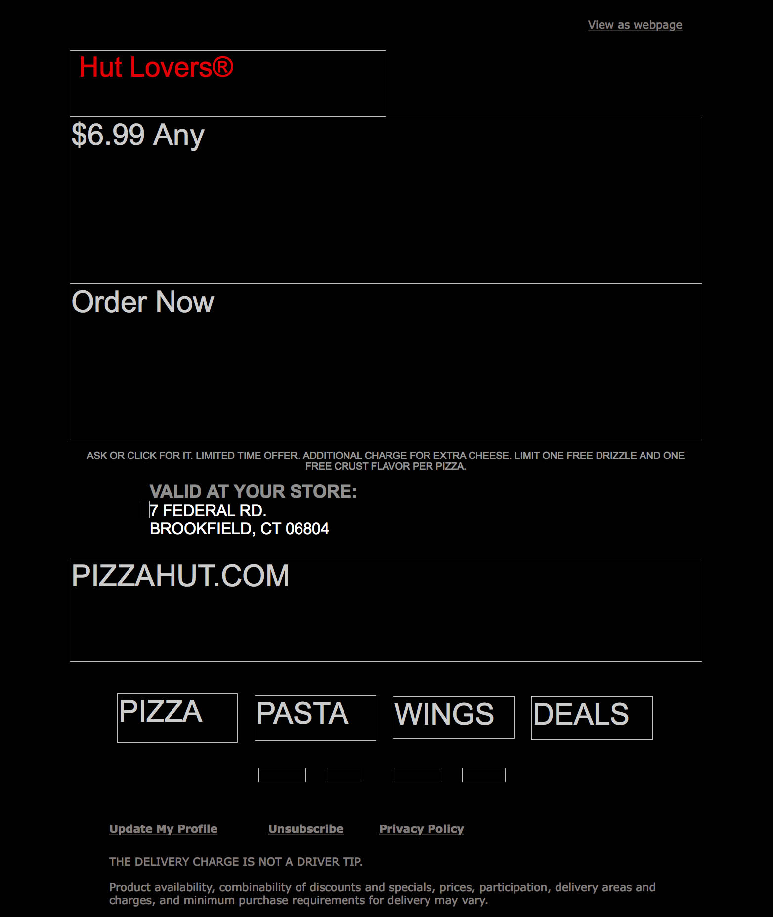
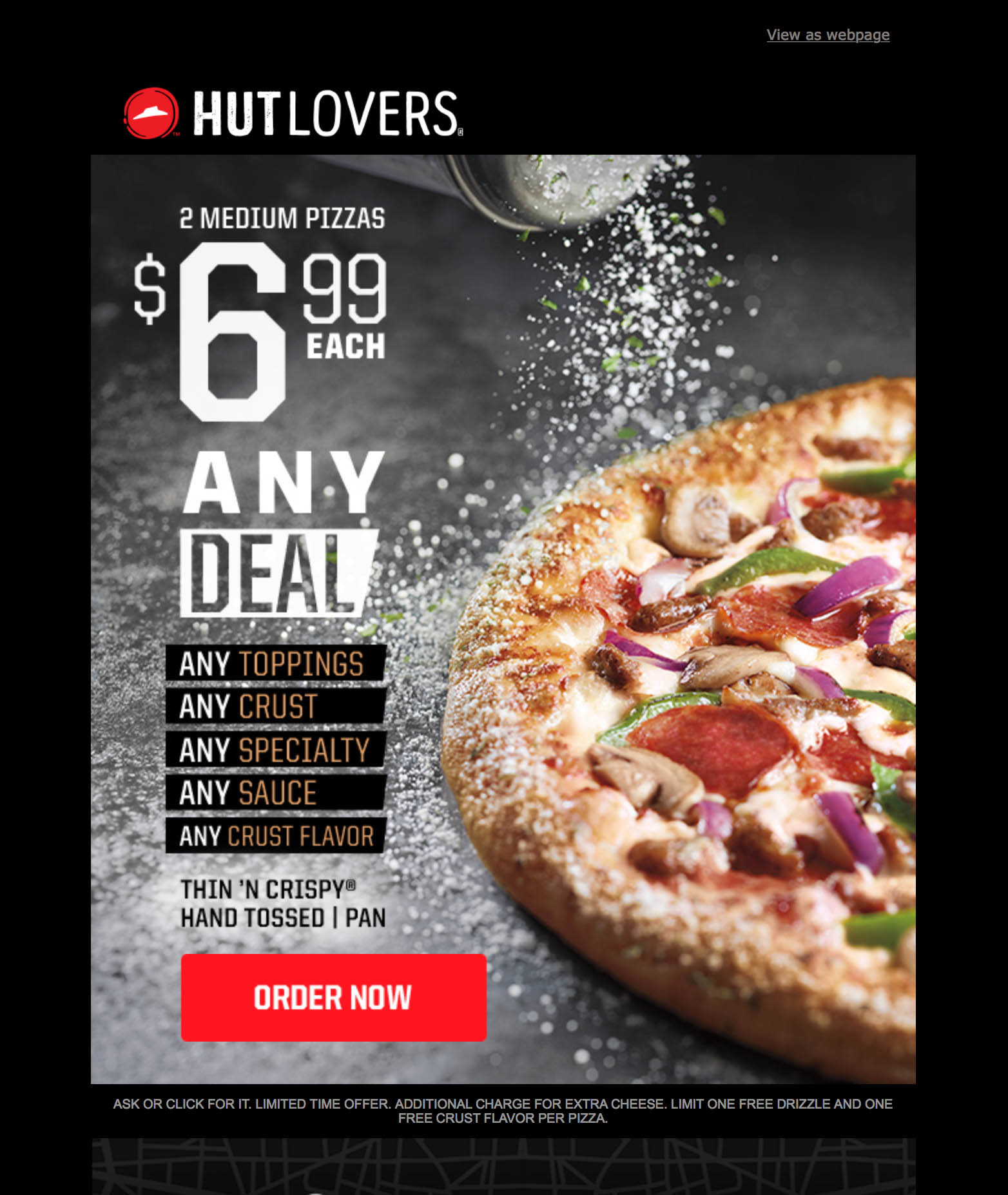
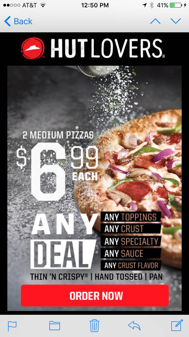
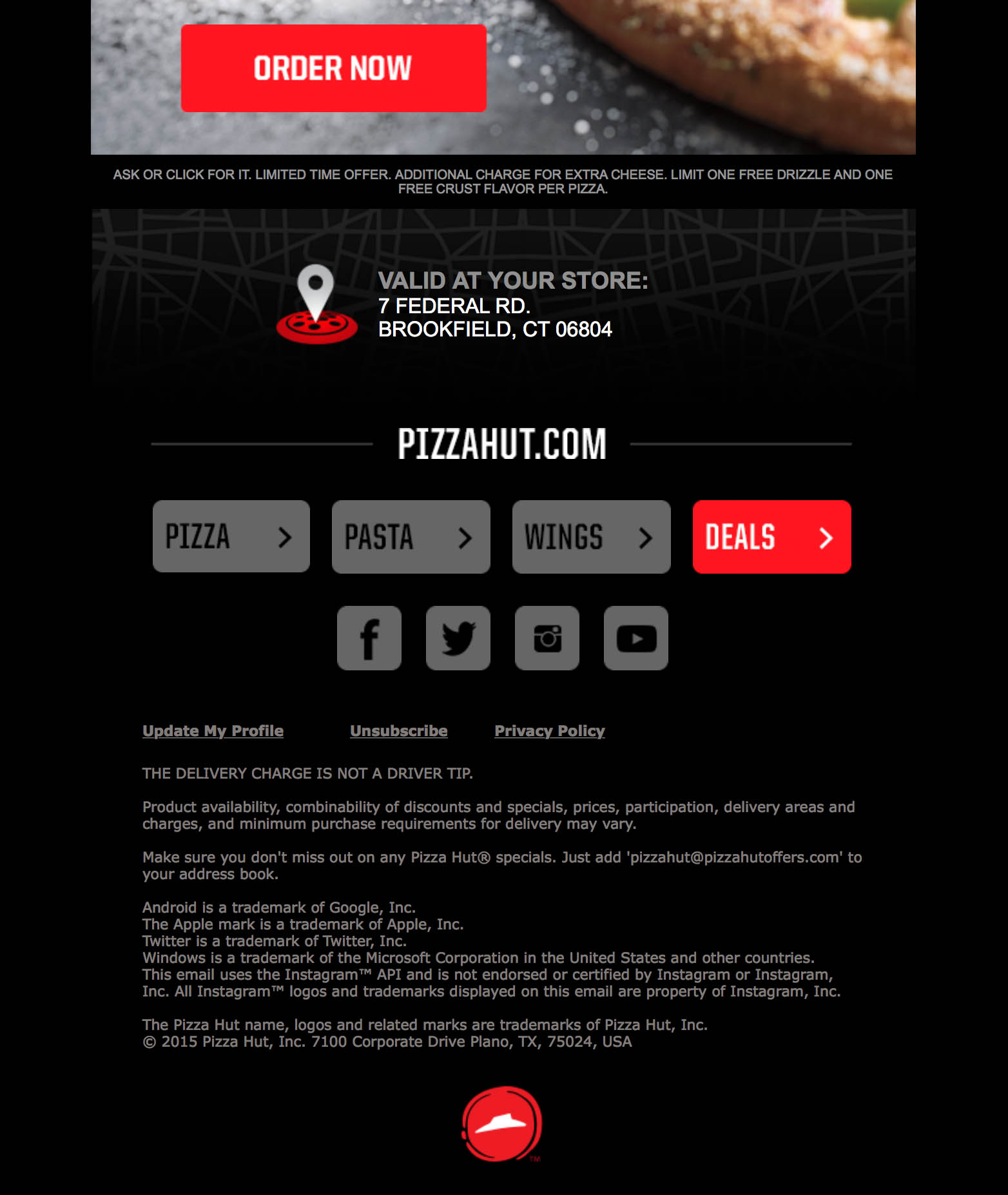
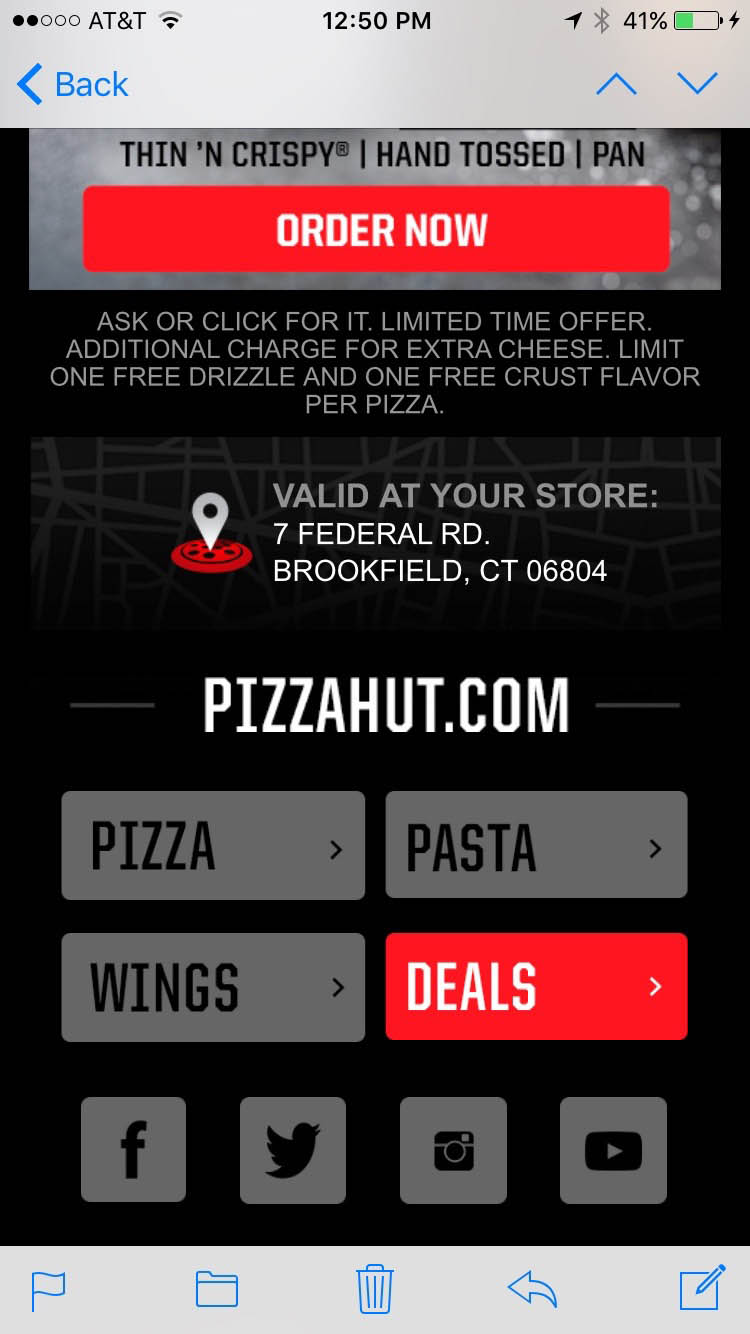
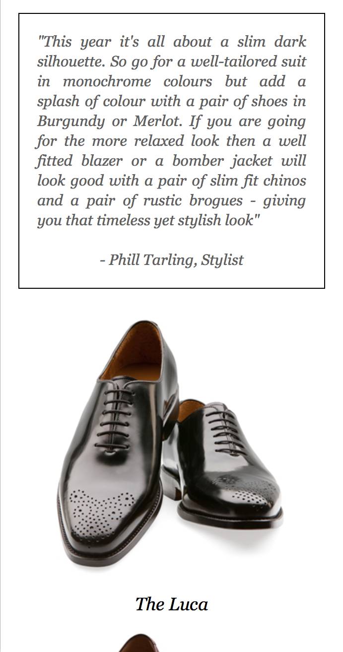
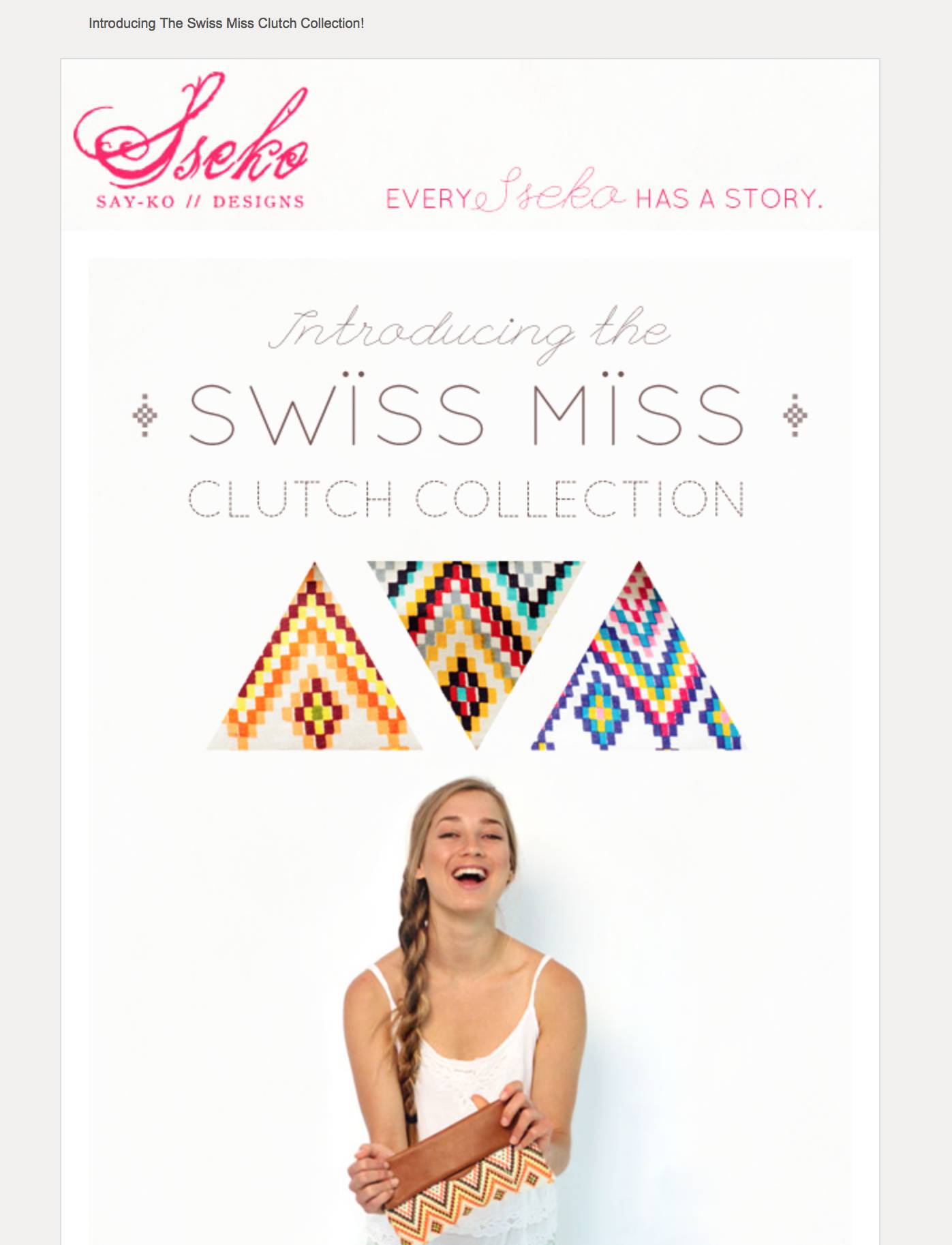
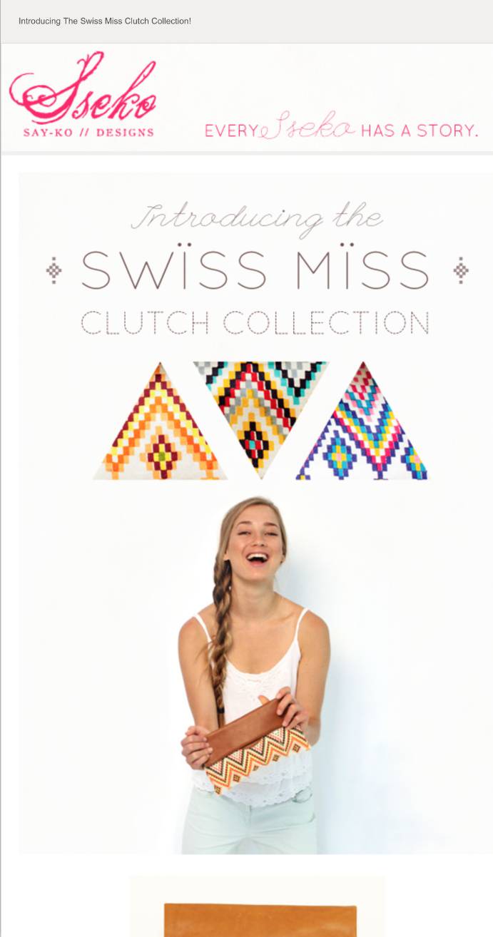
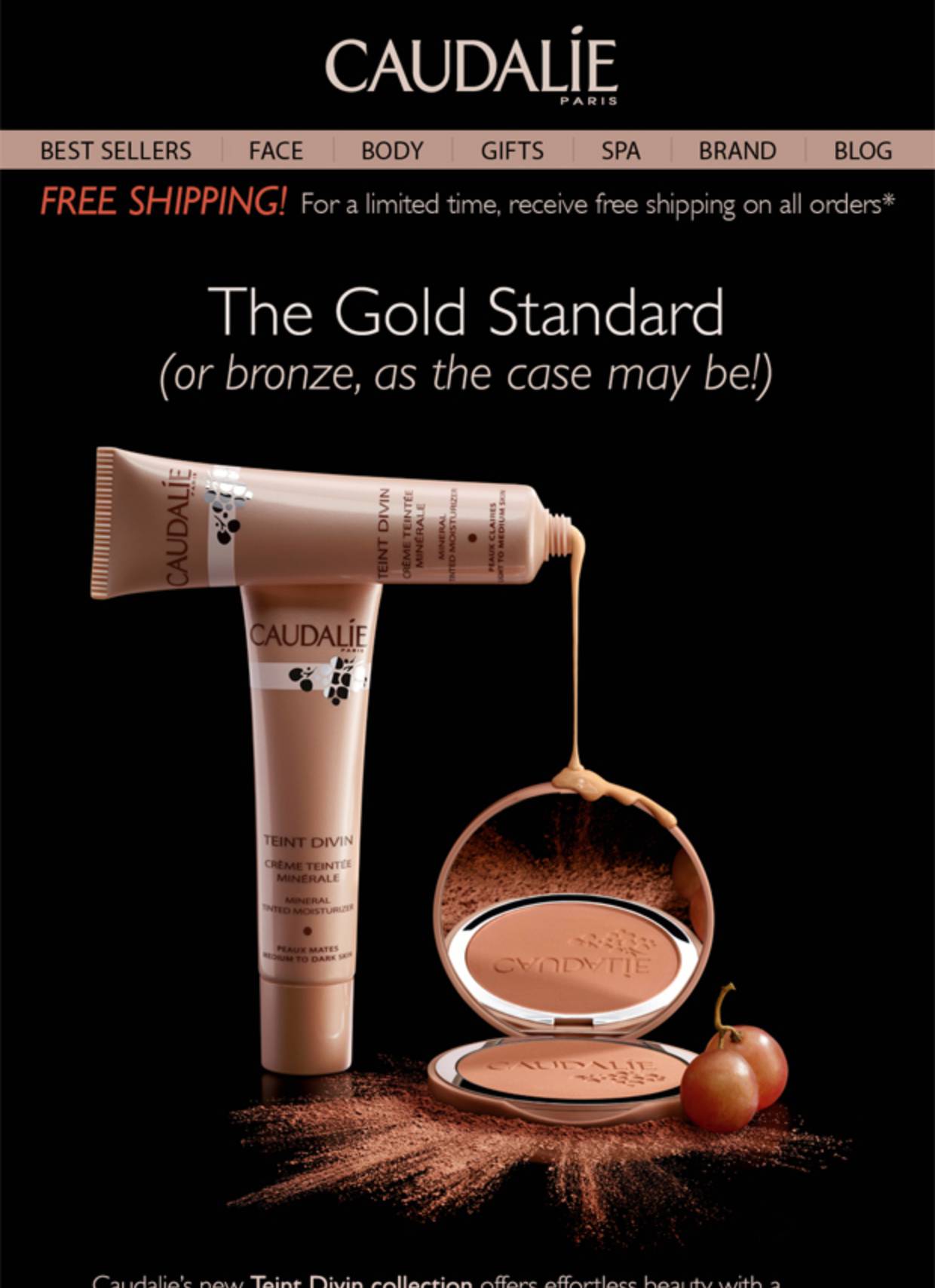
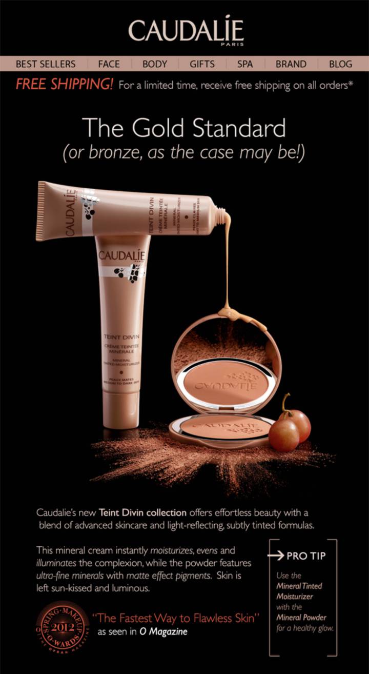
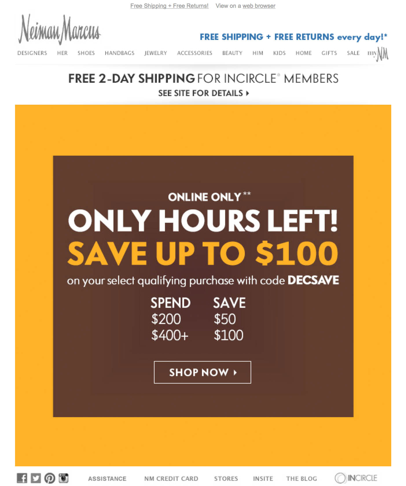
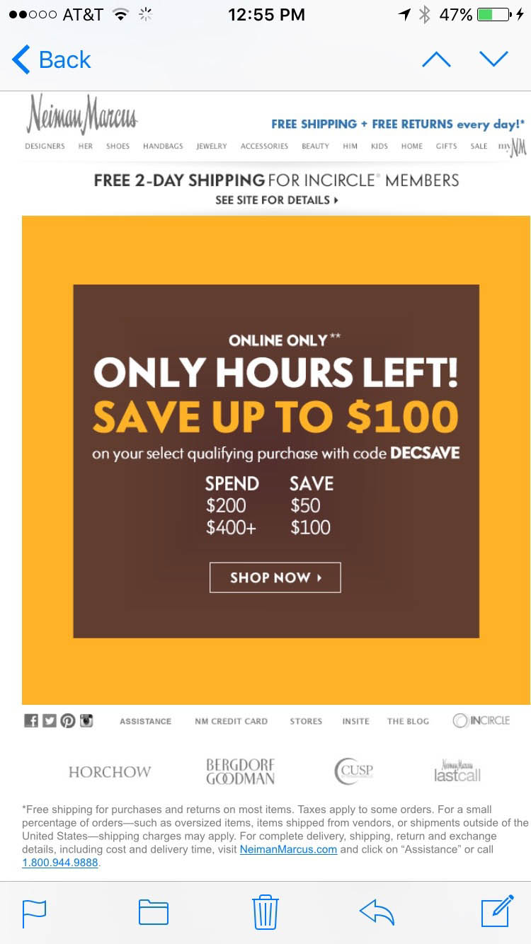
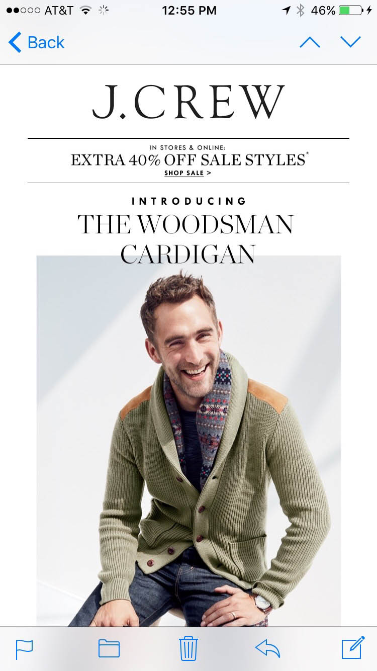
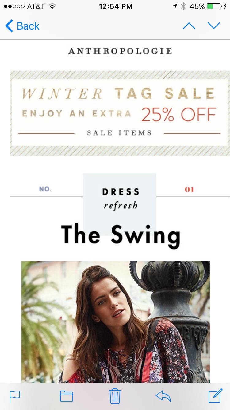
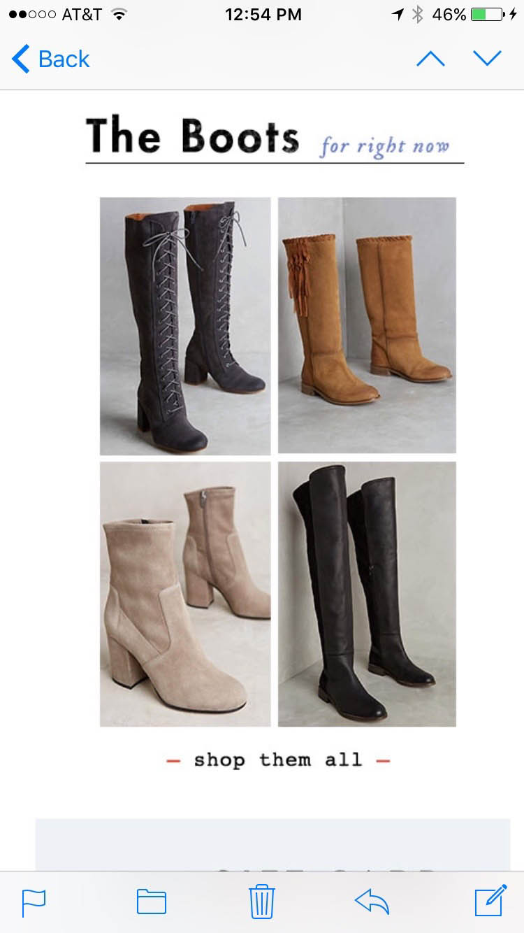
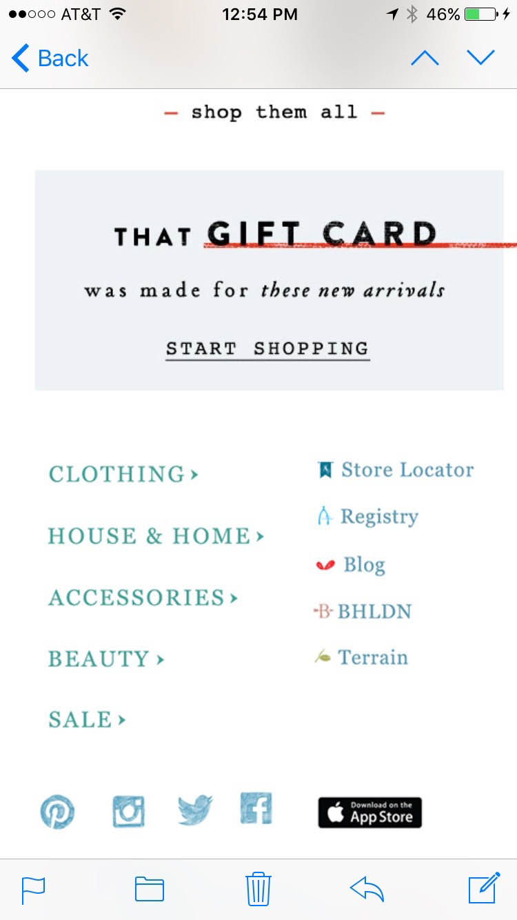
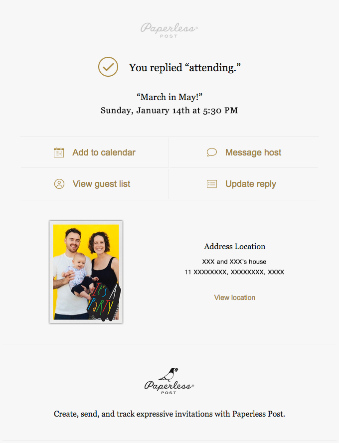
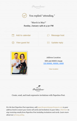
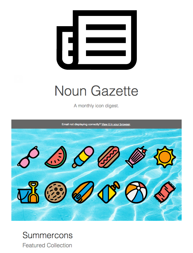
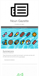
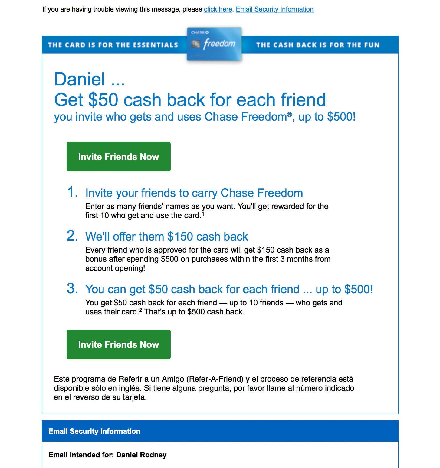
Ecommerce
(Buy Me)
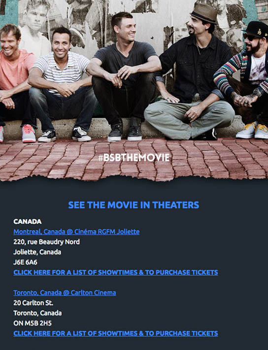
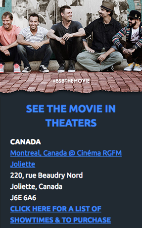
Example Emails: Good or Bad
Event
(Join Me)
Example Emails: Good or Bad
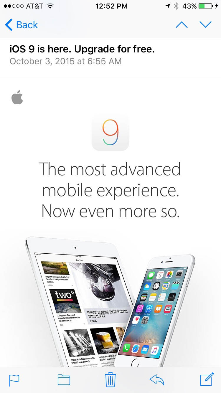
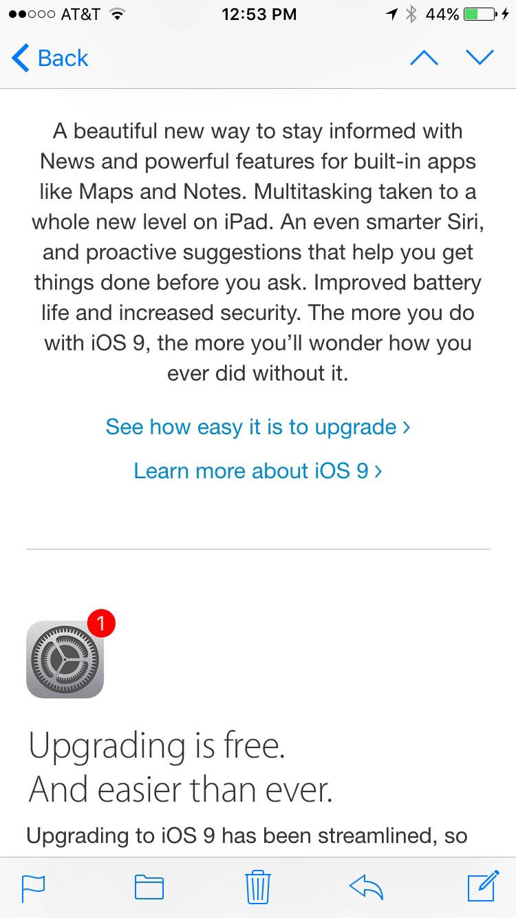
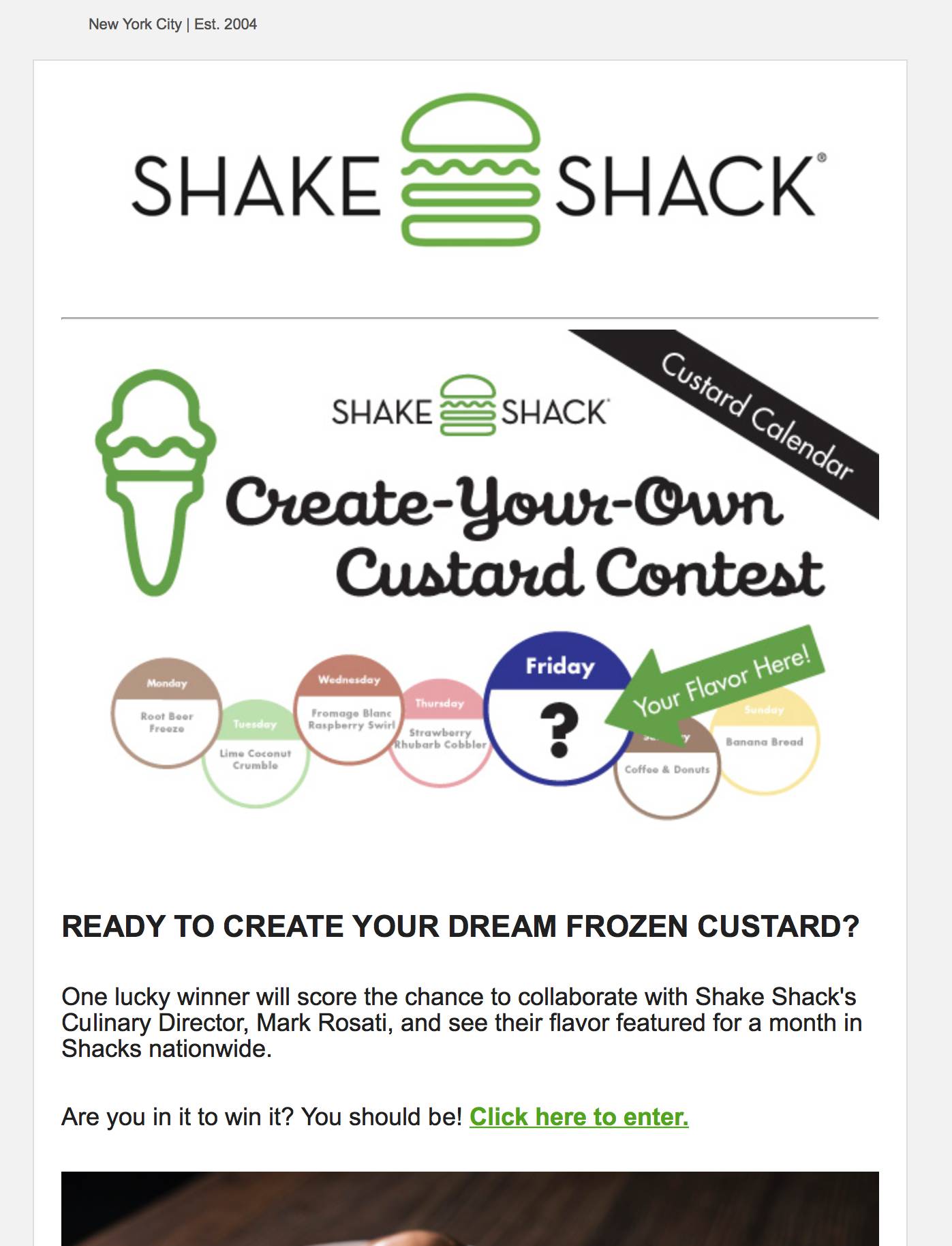
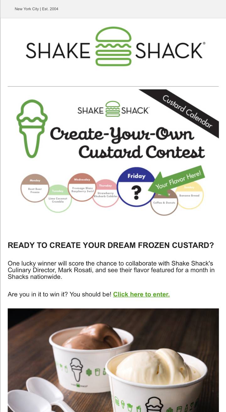
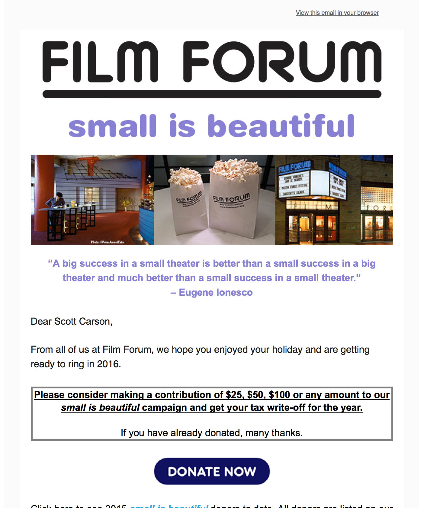
Informative
(Read Me)
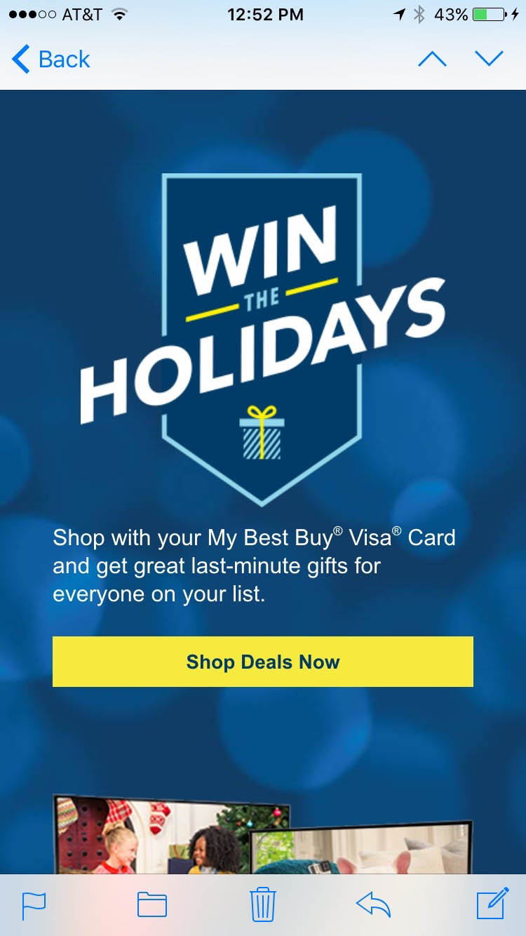
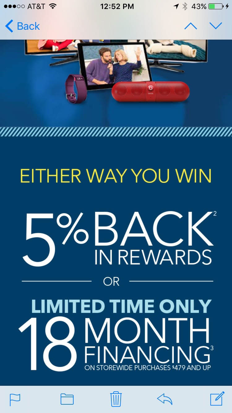
Example Emails: Good or Bad
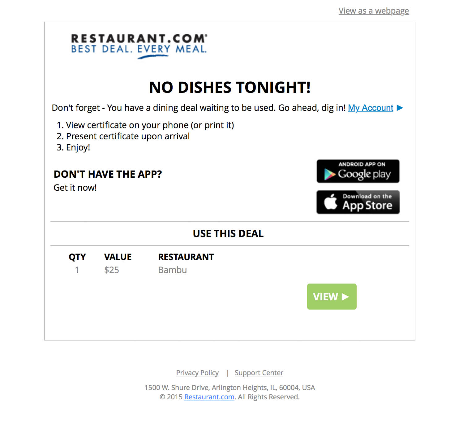
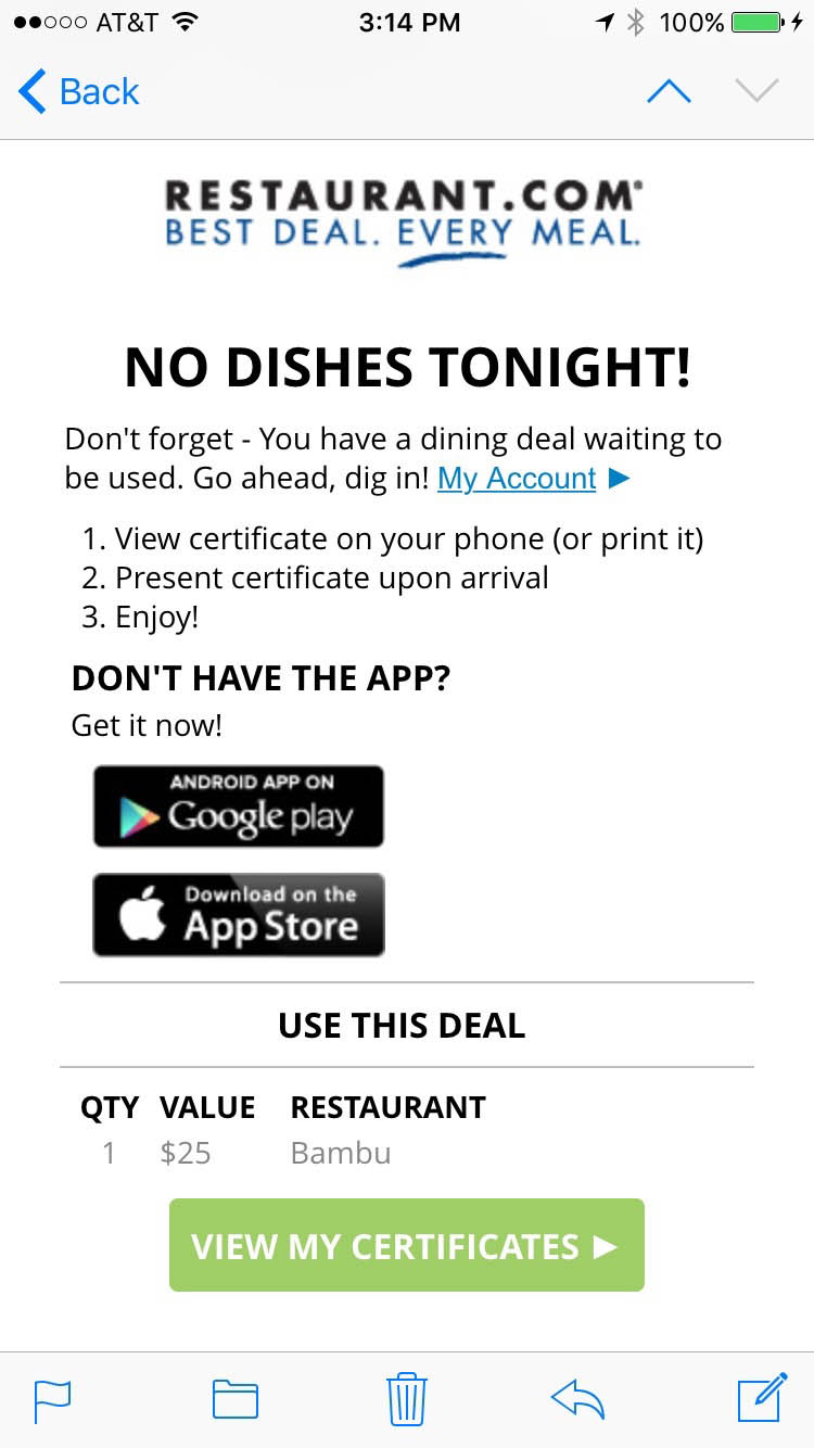
Transactional
(Do Something)
More Email Designs
Coding Responsive Emails
No Coding Standards
Websites have standards, but email does not!
Older versions of Outlook for desktop used the IE6 rendering engine, but Outlook 2007 and newer use Microsoft Word to render emails!
We use whatever techniques work at the moment.
Techniques Change
Coding & email clients can change at any time!
When researching code, techniques from a year ago (or even a few months) may now be outdated.
What Email Clients Are We Coding For?
CSS Media Queries
- In webpages we use CSS to style elements & media queries to make them responsive.
- This works in some email clients, but not all.
- In late 2016, Gmail announced support for CSS (in a style tag) & media queries!
- As of this writing, Gmail has not quite finished implementing the change. Litmus: Progress on the Gmail Roll Out
- Previously, Gmail would strip out the style tag, requiring us to inline all CSS. Continue doing so until the roll out is complete!
Gmail
Another Approach: Fluid Hybrid
Using this “spongy” method, Gmail gets a mobile optimized layout without media queries. This technique is more complex.
Responsive HTML Emails: a Different Strategy
Future-Proof Responsive Email Without Media Queries
Hands-On Training
Learn how to code responsive emails in
our Responsive Email training.
Useful Info & Tools
- Campaign Monitor: Ultimate Guide to Email CSS
(as of this writing, the guide has not been updated for responsive Gmail) - Bulletproof Email Buttons
- Bulletproof Background Images
Email Resources & Insights
- MailChimp: Email Design Guide
- MailChimp: Email Design Reference
- Campaign Monitor: Tools for coding HTML emails
- Campaign Monitor: Marketing Resources
- Litmus: Email Community
Learn More
Learn to code responsive email in our
Certificate in HTML Email